Airports are not enjoyable places to be. Long distance travel is not fun. Badly designed boarding passes are annoying. Seriously annoying. The boarding pass is essential for air travel, but it must be one of the most counter-productive items an airline could issue when badly designed. I think they cause headaches for airline and airport staff and travellers alike. Travellers are often stressed, emotional, groggy, jet lagged or a toxic mix of all four. The thought of having to decode a rubix-cube-puzzle of crucial information in that state makes me want to just give up.
I am sure you are no doubt trying to figure out what the f*** to do with the piece of paper in your hand right now. You’re confused, lost and you just want to get on your flight…
You may have read Tyler Thompson’s post — I did, and on every plane journey since, I have looked at my boarding pass with a little bit more intrigue. Wondering why it is the way it is, pondering what it couldlook like?
Obviously, it’s difficult to fully define how to plan out an area when you don’t know the how far the boundaries reach.
There are definitely restrictions to how a boarding pass can be created and probably a haberdashery worth of red tape to try to break through. There are some sticky issues that I can think of and probably some that I am unaware of. But they basically break down into a number of categories.
- Print limitations (airports seem to have crazy basic print machines, colour may be an ideal but not a realistic ask)
- Cost (we are talking about millions of pieces of paper here)
- Flexible content restrictions. I have a long surname at 13 characters, I am sure others can go longer. Getting that on a ticket with long strings of other characters is troublesome.
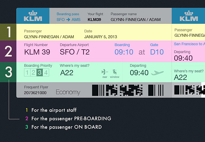
3 Sets of Eyes
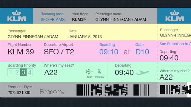
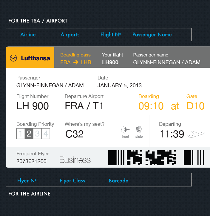
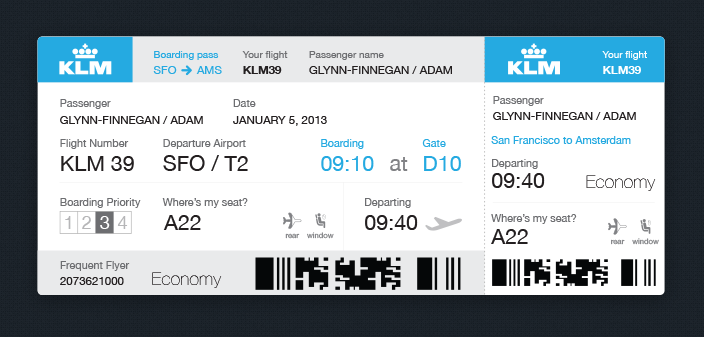
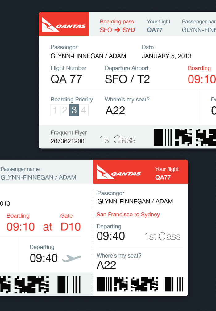
The boarding pass has to clearly show the information for the TSA, airline staff and the traveller.
I constantly kept in mind that the ticket has at least two users, and usually three: both the traveller, who uses it as a reference, and also any TSA agent or airline employee that might need to inspect it.
I wanted to solve not only the aesthetics of the boarding pass, but the layout of information in order of importance and chronology — meaning from the start of your journey ’til you arrive at your destination gate.
Chronology
There needs to be some chronology. You don’t need to know your seat number until you are on the plane. Before that, the questions are What time do I fly? What gate do I leave from? Which boarding group am I in. I wanted my design to answer these in the order you would ask them.
Where’s My Seat?
I think airlines can do better at helping passengers find their seat. It is in their interest to get everyone seated quickly, but how many people stop in the middle of the aisle and stare into the row hoping for some sort of enlightenment moment to help them find their seat?
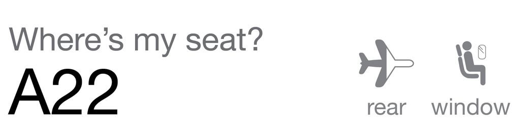
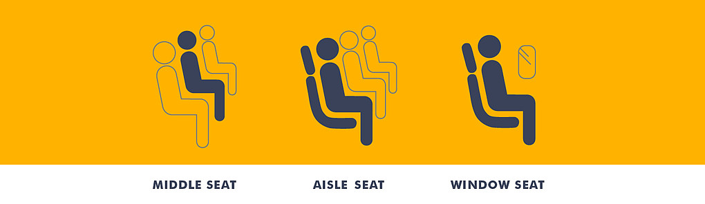
I think using a mix of icons and numbers, these issues can be broken into three easy-to-follow steps.
- Seat number: What to look for.
- Seat location: Front or rear of plane.
- Seat type: Aisle, Centre or Window.
I have not seen this done and I think it would be extremely helpful.
The other thing I would love to include is a halfway fold… I bet you have had this happen — You stick your boarding pass in your pocket, take it out at the gate and the stub is hanging off. You reached peak perforation too soon! I would include a foldline on the reverse of the ticket that leaves the stub nicely intact and means you can put the pass into your passport neatly.
Branding
Every airline is recognisable by it’s aeroplane livery. If it is not- they have done a bad job. The two key brand assets used by an airline are their colour and logo. Most airlines will have a strong enough brand presence with just these two elements present — so keeping a simple design and adding just a few sections of block colour and the logo should be enough to invoke those brand associations.
Here is a breakdown of the design based on some of my ideas.
Boarding passes need to change. But here’s the question: Is re-structuring the information enough or is the whole boarding pass concept obsolete?
This post originally appeared on Medium and was republished with permission. Adam Glynn-Finnegan, a winner of 2 Webby Awards, is a Graphic Designer for Evernote, enjoyer of mountain biking, drinker of coffee, resident at Duke Studios in Leeds, UK and frequent traveller to San Francisco. You can find him on Twitter here.