It’s human nature to hate things that remind us of how dumb we used to be. Like teenagers who can’t stand their baby pictures, we prefer to ignore the proof of our humble beginnings. The same goes for artefacts of computing history — for proof, just look at the rage directed at relics of those early days, like Comic Sans and Clippy.
Yet many of those old artefacts are the very things that taught us how to interact with a computer. You may have hated Clippy or bashed the broken image icon for their crude representation of reality, but Clippy was a valid precursor to today’s sophisticated digital personal assistants, and the broken image icon is still a vital piece of vocabulary in the internet’s lexicon. Hate them all you want — it won’t make them any less important.
Curious about who designed these early visual metaphors, we dug into the internet — and it turns out that there’s something to be learned from even the most humble piece of GUI lore.
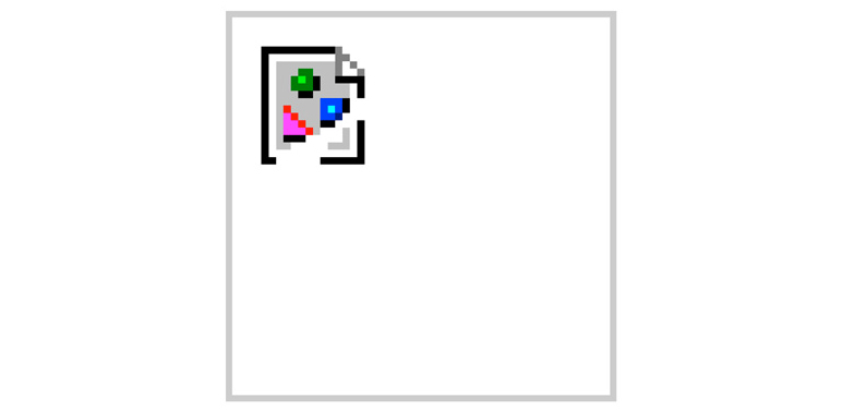
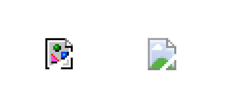
Who Designed the Broken Image Icon?
It’s probably one of the more enduring icons of the early Netscape era: a piece of paper showing a magenta triangle, a green circle and a blue square, frozen in time as one corner is ripped off by forces unseen. But who designed the broken image icon, which seems older than the internet itself?
One of the greatest threads we’ve ever seen on Quora, from 2011, enlightened us to the designer who spawned this ubiquitous icon. According to Hagan Rivers (neé Heller), the UI designer at Netscape from versions .0 through .4, it was a graphic designer named Marsh Chamberlin, who was actually responsible for all of Netscape’s graphic elements.
“Before the first version of Netscape, there wasn’t a specific icon that meant ‘broken image’, but there were placeholder images used for missing images in the product,” explained Rivers. “Marsh actually produced icons for broken image, missing image (two different things), and also the icons for the individual file types that might show up in a file listing.”
Though it seems intuitive now, dedicating an icon to tell users that an image was missing was actually a pretty inspired design move. It set the precedent for browsers developing their own GUIs, outside of whatever operating system was running it. And we’re seeing the legacy of that today, as companies like Google develop comprehensive visual guidelines across all their products.
In fact, Google (or Chrome, specifically) is doing away with Chamberlin’s work, eschewing the torn paper for flatter, simpler icons. Still, it’s a bit sad to see ol’ rippy go.
Who Designed the Pan Hand and Cursor Pointer?
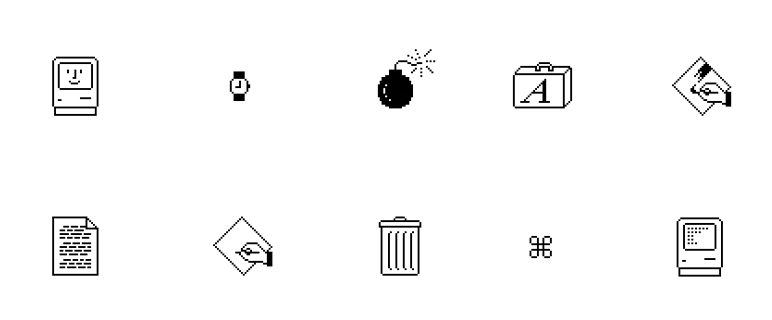
The cursor is almost like your own hands: It’s been there since the beginning, and you barely even notice it anymore. We point to the thing we want, and then we click. Yet even the cursor was designed — by one Susan Kare, the noted graphic designer who created the first set of Apple icons.
After starting at Apple in 1982, she went on to design most of the graphic elements that made up the company’s very first Operating System, including much-loved sad-face Apple, the file folder, and the waiting wristwatch. Perhaps her most enduring contribution — if a bit less discussed — is the pan hand: the fat-fingered cursor that we still use in plenty of programs, including Adobe’s.
The mouse — and the cursor icon — were the very first gestural interface, a fact we tend to forget today. It allows us to move our hands to point out what we wanted to select in digitals space — and without a visual metaphor (a hand) to explain that idea to first-time computer users, it may not have succeeded in exactly the same way.
Who Designed Comic Sans?
Why are we including Comic Sans in this group? Because it was designed, like so many other GUI elements, to help humanise computers.
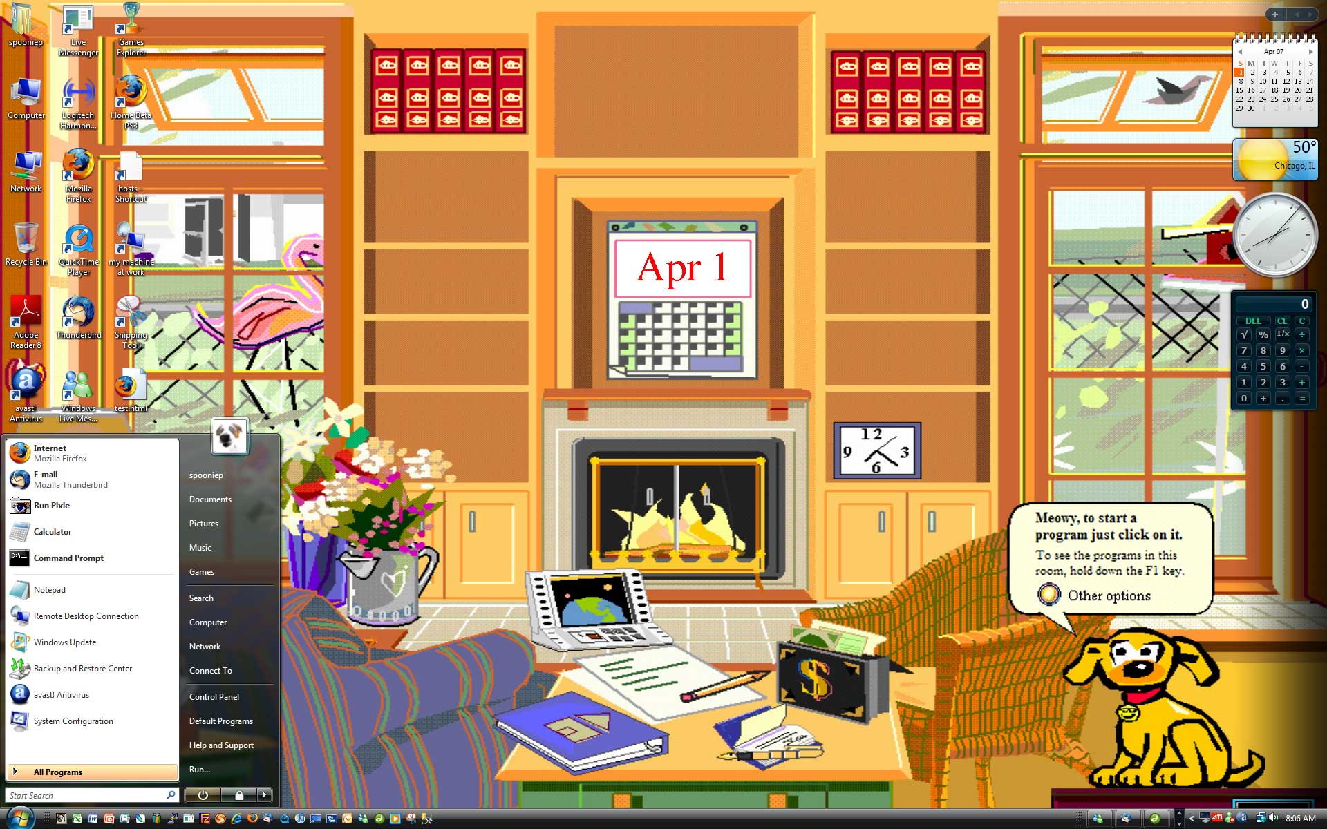
According to a fascinating post on Ars Technica recently, Comic Sans was actually a product of an early digital personal assistant: Microsoft Bob. Bob was one of Microsoft’s early attempts to create a user interface that applied basic skeuomorphism to the desktop — in this case, a house, where each room houses different application icons:
One of the characters in the house was a dog named Rover, who, at the beginning, spoke in Times New Roman. Microsoft type designer Vincent Connare was appalled that a dog would speak in a serif typeface — so he decided to create a more comic-esque font.
It’s a bit of a shame that Comic Sans inspires so much snobbery and hate these days. Because in reality, it was an early and important attempt to make digital type more accessible to new users — and in a way, it’s been incredibly successful. It might be unfashionable at the moment, but it serves an important function in the universe of human interaction. “If you love it, you don’t know much about typography,” Connare told the >Wall Street Journal in an interview. “If you hate it, you really don’t know much about typography, either, and you should get another hobby.”
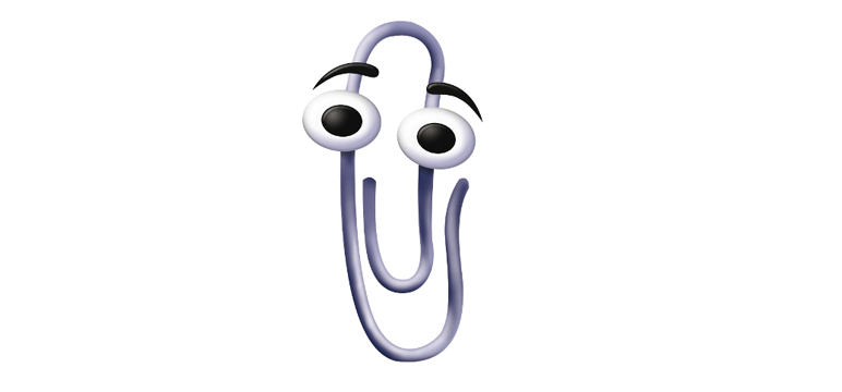
Who Designed Clippy?
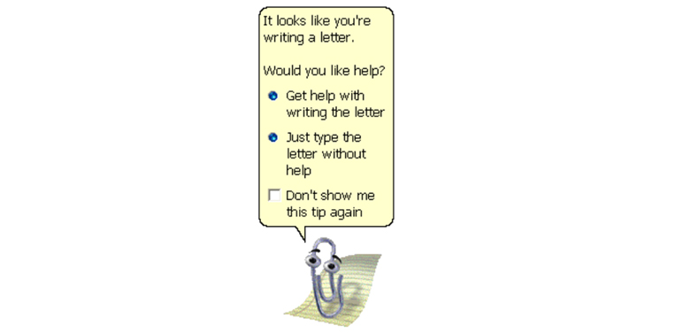
You remember Clippy, the paperclip-shaped personal assistant that infuriated Word users from 1998 to 2004, right? Or at least you remember his (or her?) signature move: tapping on the computer screen to get your attention, or appearing based on context-based cues like “Dear ____.”
Clippy was designed by Kevan J. Atteberry, a logo designer whose charming website is full of similar characters. “Woohoo!” says the sardonic Atteberry. “Credit for creating probably one of the most annoying characters in history! Actually, people either loved him or loathed him. I guess just noticing him is something… isn’t it?”
It is. It’s worth pointing out at Atteberry was just contracted to do the art — if the blame lies with anyone, it’s the interaction designers behind Microsoft’s ill-fated Office Assistant project. The final misstep came in 2004, when Microsoft threw Clippy under the bus with a series of ads that show Word users killing him — all designed to celebrate the exit of this era in UI design.
Despite how much Clippy may have annoyed you though, he did pave the way for less obnoxious digital assistants down the road. Though Office Assistant was axed — to the glee of many — in 2007, it served as a test case for how intrusive a digital assistant should be. So in some ways, Clippy is the ornery grandad of Siri and other modern-day equivalents.
What are we missing? Does anyone harbour a deep nostalgia for the Internet Explorer logo? Comment below!
The Cheapest NBN 50 Plans
It’s the most popular NBN speed in Australia for a reason. Here are the cheapest plans available.
At Gizmodo, we independently select and write about stuff we love and think you'll like too. We have affiliate and advertising partnerships, which means we may collect a share of sales or other compensation from the links on this page. BTW – prices are accurate and items in stock at the time of posting.