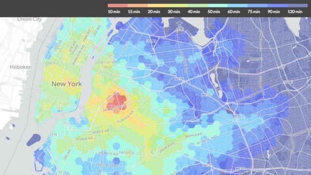
As cities grow and populations expand, people move further and further away from the centre. That’s definitely happened in New York — and this visualisation shows how the shift to more distant neighbourhoods affects travel time.
The interactive maps lets you click on a location and then gives a colour-coded insight into transit times across the entire city. It’s a little like Trulia’s Google Maps mashup — in fact it almost certainly shares some data sources with it — though it collapses data down instead of giving results by transport type. And it looks prettier too. [WNYC via Flowing Data]