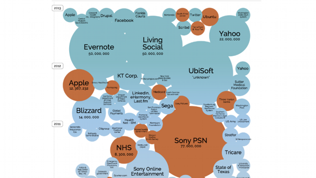
It sometimes feels like there’s a big data breach in the news every week — but some are far worse than others. This data visualisation shows the world’s biggest data breaches to date, and how they compare over time.
Put together by the team at Information is Beautiful, the interactive visualisation reveals some interesting trends. First, it seems universities and financial institutions have become more secure — or less attractive targets — over time. Most worrying, perhaps is that health care seems to be a very leaky (and inept) industry, accounting for over 50 per cent of breaches stemming from stolen or lost computers. Oops.
And the sector with the biggest cumulative number of data breaches? Unsurprisingly, the gaming industry. *Cough* Sony *Cough*. All told the visualisation makes for fascinating reading — go check it out. [Information is Beautiful]