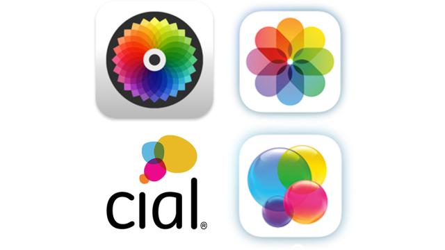
Apple’s new app icons are sure something, aren’t they? Each one is so delightful and cheery and vibrant. Who knew shading would look so much better than drop shadows! But wait! I think I’ve seen some of these before.
That Game centre icon looks a lot like Living Social’s colour blob. At least we now know what Apple did with that Color acquisition, too! Crazy, I know. This wouldn’t be the first time, though. Apple did “borrow” the Swiss National Railway’s clock for its new clock icon in iOS 6.
I can’t quite put my finger on any of the rest but maybe you’re seeing something I’m not?
