Designing a museum logo used to be a simple. Maybe you chose the outline of the building facade. Or a staid serif logotype. Or, hell, just the heraldic seal of whatever aristocrat was underwriting the whole operation. But in an era of faltering endowments and declining attendance, many museums are turning to high-concept graphic design to market themselves to the public.
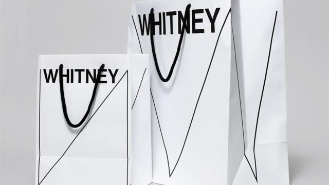
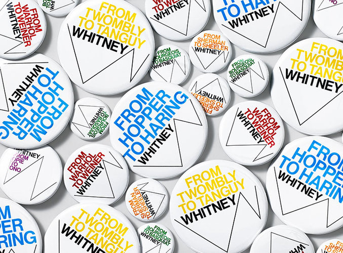
This month, the Whitney Museum — a bastion of post-War modernism on Manhattan’s Upper East Side — unveiled a newly revamped identity and website courtesy of Experimental Jetset, a trio of Dutch designers known for their theory-based work. Experimental Jetset describe their design as a “toolkit”, which is easily adaptable to contexts ranging from buttons to stationary to games. The sparse logomark itself is based on a heavy black Neue Haas Grotesk text, while a system of jagged lines forming a “W” change based on context.
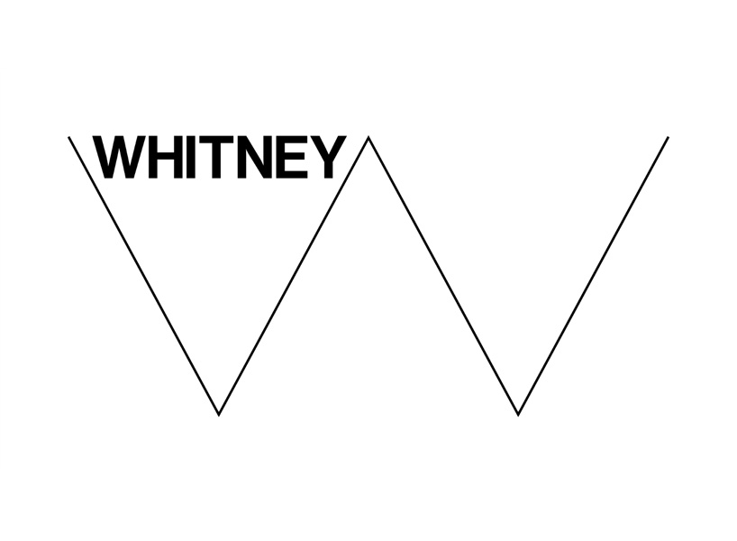
According to the designers, the “responsive W” is meant to fit around news, artwork, and other pieces of content, like a simple black-and-white frame. “One of the main subjects we tried to explore was the notion of a graphic identity that wouldn’t consists of a static, single logo,” they told me over email, “but one that would be able to change shape, reacting to ever-changing proportions and surfaces.”
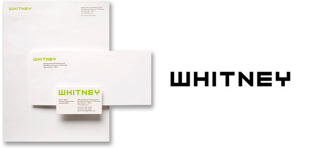
The old Whitney identity, designed by Pentagram partner Abbott Miller, was only 10 years old. That’s a remarkably quick turnaround, even by art world standards. Miller’s chartreuse, pixelated logotype was bold and very much dated, in an incredibly charming way — it spoke of the early ’00s, the dot-com boom, and a kind of irreverent optimism. It would’ve aged authentically — like a Upper East Side grand dame who refuses to tone it down.
But these days, developing a museum “brand” is a complicated chore. The visual identity of an arts institution has attract visitors and donors, and it also has to say something about the curatorial stance of a museum. That’s a difficult thing to convey in a single shape or form — and many museums, instead, are turning to “flexible” identities.
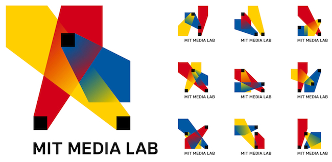
For example, the Brooklyn Museum of Art adopted a flexible logomark in 2004, designed by 2×4 to “better reflect the visitor-centred goals of the Museum.” Then there’s the Museum of Arts and Design, which adopted a Pentagram-designed customisable logotype in 2008. Perhaps the most famous — and successful — example of a flexible identity is MIT Media Lab’s algorithmic logo, designed by E Roon Kang and Richard The. Sure, Media Lab isn’t an arts institution, but the logo set the tone for dozens of identities that came after it. The design is based on three spotlights, which change according to each permutation — there are over 40,000 unique logos available — and it was so successful because it spoke to what makes Media Lab so successful.
The notion of adaptivity and flexibility in graphic design seems to appeal particularly to the art world, which makes a modicum of sense: galleries and modern museums focus on visual culture as it evolves, and their graphic representation should reflect that. But as logos and identities get less specific and more scalable, is something lost in the exchange?
The original purpose of arts organisations like the Whitney was to guide the unwitting public through the currents of contemporary art with an unpretentious, decisive voice. As far as we can intuit anything about a museum from its identity, are we witnessing a curatorial crisis of confidence? Maybe, but maybe not. Either way, it’ll be interesting to see whether this stark new identity outlasts its predecessor.