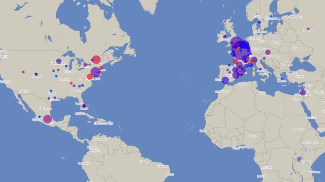
Sick and tired of hearing about New York’s bike share and the irresponsible weirdos that populate it? Well, here’s a change of pace: this excellent real-time map illustrates 85 different bike share systems from all over the world.
According to The Atlantic Cities, the map was built by one Oliver O’Brien, a software developer at the Centre for Advanced Spatial Analysis, in London. It updates every two to 10 minutes, pulling data from over 200,000 bike docking stations in cities as far as Kaohsiung and Tel Aviv. What’s really great about O’Brien’s colour dot system is that it shows us multiple values: Each circle’s diameter denotes how many bikes are in the system, while its colour shows the ratio of in-use and out-of-use bikes.
The most enjoyable part, maybe, is seeing which cities have the most night riders. Vienna and Madrid seem to have quite a few Friday night cyclists, and Moscow ain’t bad either, despite the fact that, according to a recent New Yorker story about the city’s new program, it’s far scarier riding in Russia than it is Manhattan. [Bike Share Map via The Atlantic Cities]
[clear] [clear]