
Yahoo search looks different today. It’s likely you haven’t noticed because, well, many, many, many, many people have moved on from Yahoo. To those remaining, or anyone rubbernecking in this morning, it sort of looks like just frumpy old Yahoo, slightly re-organised. But that’s by design. And keeping it visually consistent while improving the overall functionality actually requires more sophisticated tinkering than you might think.
Here’s the GIF Yahoo used to show the change:
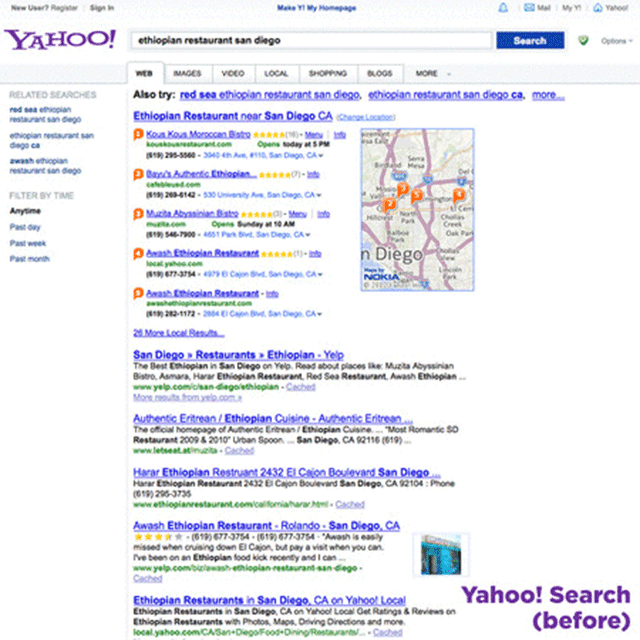
- The font has been trimmed down. Yahoo’s familiar Arial typeface is cleaner and slimmer, even when it’s bold or semi-bold. This goes very far toward making the results page seem less claustrophobic.
- Navigation is more prominent. Yahoo added a bar across the top of the page to take you to other Yahoo sites. Unfortunately, the bar isn’t persistent on those sites, like Google’s top bar is, but it’s also less intrusive. Buttons for settings, your account, and mail are also larger and more clickable.
- Persistent search filters are the norm. Instead of the left column (prime functionality real estate) being left to related searches, which are constantly changing and are usually not very helpful to begin with, it now has persistent search filters.
- Columns are more defined. Part of what made the old search so messy to look at is that UI elements roamed from one column to another, which gave your eyes nothing to lock in on. The same goes for all the floating elements that used to be just sort of tossed along the top of the page, which are now tucked neatly into horizontally consistent rows.
- Information organisation makes more sense. The related searches, for example, were duplicated in the left column and at the top of the results before.
Now, this stuff isn’t reinventing the wheel, which itself was introduced just a few months before the first Yahoo search site went live. The whole design is probably a few years old at this point. But with Yahoo’s user base being what it is, there’s a pretty strong case to not overturn the whole apple cart at once — like, say, Windows 8 did — and confuse everyone.
This is a nice example of design influencing experience without making the experience all about the design.