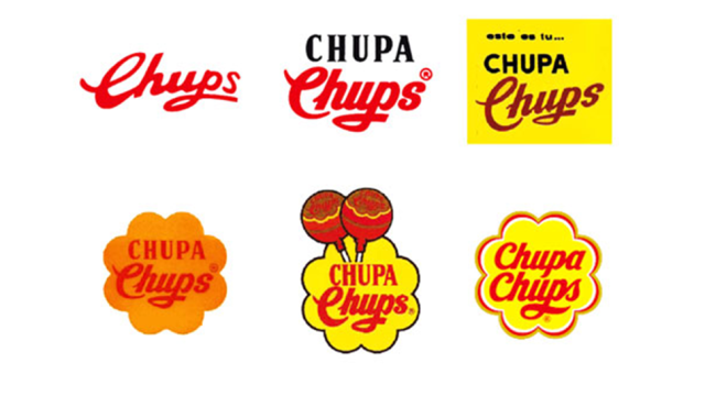
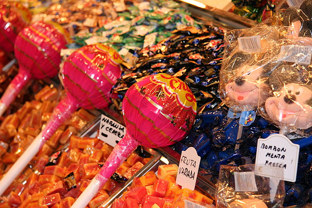
The Chupa Chups packaging is uncanny — you could spot the swirly, colourful wrapper from a mile away, and you’d instantly know it was the most famous Spanish lollipop in the world. David Airey, an Ireland-based graphic designer, put together this illustration that shows the evolution of the Chupa Chups logo since it first arrived on the scene in 1958.
Chupa Chups are the original lollipop. In the late ’50s, brand founder Eric Bernat got the idea for a candy on a stick from a mother scolding her child for getting sticky with candy. The name comes from the Spanish verb “chupar” which means “to suck”. It just goes to show that sometimes the best ideas are the most obvious ones.
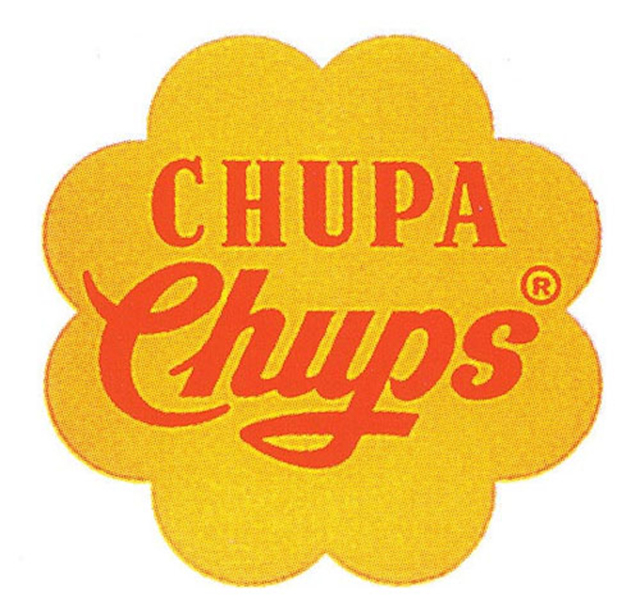
But it’s not all just juvenile — in fact, Chupa Chups have a surprising fine art pedigree. In 1969, legendary surrealist artist Salvador Dalí designed a new Chupa Chups logo. Set on a bright yellow daisy background, it’s just about as recognisable as Dalí’s signature floppy clocks. Here’s Dali’s design:
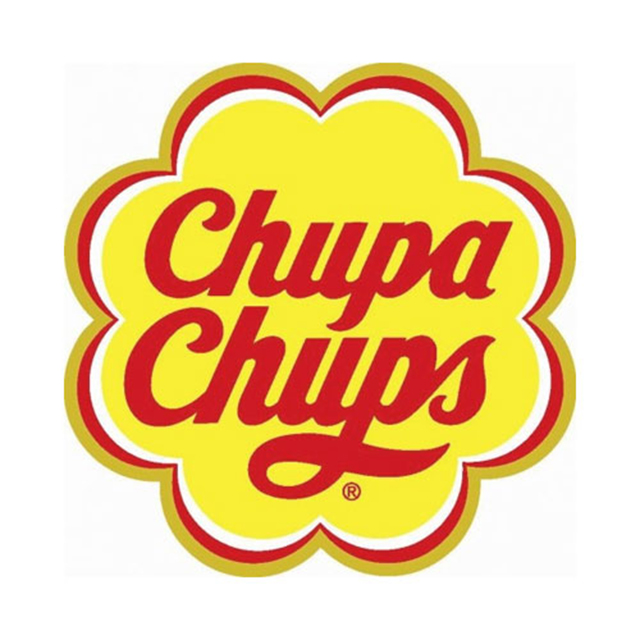
Using that as the gold standard, the Chupa Chups logo has undergone a number of transformations since. Here’s the current logo, which was revised in 1988:
Chupa Chups are unique from any other candy, even if it’s just in terms of its packaging. Maybe you couldn’t put your finger on the taste, but you’d definitely know that label anywhere.
[Chupa Chups via Logo Design Love via DesignTaxi]