The film, Star Wars, premiered on May 25, 1977. To celebrate its 36th anniversary, I’m examining the evolution of the film’s logo.
During the film’s pre-production, a decal (below) was produced. In the first Official Star Wars Fan Club newsletter, reprinted in the Star Wars Scrapbook (Chronicle Books, 1991), there was an explanation about the decal by Ralph McQuarrie, who did the art:
…“It was done as a symbol for the film — to go on film cans and letters. George [Lucas] had had one for American Graffiti, and wanted one for Star Wars.”
…“It was done while we were working on costumes,” said McQuarrie. “This was how we first pictured Han Solo. It could be a sort of Luke character, but I think it’s more like Han. Anyway, George decided that Han Solo should be a more relaxed character, and his costume was changed. But this decal was designed before the change.”
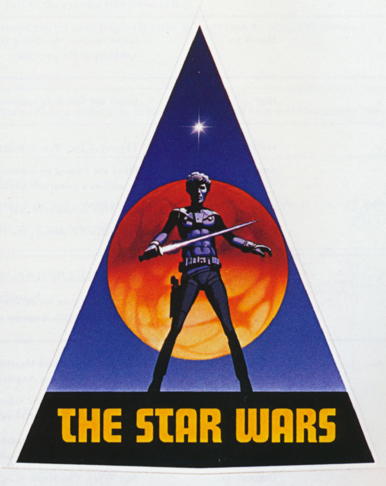
At the time the original title was The Star Wars. To my eye, the font on the decal is Futura Display. Below is a detail from a page in the Photo-Lettering’s One Line Manual of Styles with samples of Furtura Display and Futura Display Open. The letter “T” was modified to close the gap with the “H” and “A”.

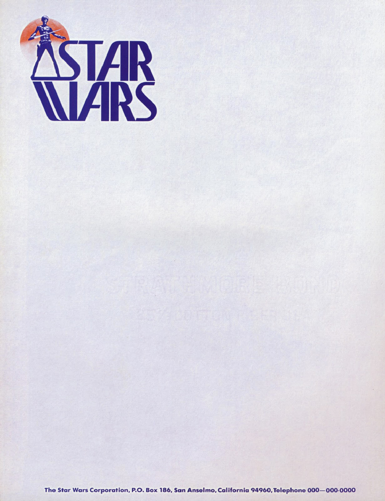
On the corporate letterhead, the film title dropped the article and a new logo had been created. In the Star Wars Scrapbook, it was revealed that Joe Johnston did the title lettering which was based on the Precis font family. (Thanks to eagle-eyed Ferran Delgado for finding the font.)
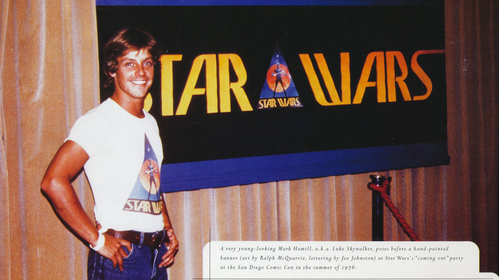
1976 San Diego Comic Con; the text credits Joe Johnston for the lettering
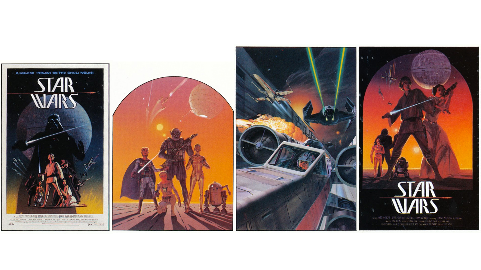
From the book, The Art of Star Wars (Ballantine Books, 1979), are some of McQuarrie’s concepts for the film poster with the Johnston logo.
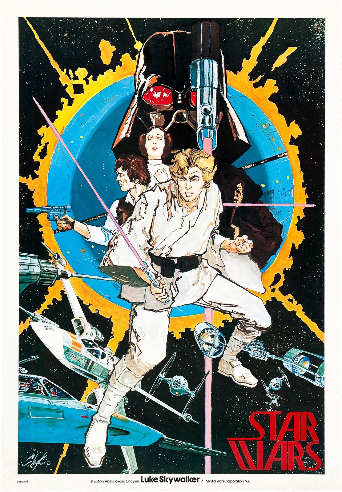
Art by Howard Chaykin
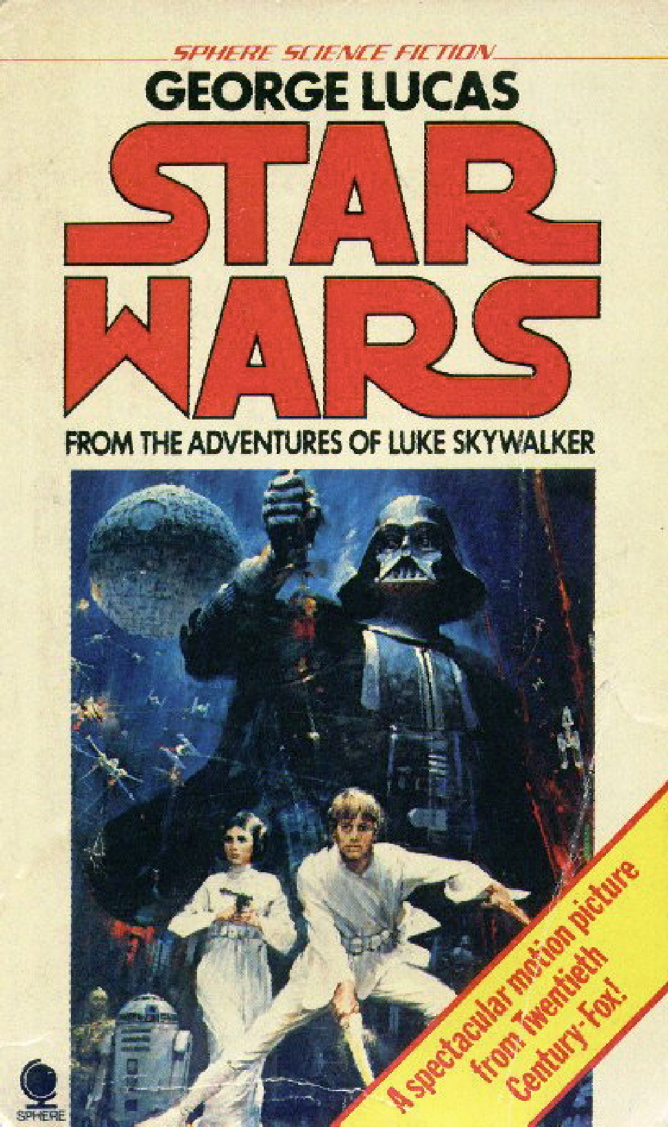
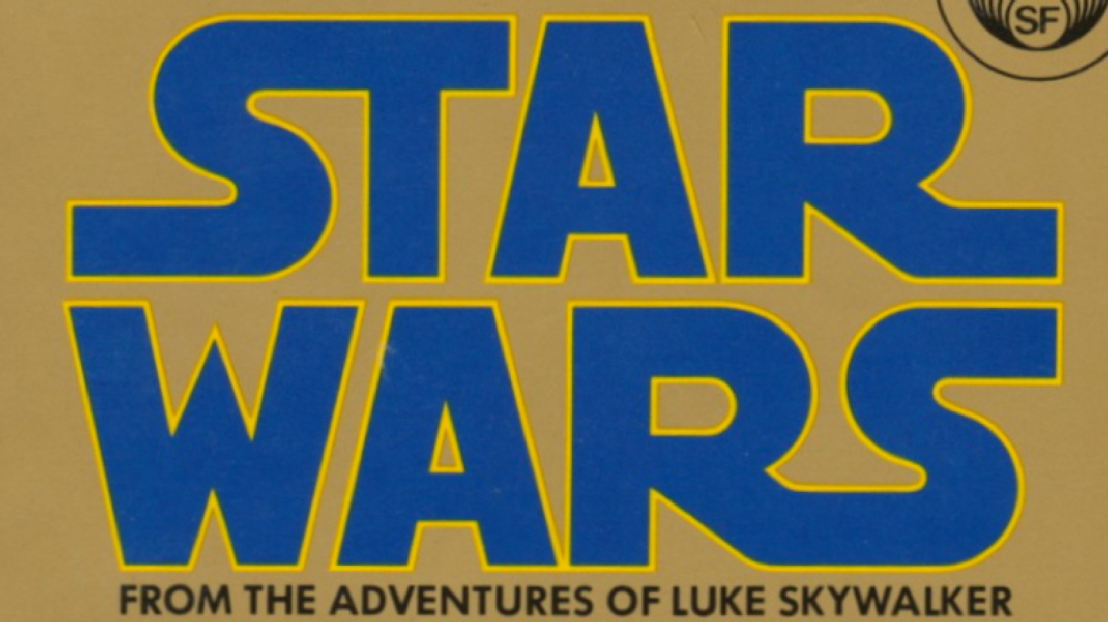
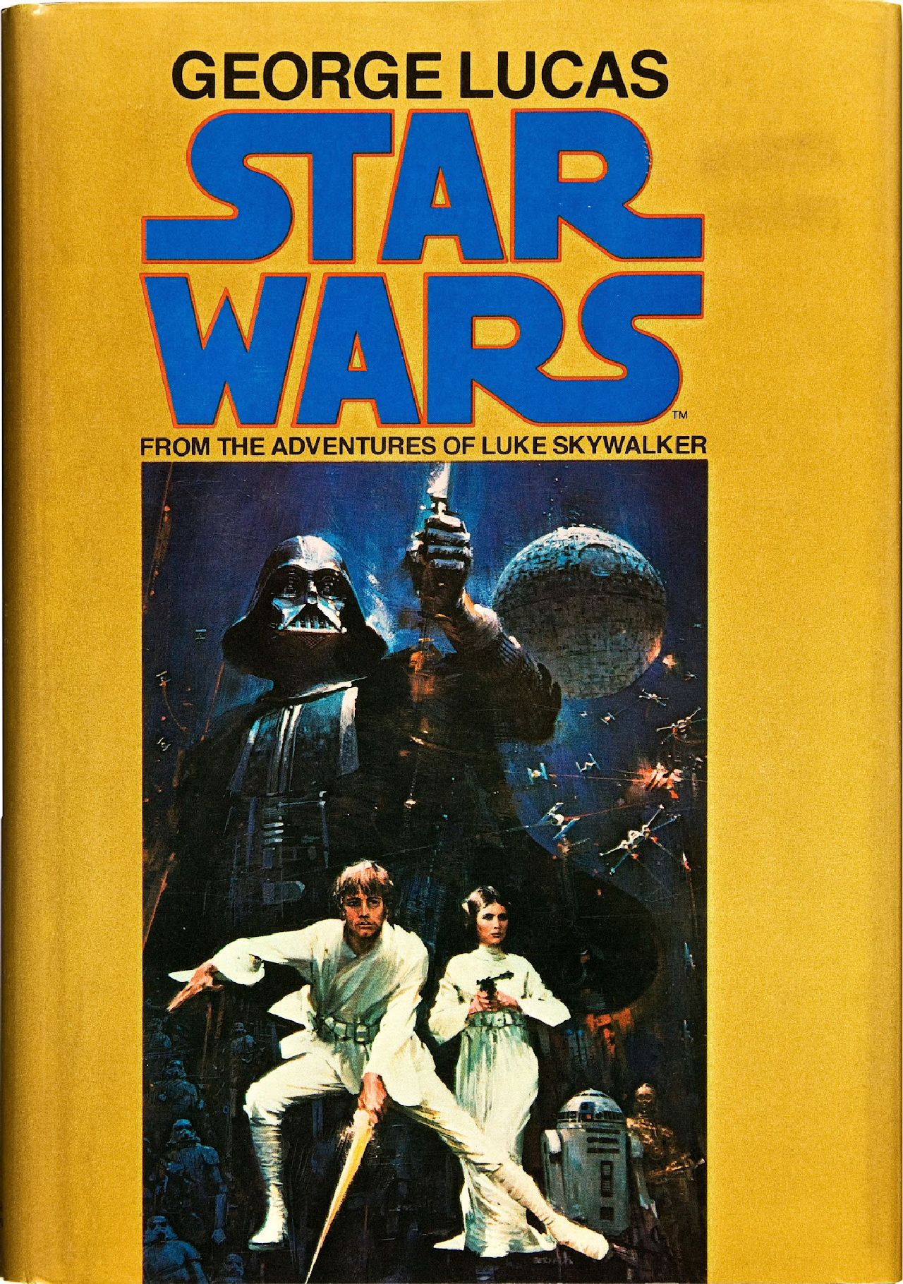
In December 1976, a novelisation of Lucas’s screenplay, ghost-written by Alan Dean Foster, was published by Ballantine Books. The cover art was by McQuarrie and the cover fonts are from the Helvetica family.

A full-page advertisement for Del Rey books appeared in Starlog #7, August 1977. Included was the Star Warsnovel with a photograph on the cover. The book with this cover was not published. In place of the photograph would be an illustration with a logo, which I have included.

As mentioned earlier, the original title was The Star Wars. Below is a storyboard panel, by Alex Tavoularis, of the opening crawl reproduced in The Art of Star Wars.

Lucas referred to the crawl used in the Flash Gordon and Buck Rogers serials. The same crawl was used in The Green Hornet serial.
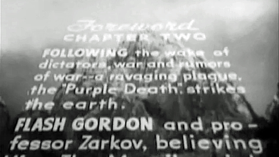
Universal Pictures, 1936
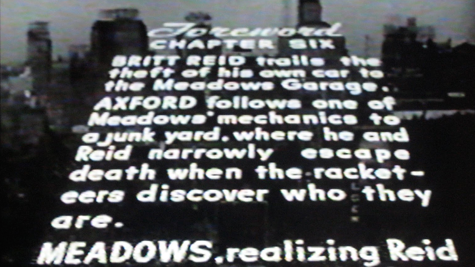
Universal Pictures, 1940
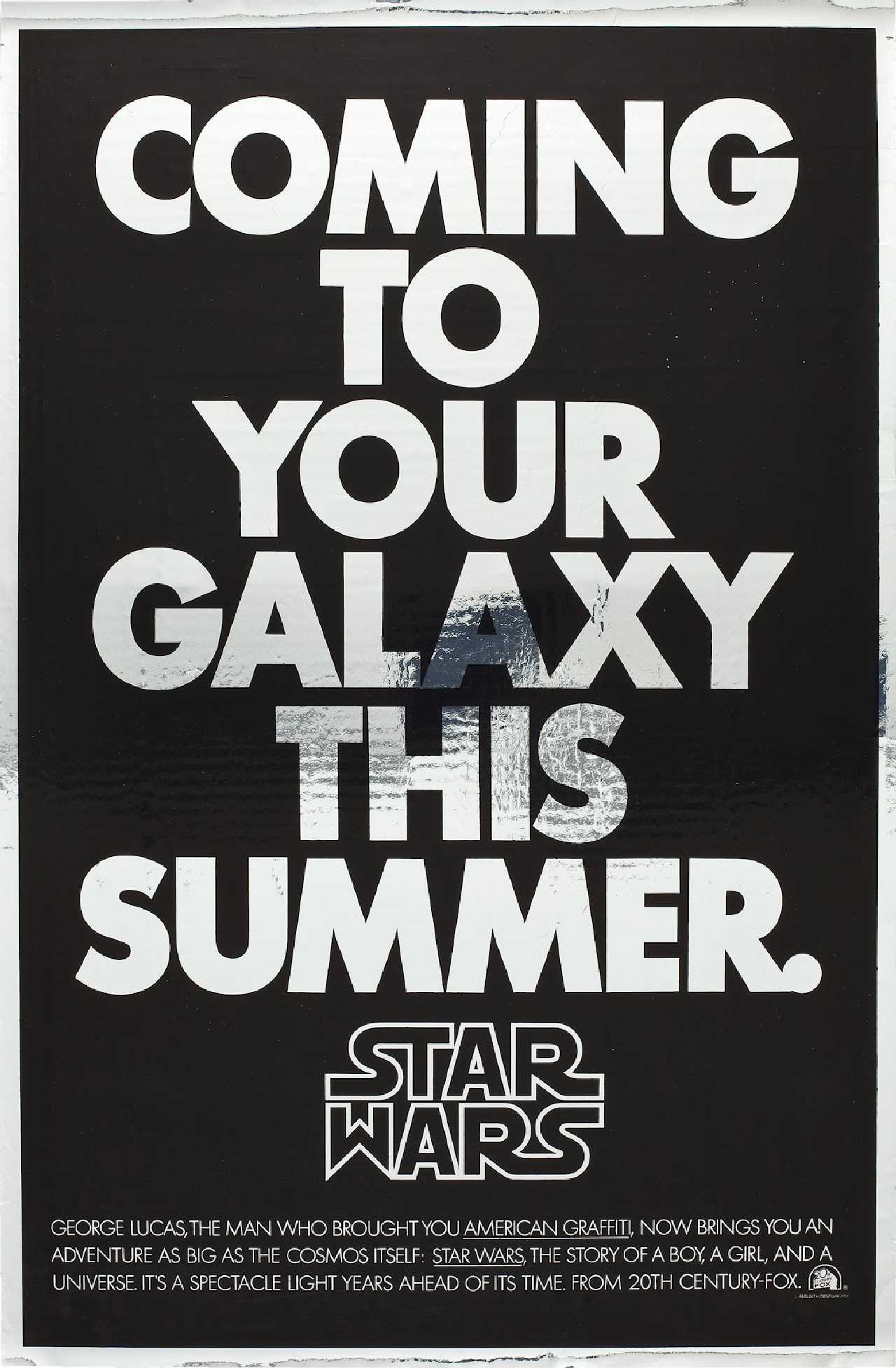
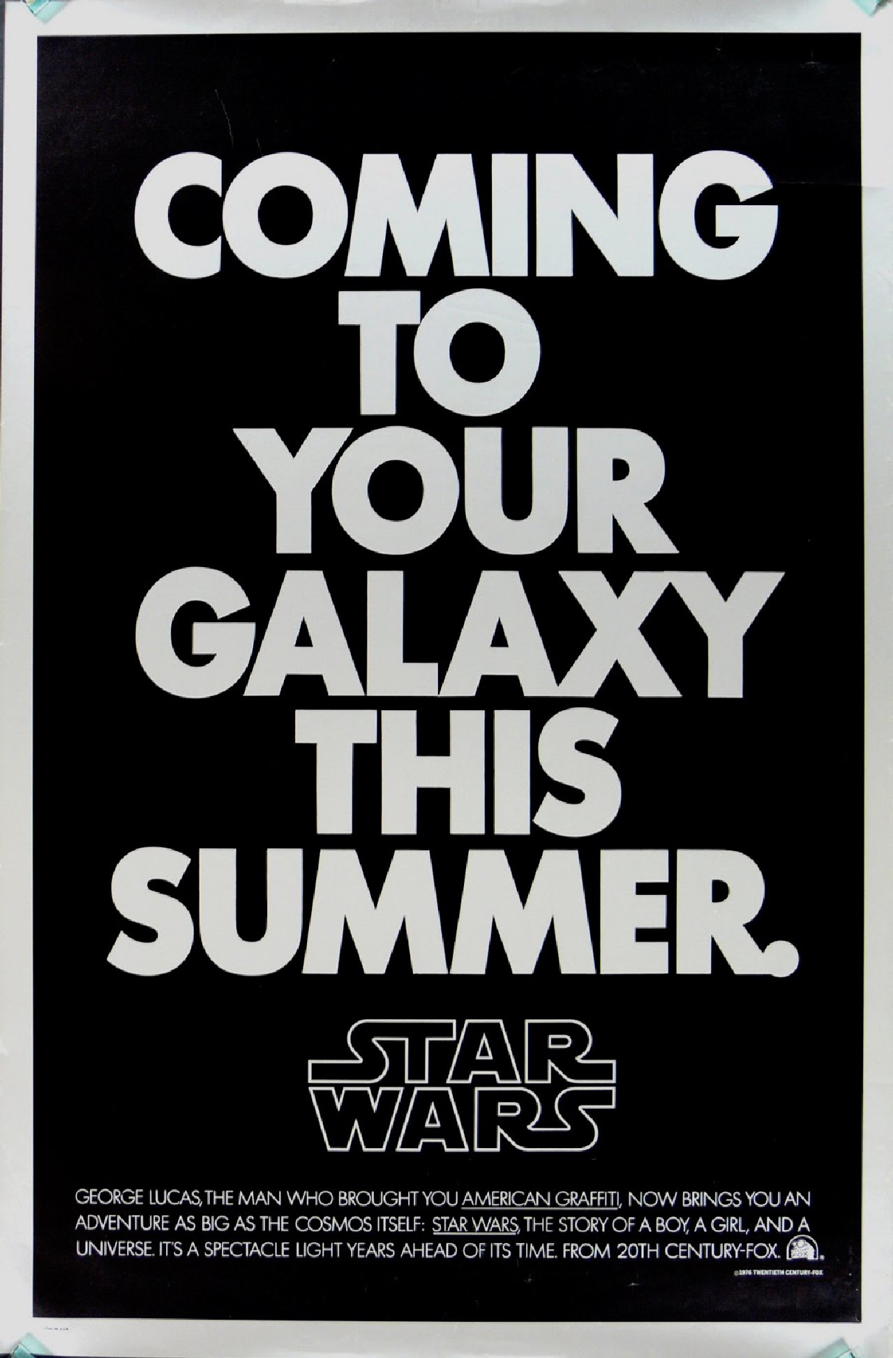
Dan Perri designed a logo, with a vanishing point, for the opening crawl, but it was not used. Instead, it appeared in print on posters and advertisements.
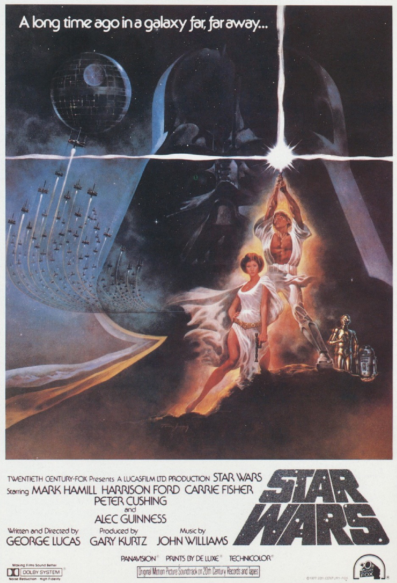
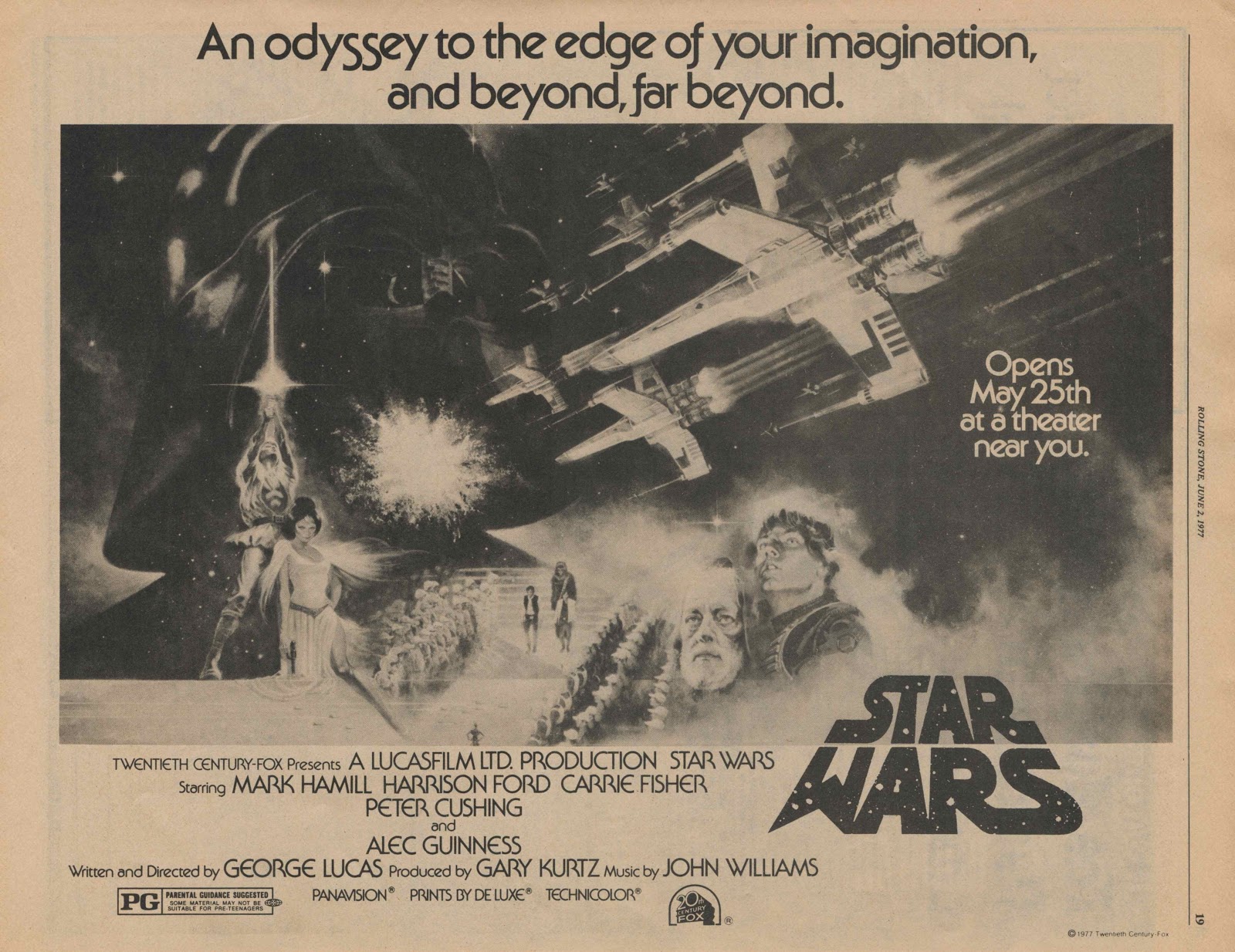
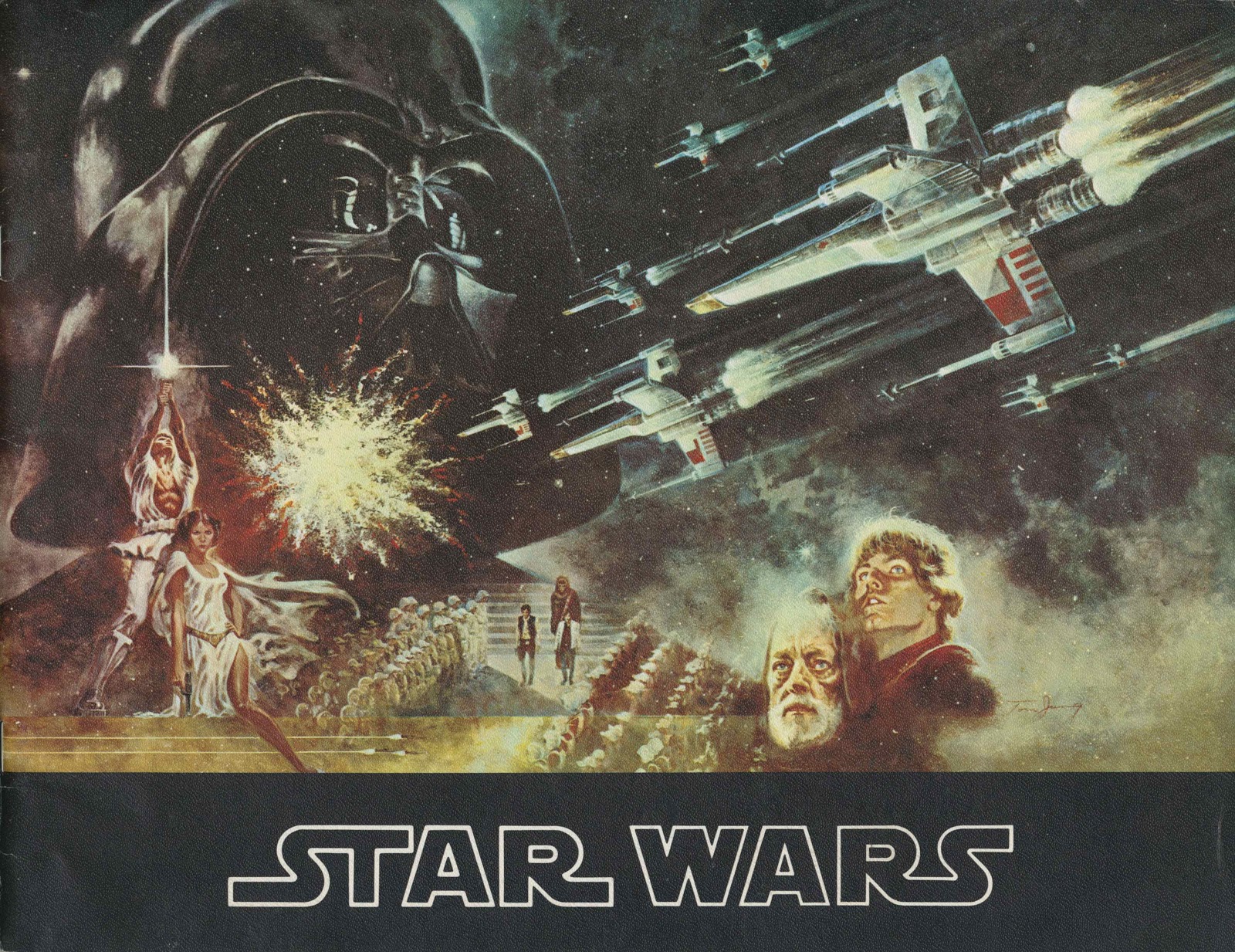
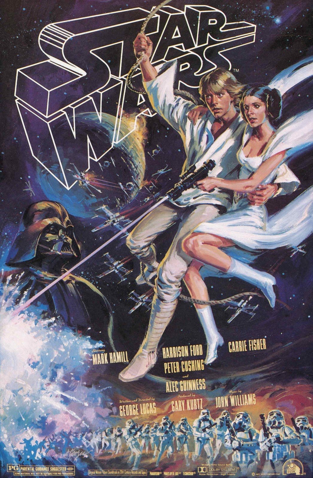
1977 movie poster
People Weekly, September 4, 1978
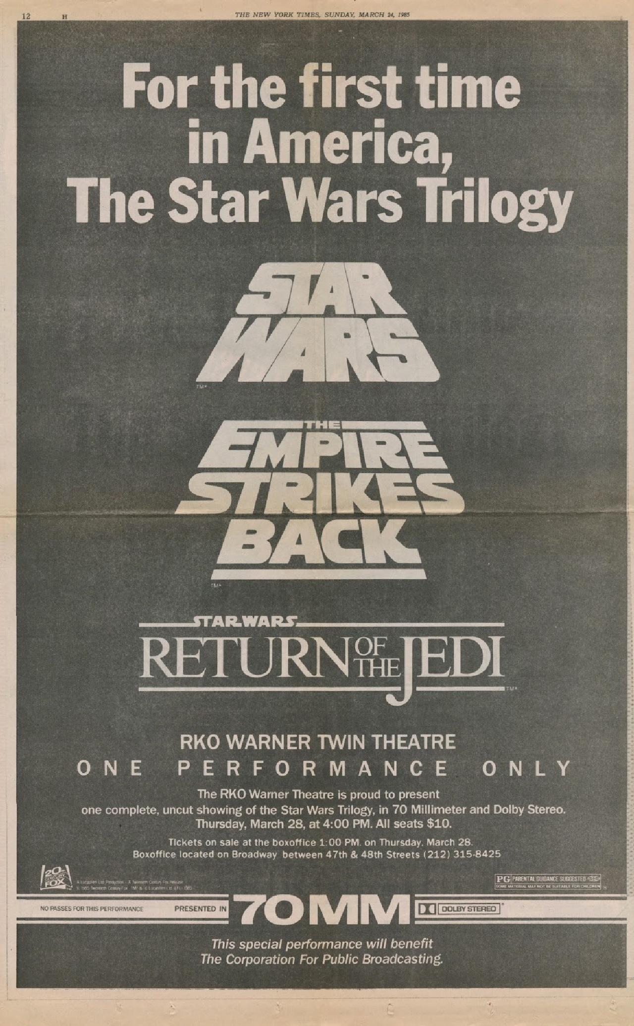
The New York Times, March 24, 1985
Lucas turned to Suzi Race to design a new Star Wars logo. She wrote about her involvement in a two-part post on her site: part one and part two. The Star Wars Poster Book (Chronicle Books, 2005) had a short account of her role:
…Though the poster contained no painted imagery, it did introduce a new logo to the campaign, one that had been designed originally for the cover of a Fox brochure sent to theatre owners….Suzy Rice, who had just been hired as an art director, remembers the job well. She recalls that the design directive given by Lucas was that the logo should look “very fascist.”
“I’d been reading a book the night before the meeting with George Lucas,” she says, “a book about German type design and the historical origins of some of the popular typefaces used today — how they developed into what we see and use in the present.” After Lucas described the kind of visual element he was seeking, “I returned to the office and used what I reckoned to be the most ‘fascist’ typeface I could think of: Helvetica Black.”
Inspired by the typeface, Rice developed a hand-drawn logo that translated well to the poster campaign, and ultimately to the movie itself. “I did have the screen in mind when I drew the logo originally,” explains Rice, who “stacked and squared” the words to better fit the brochure cover. It was an aesthetic choice that has lasted nearly three decades.
The now-familiar “S” ligature extensions that Rice drew were modified a bit after Lucas “remarked that it read like ‘Tar Wars,’” says Rice. “He asked me to make some revisions on the leading and concluding ‘S’”
Brochure cover with Rice’s logo
Detail from the brochure
Mylar poster with Rice’s logo
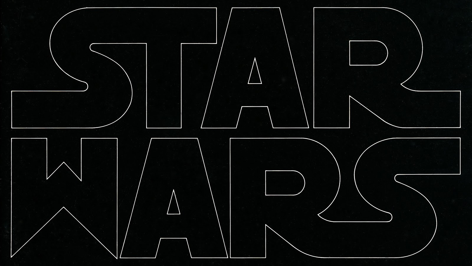
A caption in The Star Wars Poster Book explained how Johnston revised the Rice logo:
The second version of the Advance poster on regular paper features the standardized “W” used today. The modification was made by ILM conceptual artist Joe Johnston after it was decided that the original didn’t work well in the pan shot that was initially planned for the opening credits
Poster with Johnston’s logo revisions
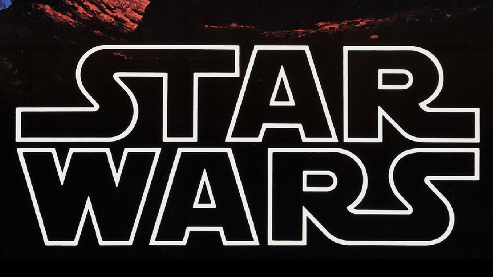
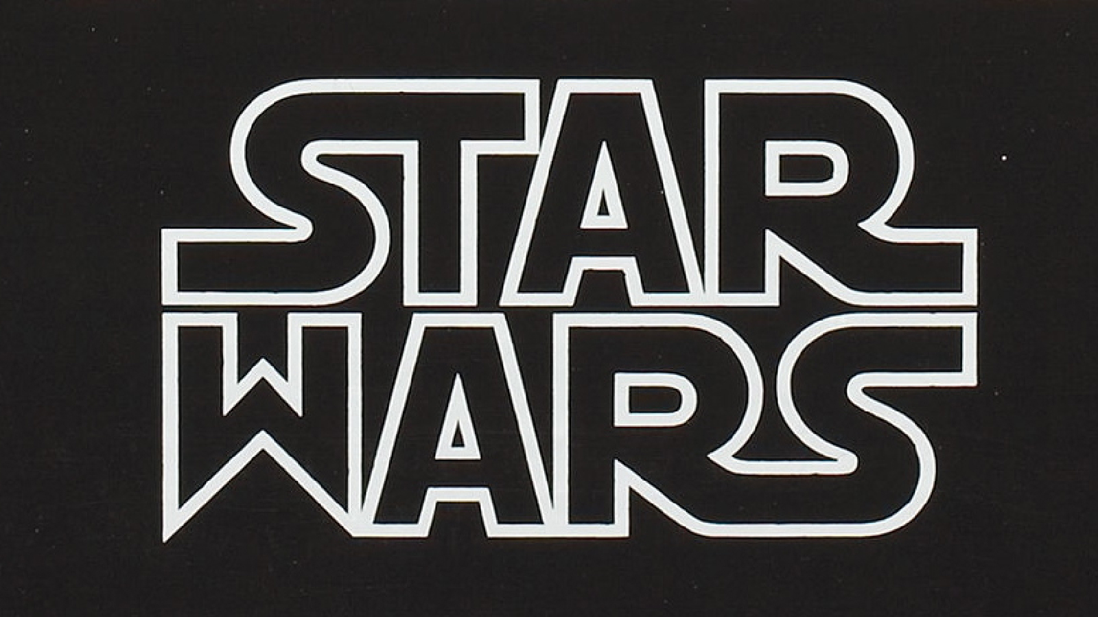
Above are the Rice logo (top) and the Johnston revised logo (bottom).
Johnston redesigned the “W”, widen the other letters and increased the letter-spacing. His version of the Rice logo was used in the film.
Rice’s original logo was used in a 20th Century Fox brochure promoting its upcoming films in Variety, January 6, 1977. The logo was also used in some consumer magazines and books, which were in production months before the film’s release.

Rolling Stone, June 2, 1977; Rice logo in perspective; advertisement font is Serif Gothic
U.K. edition paperback
Starlog #7, August 1977
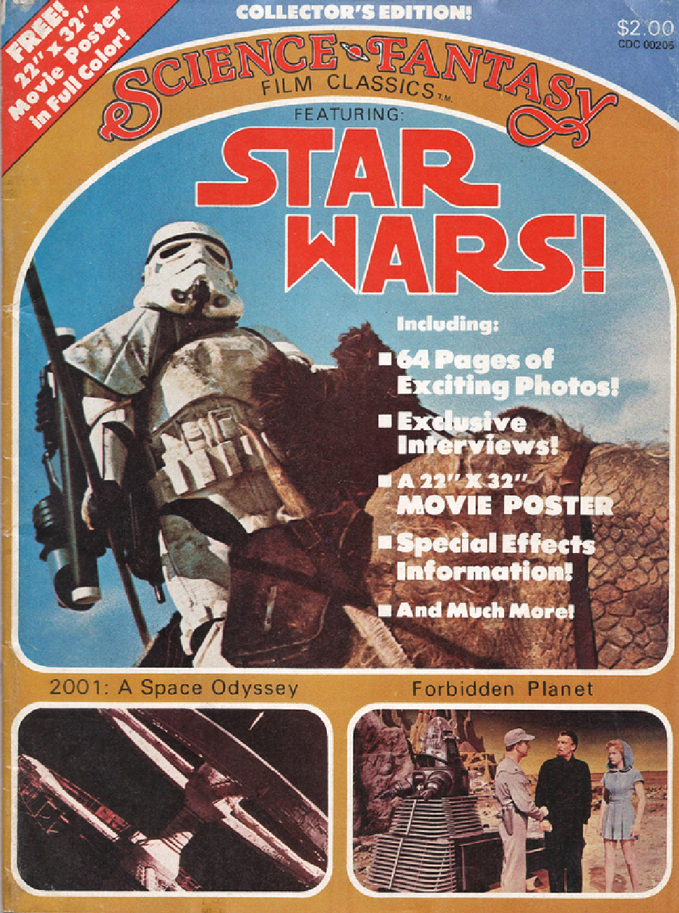
Science Fantasy Film Classics, December 1977
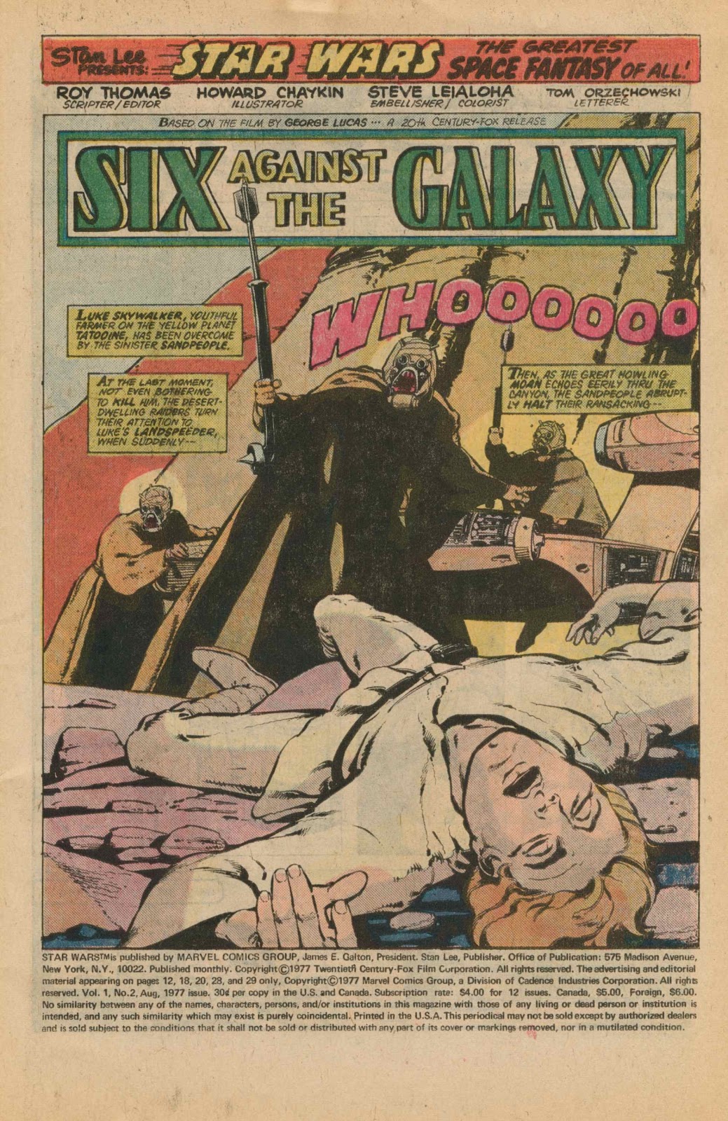
Meanwhile, Marvel Comics was preparing their adaptation of Star Wars by writer Roy Thomas and artist Howard Chaykin. Sometime in 1976 or early 1977, letterer Jim Novak was tapped by Stan Lee to rework the logo. Novak explained how it happened in an interview with David Anthony Kraft in Comics Interview #1, February 1983.
DAK: You’ve been credited as letterer of almost every series Marvel publishes, at one time or another, Jim. What are some of your uncredited works?
Jim Novak: The Spider-Man newspaper strip, various logos such as Power Man & Iron Fist (that’s one I remember doing that I felt proud of). The Star Wars logo has kind of an unusual story behind it. They brought in their logo from the studio and Stan Lee wasn’t crazy about it — the “W” was a little bit different looking and the letters weren’t Marvel-style. So I ended up re-doing it. It was way before the movie even came out. I didn’t even know what Star Wars was, at that point.
DAK: No one had any idea.
Jim: At the same time, we were working on the comic adaptation. I lettered the first issue, and I had no idea what that was about, either. The next thing I knew, the Star Wars logo was being used everywhere, from newspaper ads to some of the promotion and merchandizing materials.
DAK: You did that logo for Marvel and it ended up on all the Star Wars stuff?
Jim: Yeah. It was kind of a surprise to me, because I didn’t give it much thought. I was either working on staff or just there that day. I made a few significant changes, but it was basically their design and I Marvelized it, let’s put it that way.
DAK: Which one do they use now on posters?
Jim: I think it’s my logo. I don’t recall seeing the one they probably spent a couple thousand dollars on.
DAK: And you did yours for…
Jim: Twenty-five dollars. Things have changed since then. Now the financial situation is a lot different….
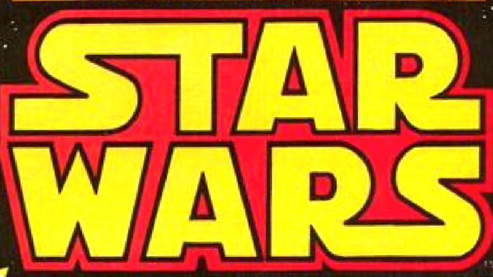
In the interview, I believe Novak was referring to the Rice logo. In the first Star Wars issue, all the letters are separated and bolder in stroke width. The major change was the design of the letter “W”. In the next issue, the horizontal strokes of the “ST” and “RS” were reconnected (Return of the Ligatures), as Rice had originally designed. That was done, I believe, for trademark reasons.
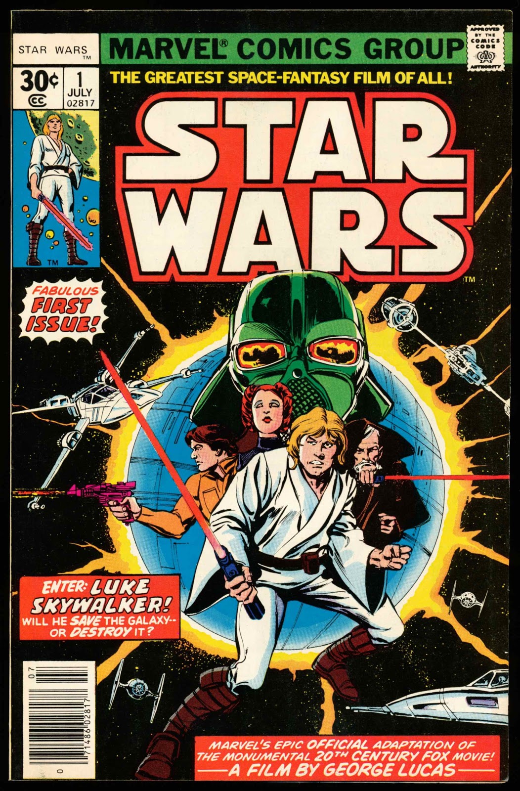

Splash page from the first issue
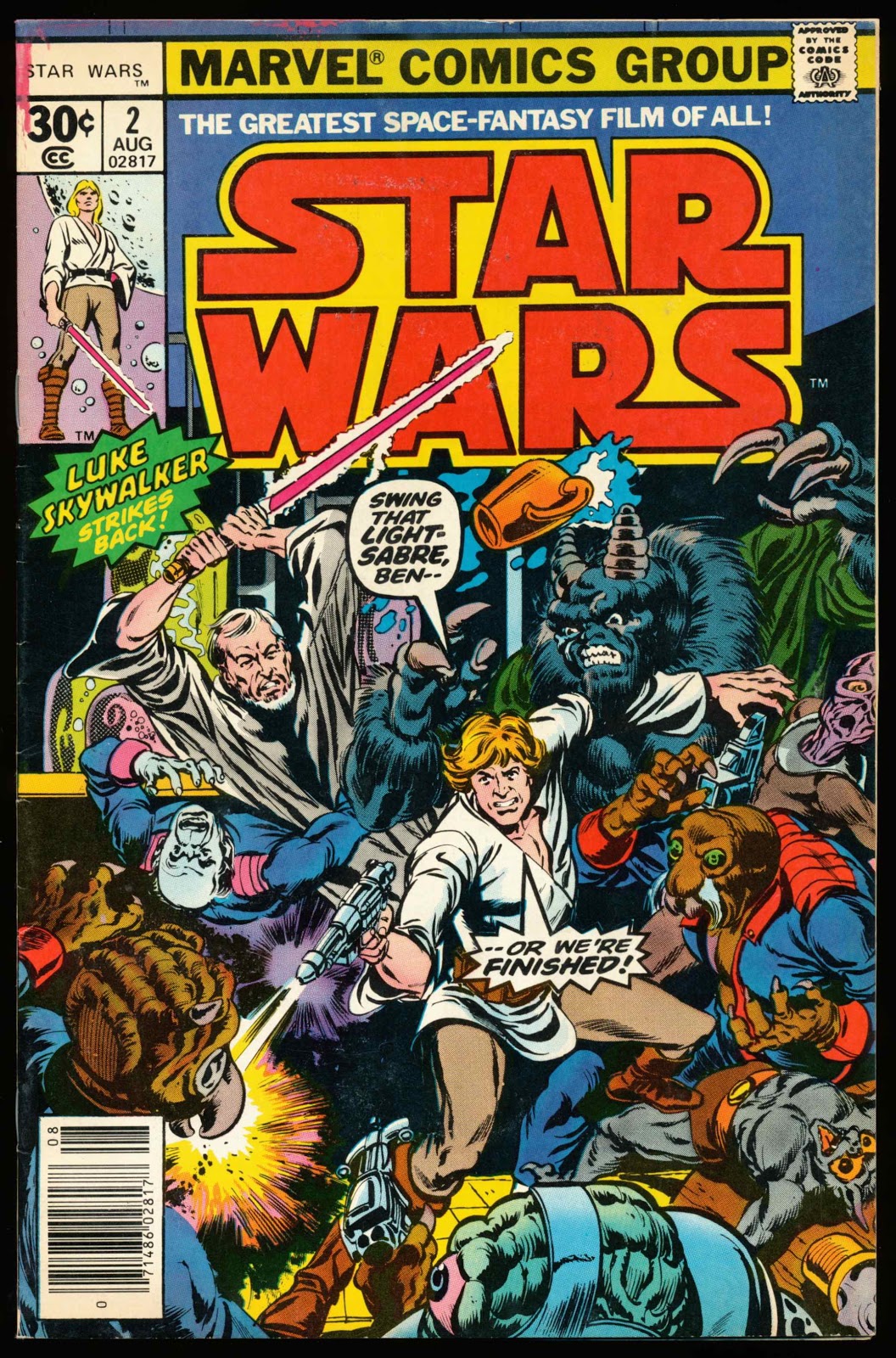
Splash page from the second issue
Novak said “…I made a few significant changes, but it was basically their design and I Marvelized it, let’s put it that way.” On closer examination, I compared his logo to the logos on the Ballantine Books mass market paperback and the mylar poster (all below). As you can see, the paperback and poster logos are essentially the same, with the exception of the W and weight of the outline. Someone drew a new “W” to replace the original one by Rice. Apparently, only the “W” was influenced by Novak’s logo. His logo, as far as I can tell, was never used outside of the comic book.
From the Star Wars Scrapbook was this comp of an unused advertising concept with the revised Rice logo.

It’s clear that the revised Rice logo was applied to some merchandising, mainly in publishing.
Dust jacket
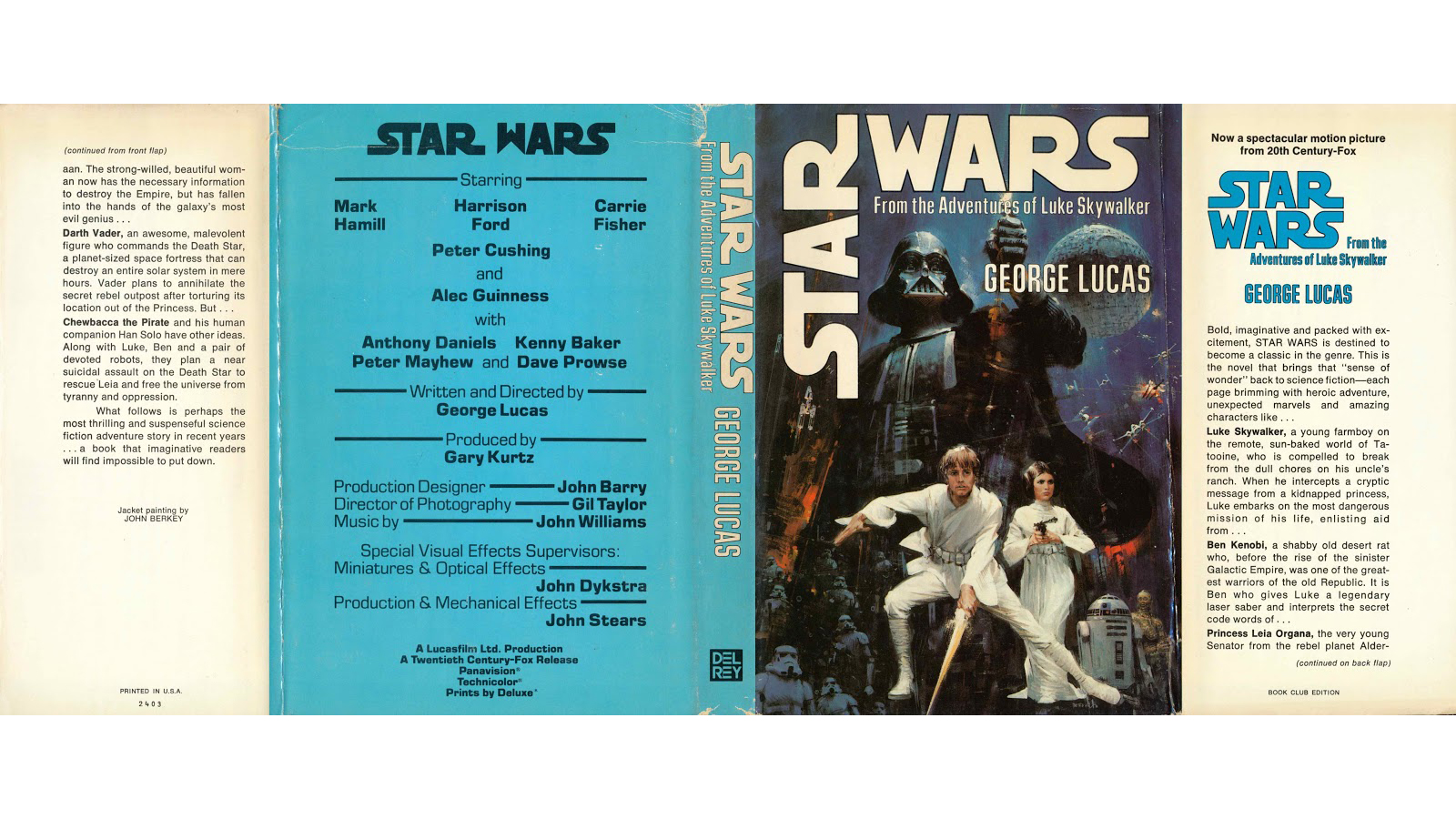
The Del Rey dust jacket has two versions of Rice’s logo; artist John Berkey made Luke Skywalker and Darth Vader left-handed. Below are the Science Fiction Book Club edition and its newsletter, Things To Come, which disregarded the logo altogether.

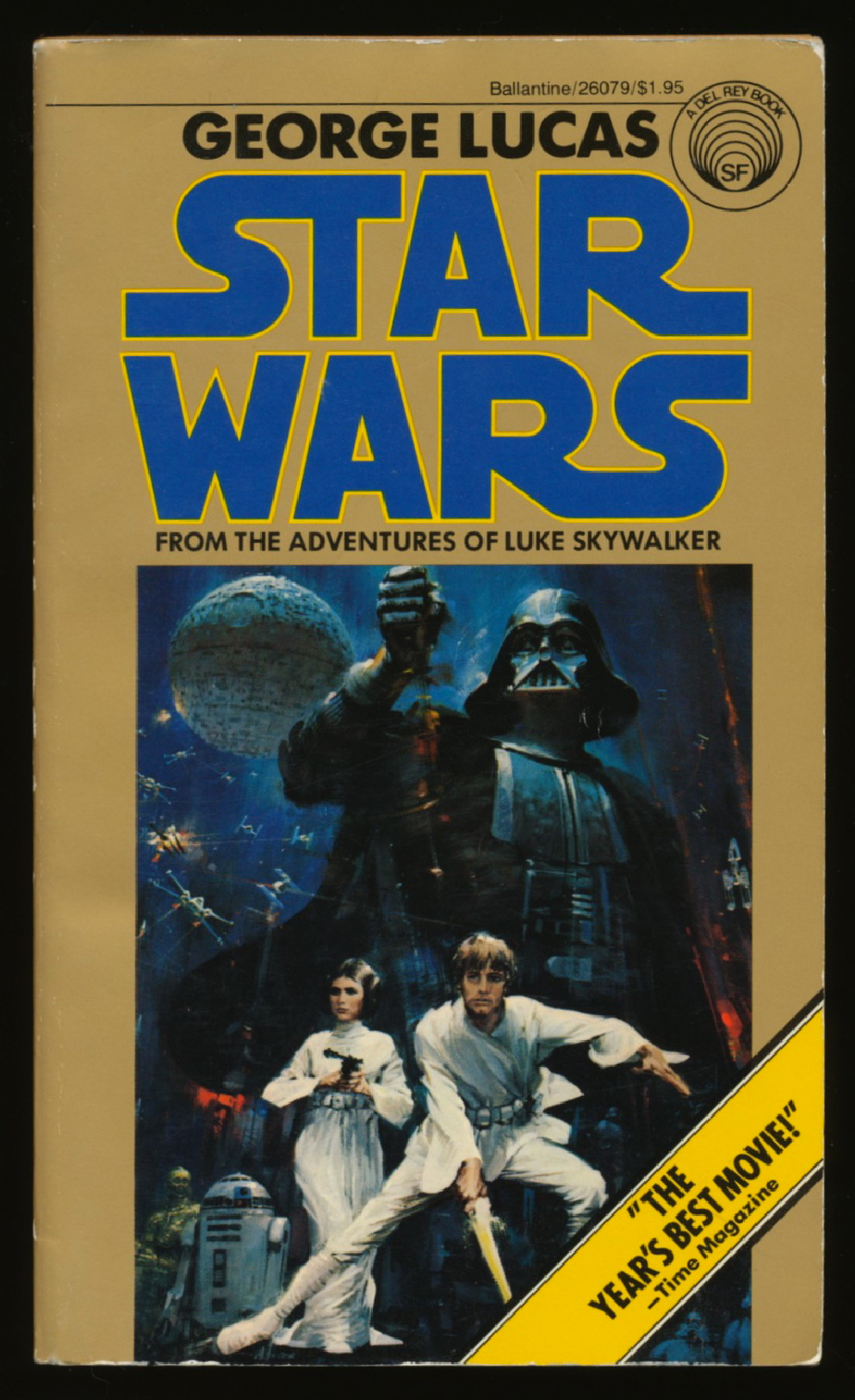
The Del Rey mass-market paperback with Berkey’s art flopped, so Skywalker and Vader are right-handed. Rice’s original and revised logos were used on the cover and inside. The novel was followed by many more books published by Ballantine Books who had the exclusive licence.


The Star Wars Sketchbook, Ballantine Books, 1977
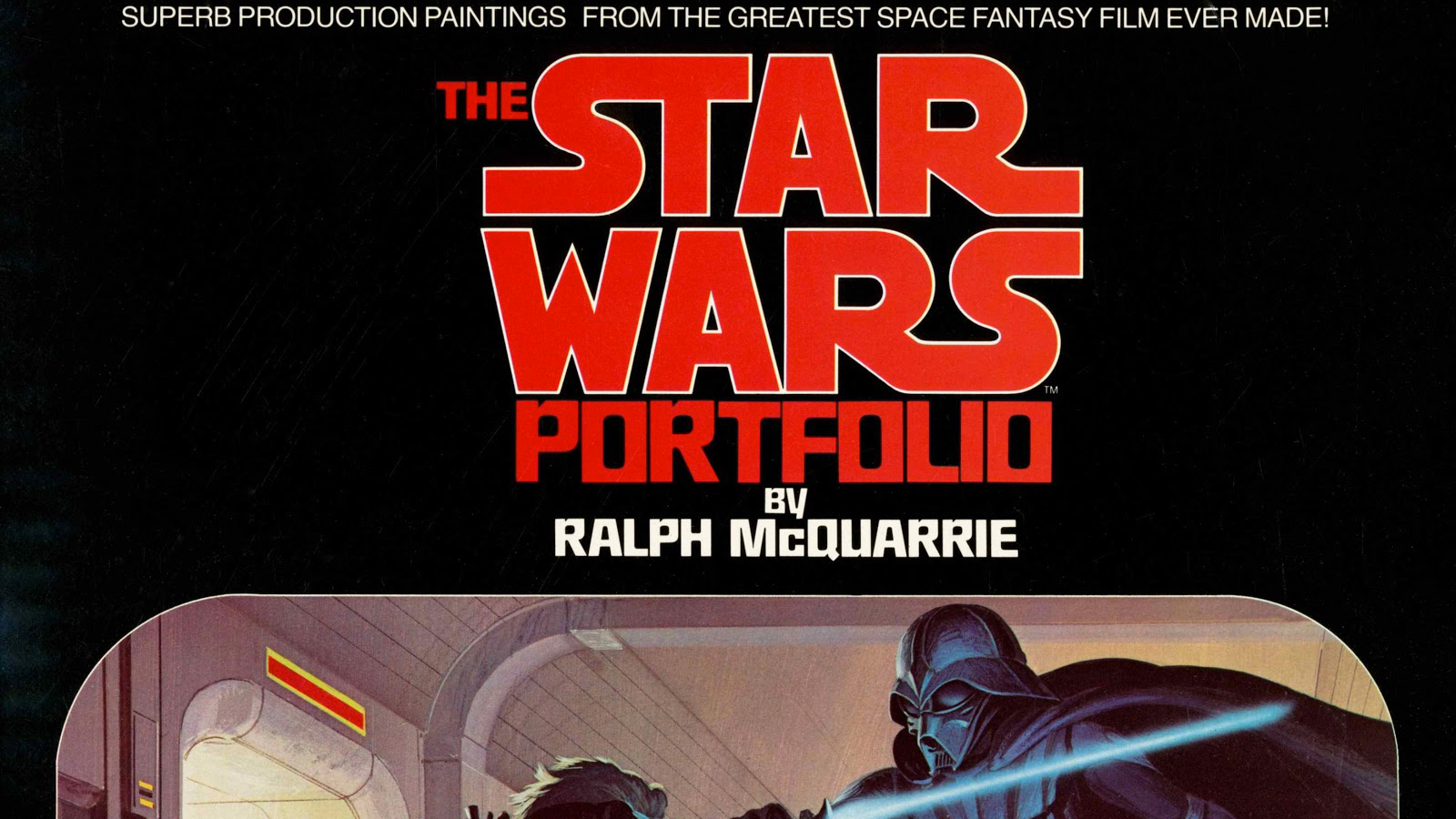
The Star Wars Portfolio, Ballantine Books, 1977
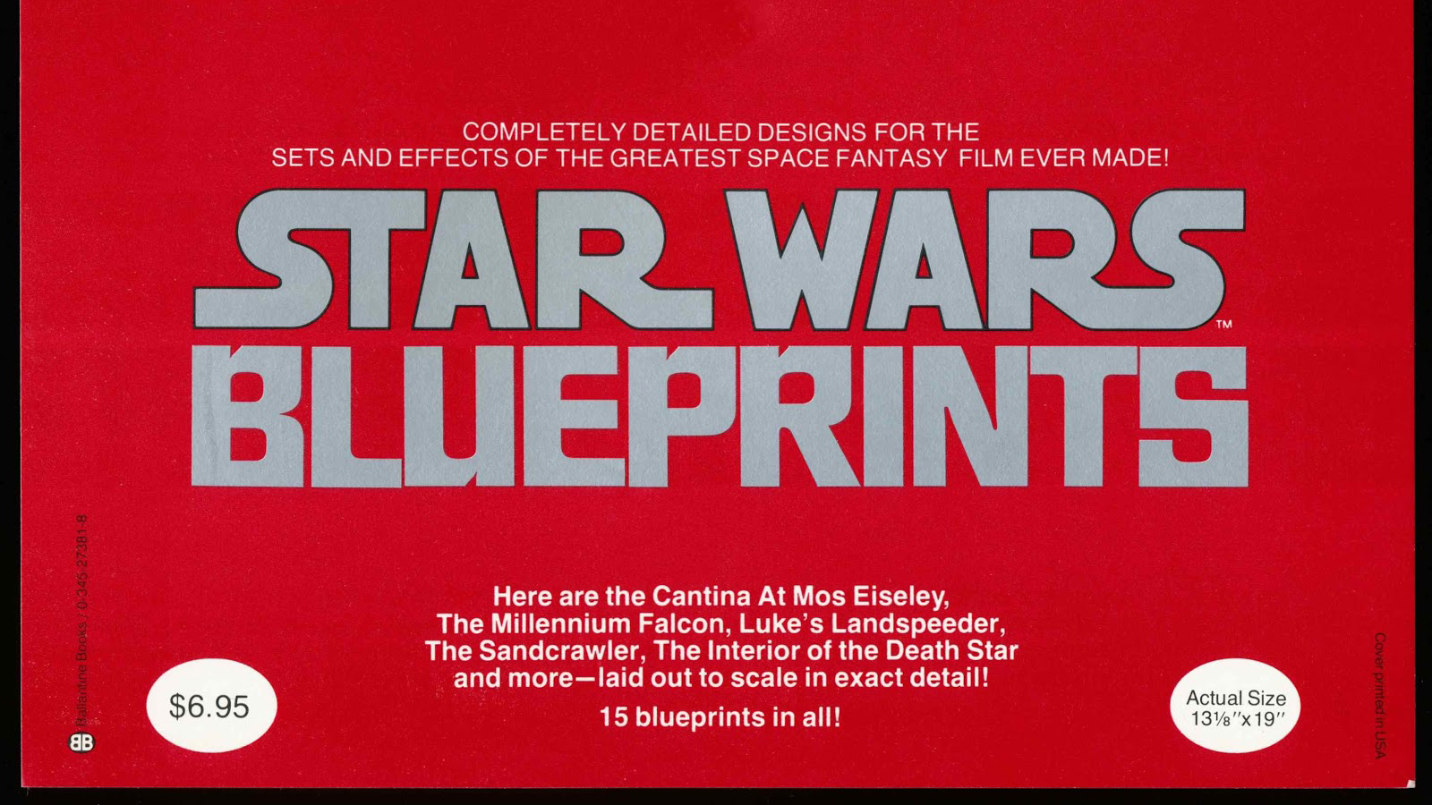
Star Wars Blueprints, Ballantine Books, 1977
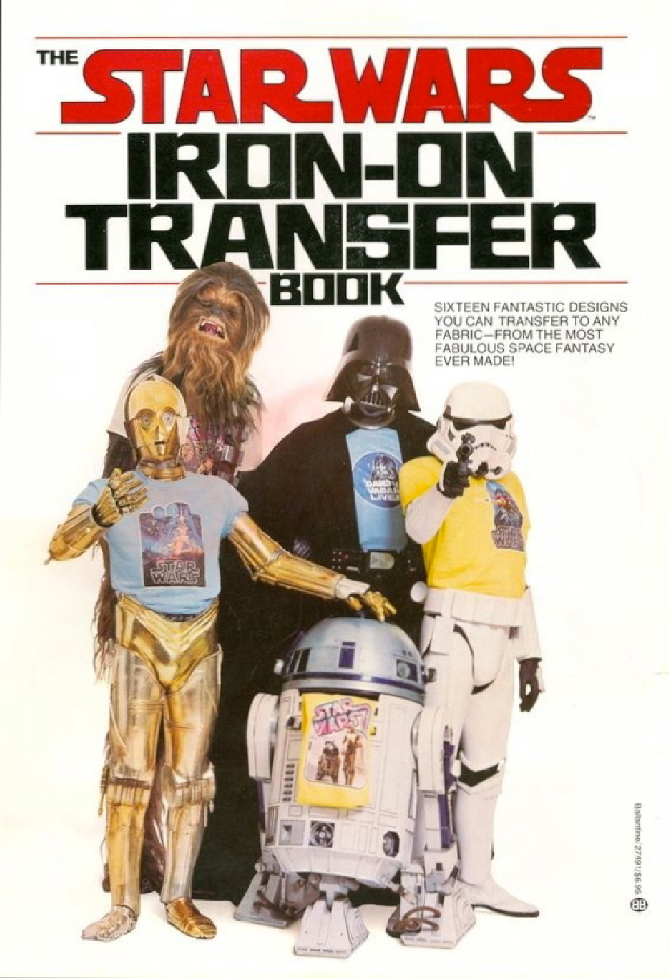
The Star Wars Iron-on Transfer Book, Ballantine Books, 1977
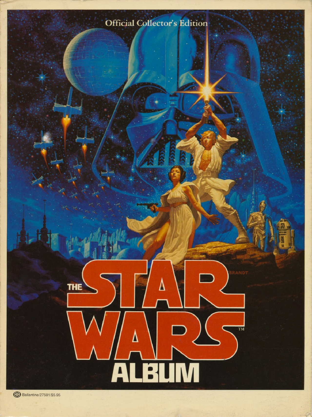
The Star Wars Album, Ballantine Books, 1977
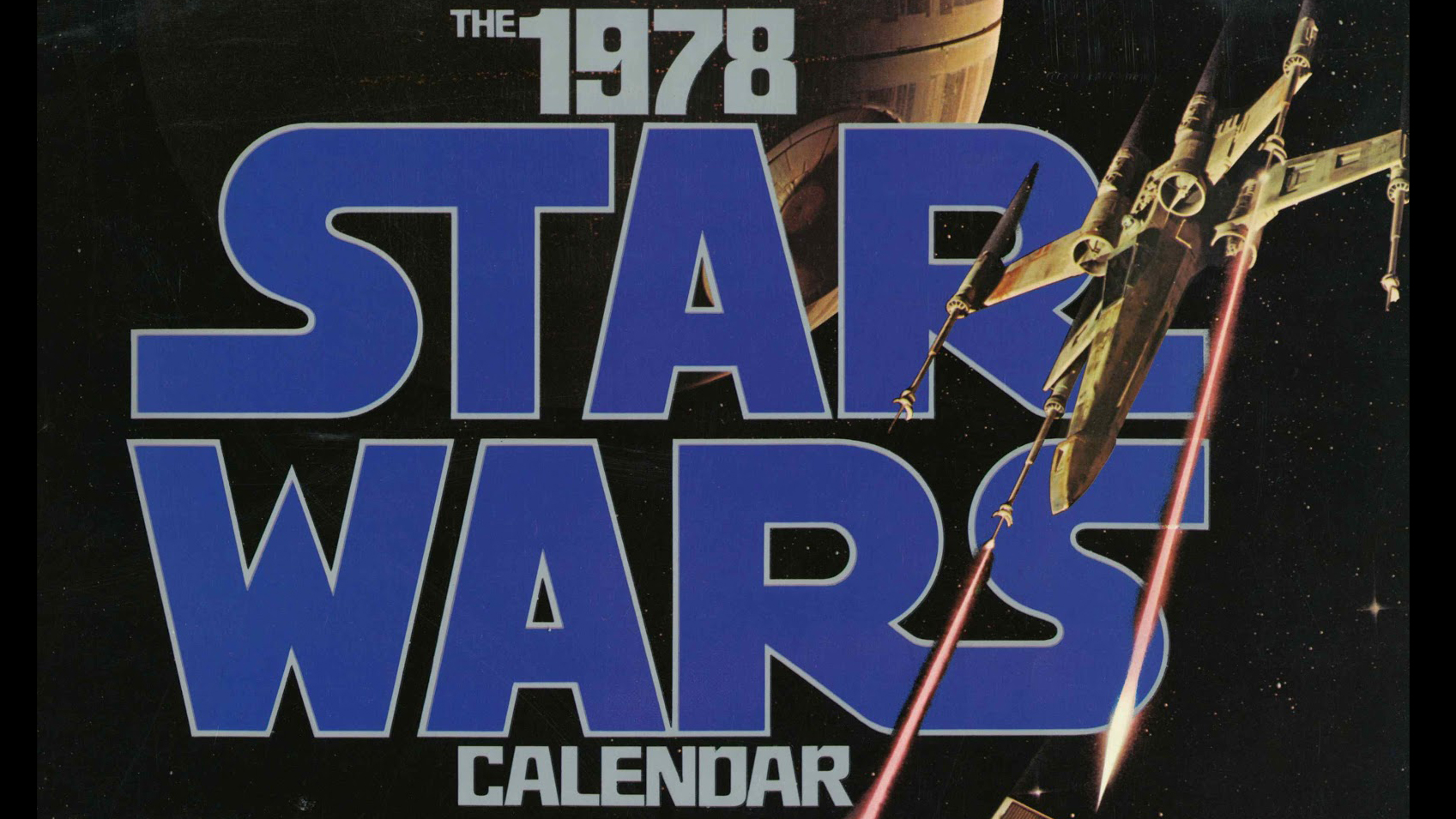
The 1978 Star Wars Calendar, Ballantine Books, 1977
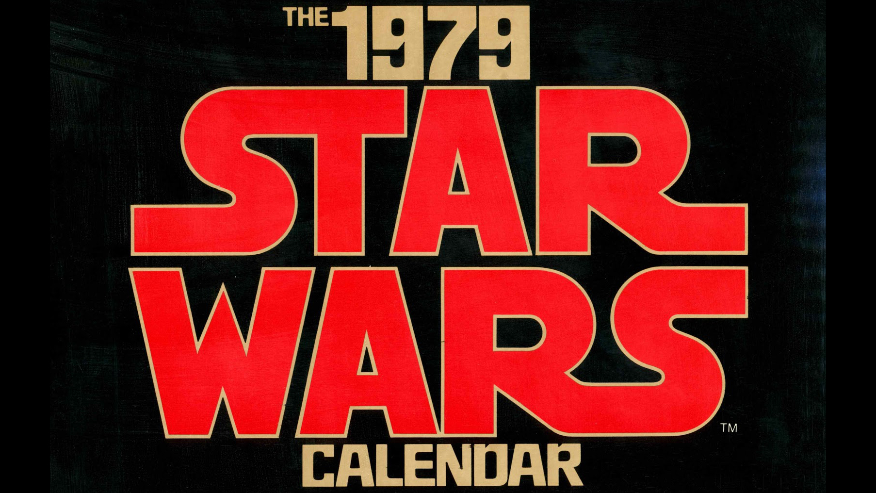
The 1979 Star Wars Calendar, Ballantine Books, 1978
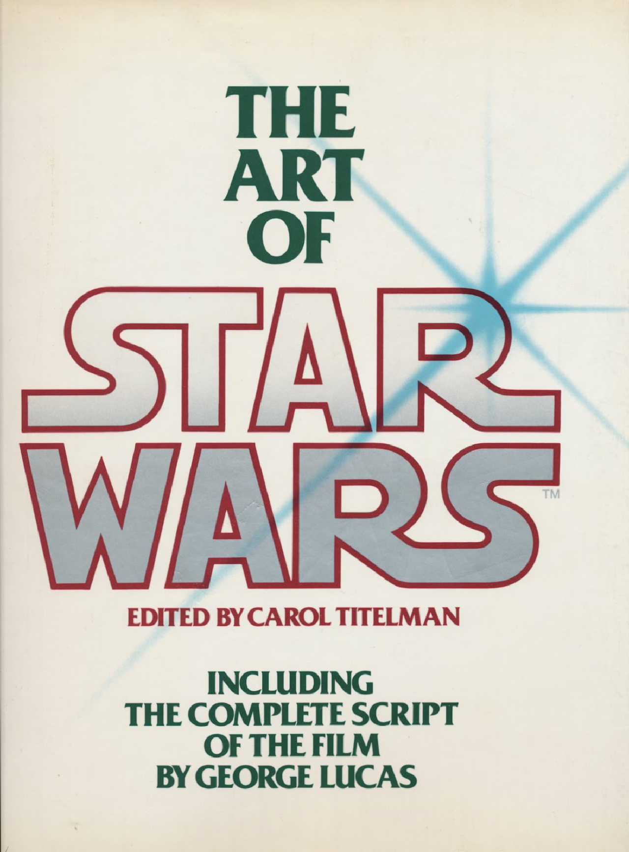
The Art Star Wars, Ballantine Books, 1979
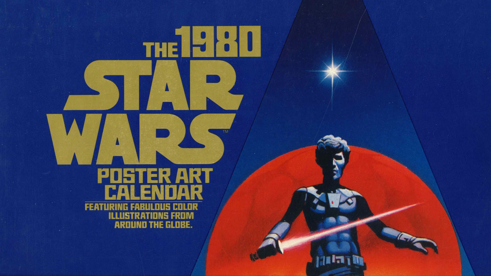
The 1980 Star Wars Poster Art Calendar, Ballantine Books, 1979
The Rice logo was used in the comic strip and, modified again, for the 20th anniversary release of the Star Wars Special Edition.

Los Angeles Times Syndicate; Sunday page

Poster
The film logo was also used in merchandising and promotion.

Souvenir program

Detail of record album cover

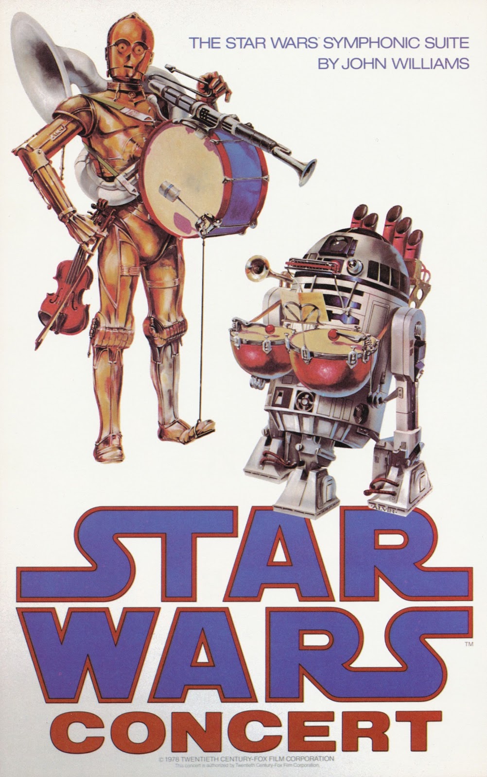
Music book

Detail of record album cover
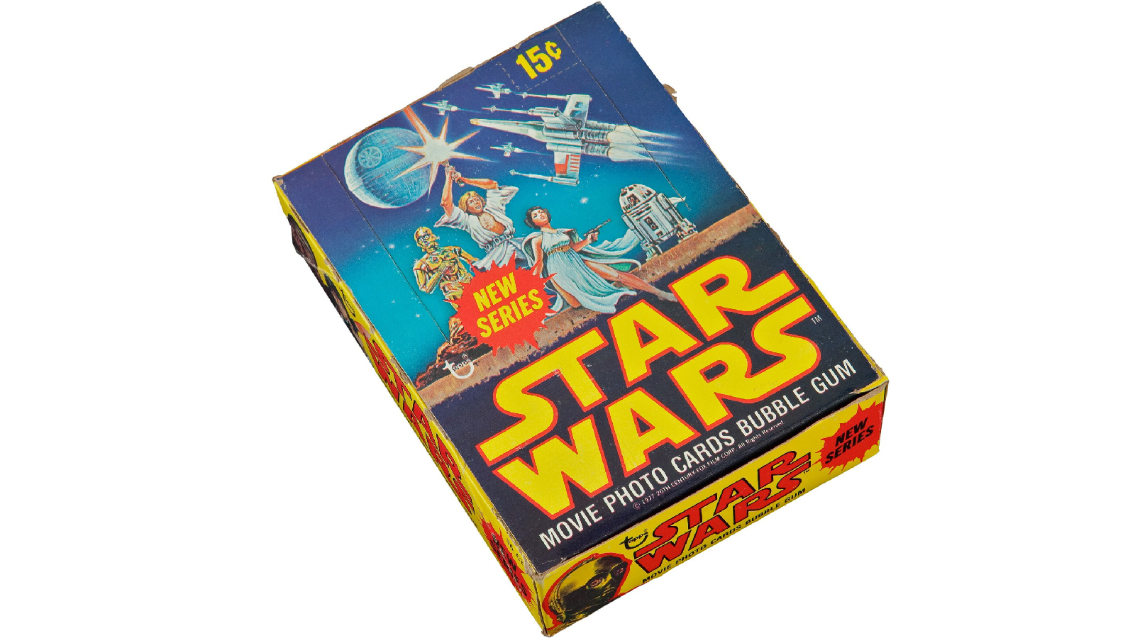
Trading cards
Poster
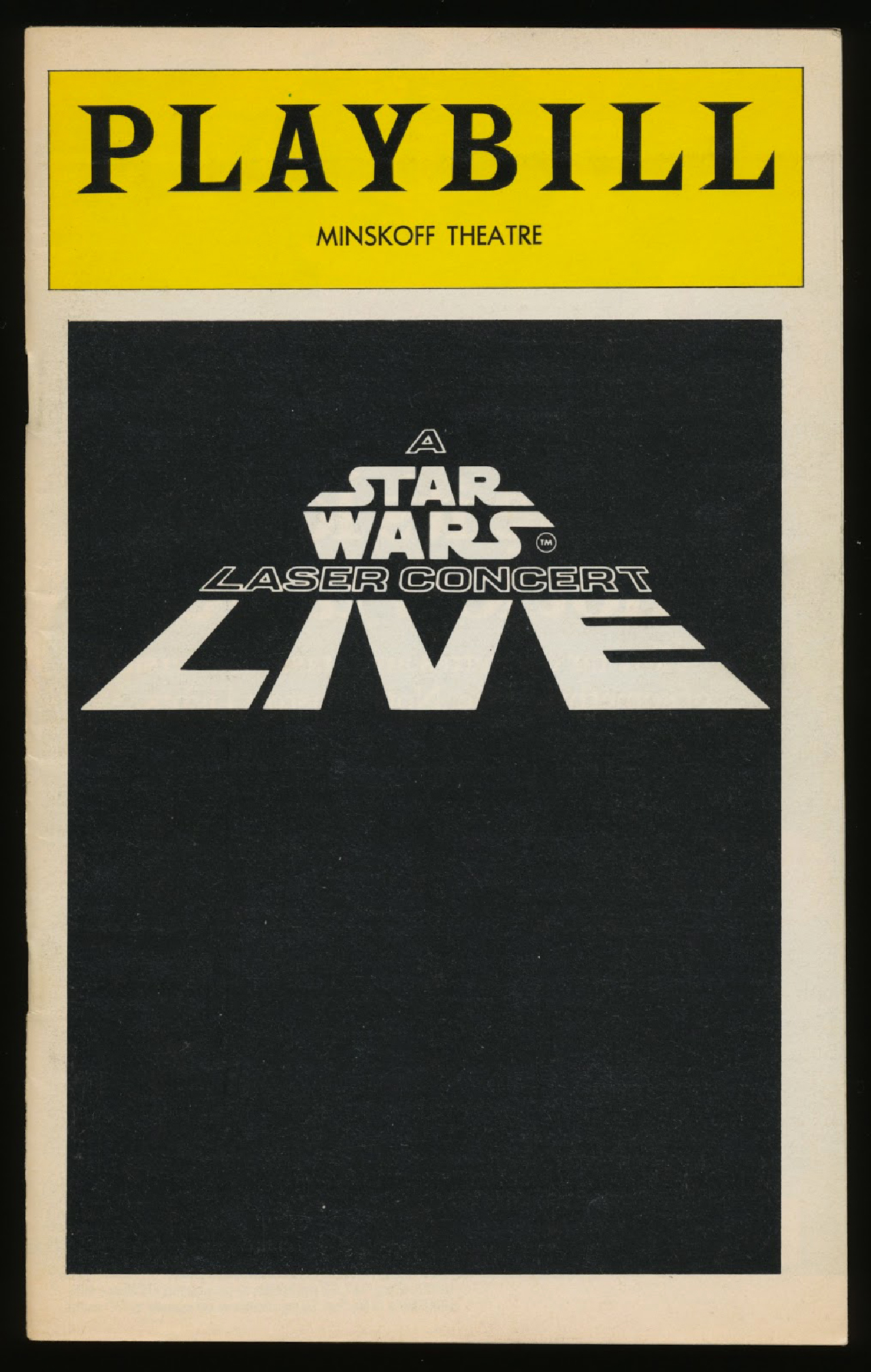
Playbill, December 1977
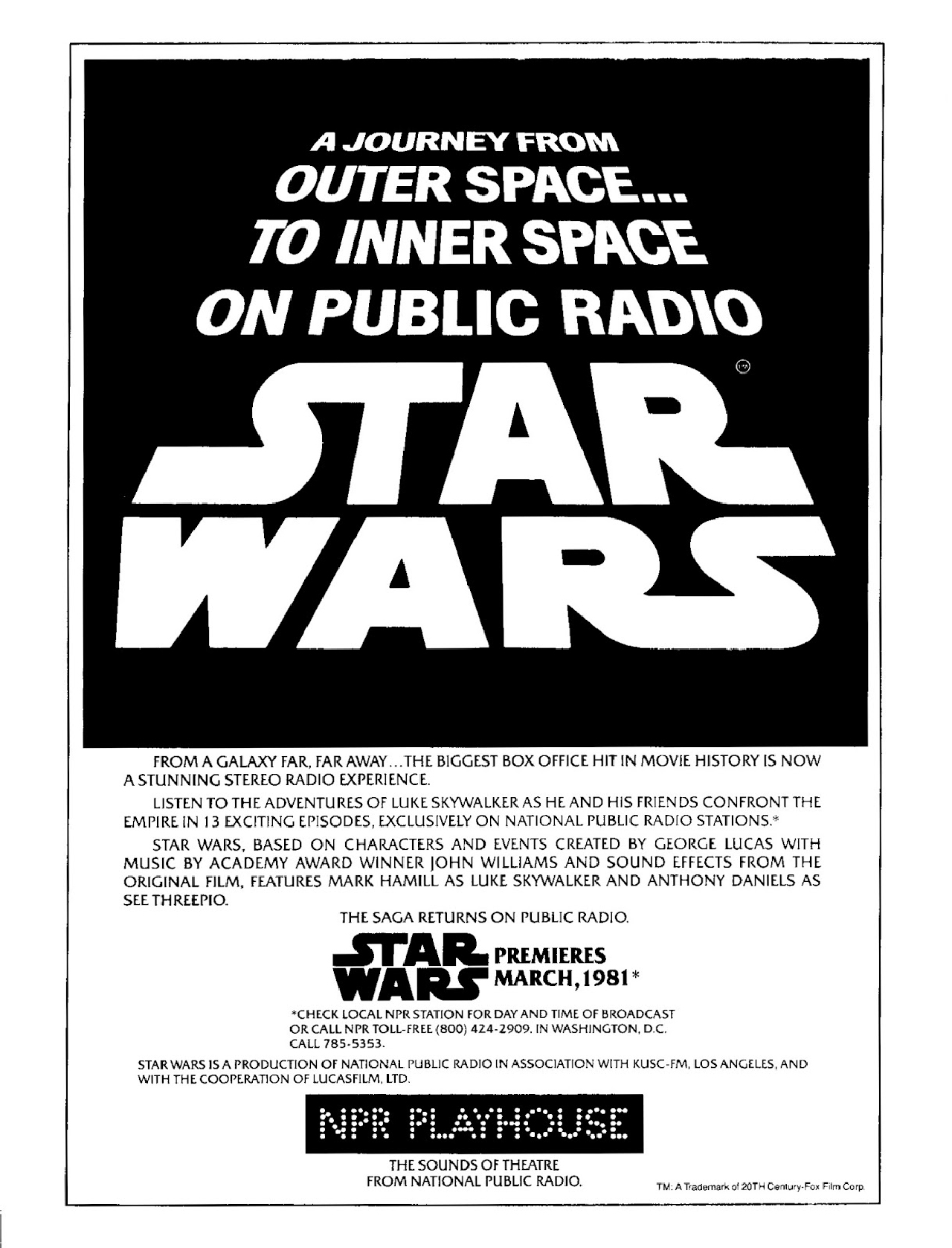
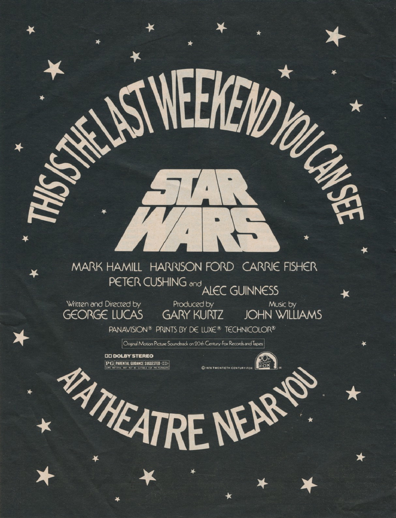
Advertisement, 1981
The 1980 Star Wars Poster Art Calendar; logo in Superman perspective
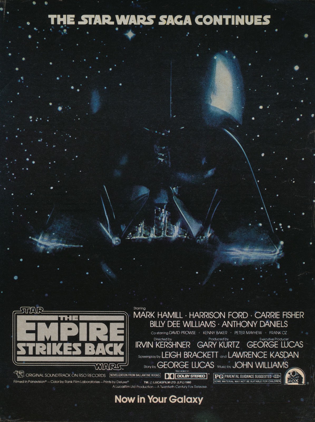
Later, the film logo was used as a frame around the logos of The Empire Strikes Back and Return of the Jedi.
Advertisement

Program
In 1998, a Star Wars manga adaptation by HisaoTamaki was published. Currently, Dark Horse has the licence to publish the Star Wars comic books.

Poster for the 1978 re-release
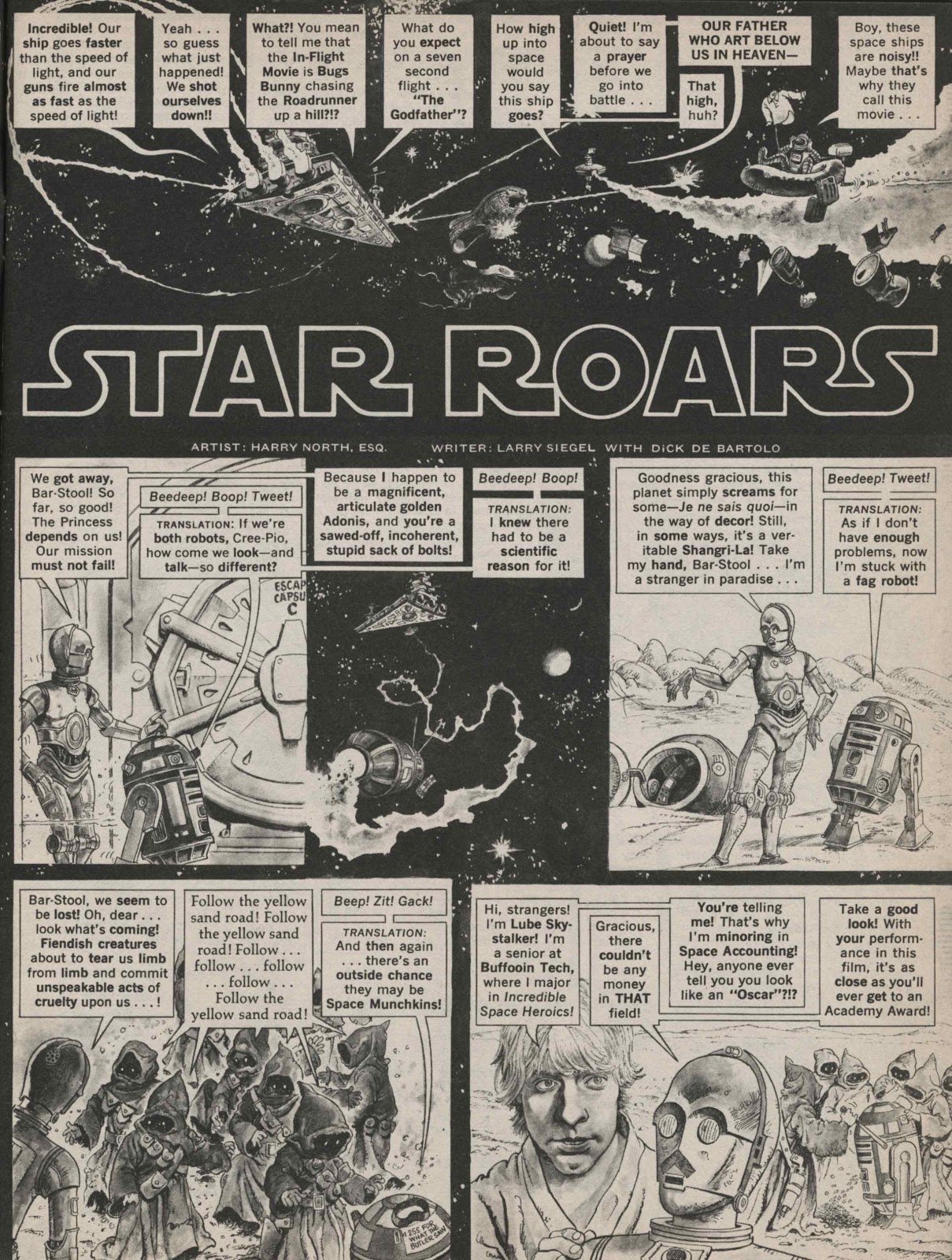
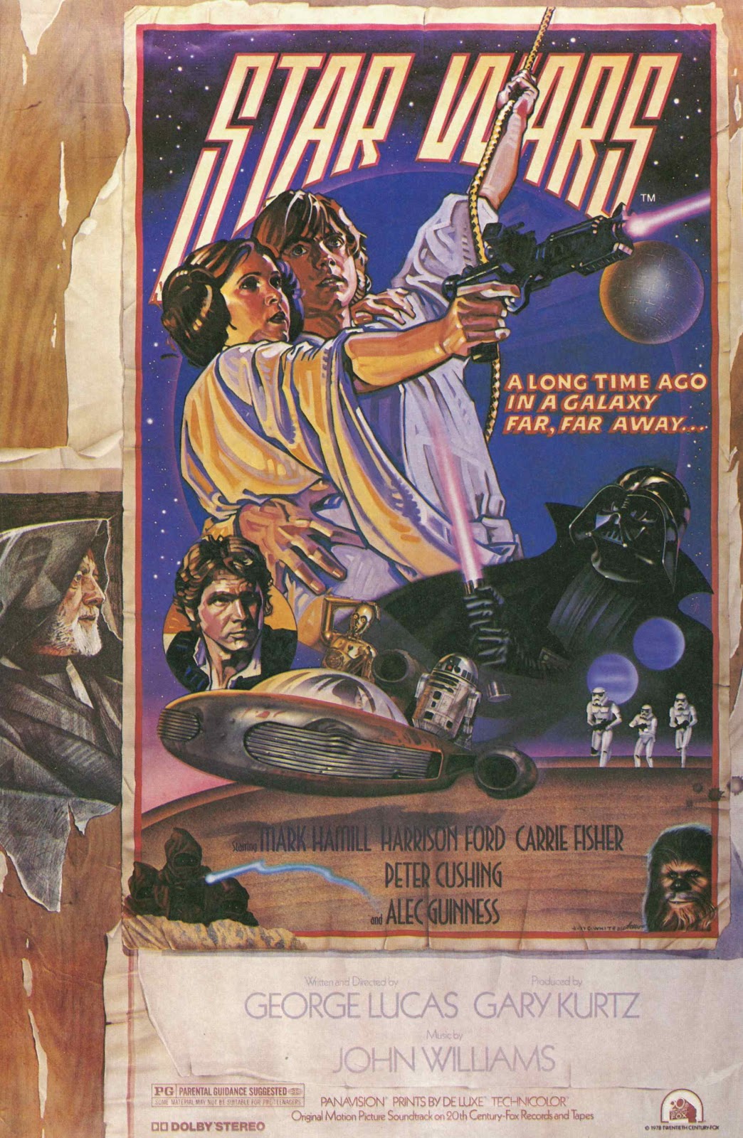
MAD Magazine, January 1978
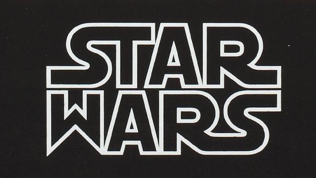
Credit for the Star Wars logo belongs to Suzy Rice. First there was her original design. Second, Joe Johnston revised her logo for the film. And third, there was her original logo with the revised “W”, which can be traced to Jim Novak, whose contribution, although minor, was significant.
The research for this post was made easier by the chronology and treasure trove of images at Star Wars Pre-Release Collectibles. Special thanks to my brother, Allen, for use of his Star Wars collection.
Related links:
Alex Jay is a graphic designer. This post was republished with permission from his blog, Tenth Letter of the Alphabet.