We all know Google design aesthetic from the products we consume, but it’s rare to get a look at the unifying themes and intentions from Google’s perspective. Usually insight about those things can only come from attempting to reverse engineer the design direction. And that’s probably not something that keeps you up nights. But now it’s all been laid out for you.
In the past 18 months, Google’s senior graphic designer Roger Oddone and art director Christopher Bettig worked to compile design guidelines for everything from broad strokes to individual pixels. The goal is to get the guidelines out there for both Google designers and third party vendors. Gotta “strengthen Google’s identity” right?
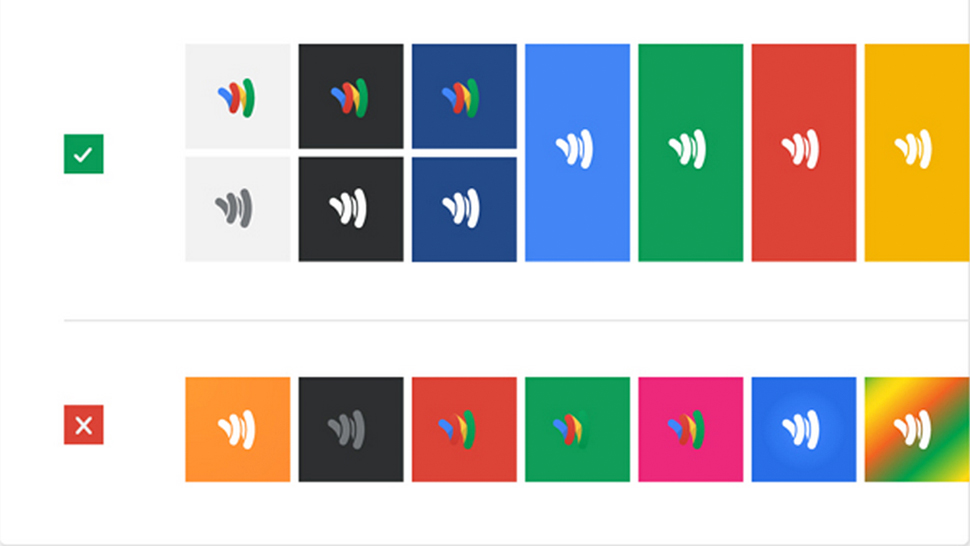
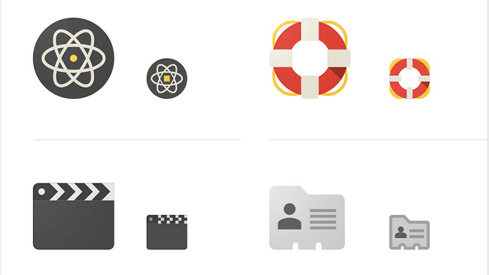
The guides encourage a fairly extreme level of simplicity, minimal skeuomorphic design, the Google colour scheme and friendly icon aesthetic. It also describes two-dimensional design, understated shadowing and, of course, typography. If you’re drowning in Google products, it’s kind of a wake up call to see the intentionality behind the blue, red, yellow and green that’s staring at you every day. See the full guides here and here. [Co.Design]