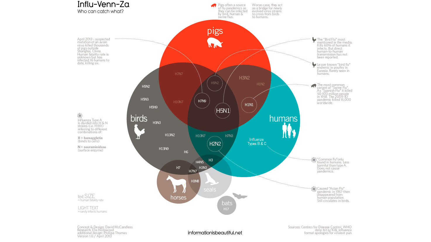
The internet is often awash with news of new types of flu — spread from pigs, birds and all kinds of other creatures — but it’s not easy to tell which ones you should really be worried about. Fortunately, this visualisation explains exactly which strains you can pick up and just how dangerous they are.
In the Venn diagram (click to enlarge), text size indicates human fatality rate from any given strain, and opacity indicates how common human infection is. There’s certainly plenty of data to let wash over you, but the main take-homes? H2N2 and H5N1 have been most damaging in the past — and you might want to keep away from seals more than you expected. If you’re so inclined, the data used to create this visualisation, by David McCandless, can be found in a Google Doc. [Guardian]