Scott Hanselman is a Microsoft programmer, stand-up comedian and author. And now he is a philosopher of computer iconography. The bane of his existence? It’s the icons with real-world analogues that no longer exist. Here are five of the worst offenders.
What happens when all the things we based our icons on don’t exist anymore? Do they just become, ahem, iconic glyphs whose origins are shrouded in mystery?
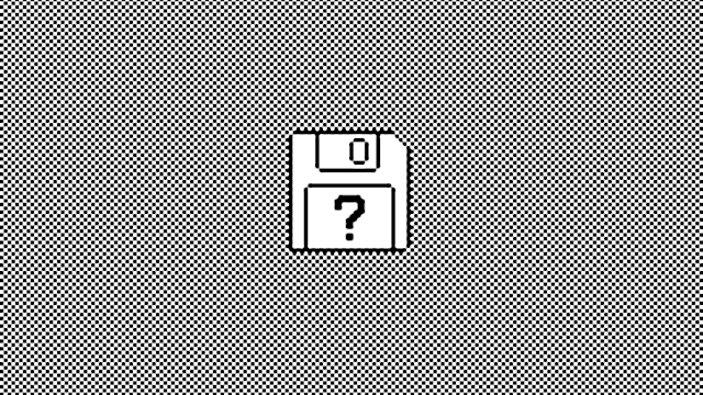
Floppy Disk — Save
Save? Save where? You know, down there. Adding the Arrow to the 3.5-inch floppy makes me smile. Is it pointing to under my desk? What’s a floppy? Why not a USB key? Maybe a cloud icon? That will be easy since there is only One Cloud Icon in the world.
Image: Red Orbit
Radio Buttons — Mutually Exclusive Choices
Why are they called Radio Buttons? Because my car radio used to have buttons where only one could be pressed at any time. I miss my 8-track.
Image: Gina Hogan Edwards
Voicemail
I assume that the Voicemail icon is supposed to be evocative of reel to reel tapes, but it always looks like a container of 110 Film. I suspect my voicemail is no longer stored on spooled magnetic tape. No, you’ve never seen either of these before, young person. #getoffmylawn
Manila Folder
I suppose the kids use Pee Chees still these days? I use folders because I use the 43 Folders organisational system, but I don’t see any reason that we couldn’t be storing our files in abstract squares rather than folders in the sky.
Image: Intercultural Talk
Televisions
Does your TV have “rabbit ears”?
What other icons do we use while the original inspiration fades into obscurity?
Note: If one of these icons is yours let me know and I’ll link to your site. I found all these and haven’t been able to attribute all of them.
For the rest of the list, click here.
Republished with permission from Scott Hanselman.
Top image: LowEndMac