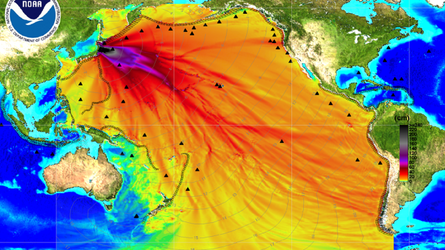
It’s just a computer model of the Japan tsunami waves created by the NOAA Center for Tsunami Research, but it’s scary anyway. Maybe is the use of red streams and the dark black and purple epicentre. It looks as if the planet was bleeding.
This graphic shows the “most forecast model. Filled colours show maximum computed tsunami amplitude in centimeters during 24 hours of wave propagation. Black contours show computed tsunami arrival time.” [NOAA]