logos
-
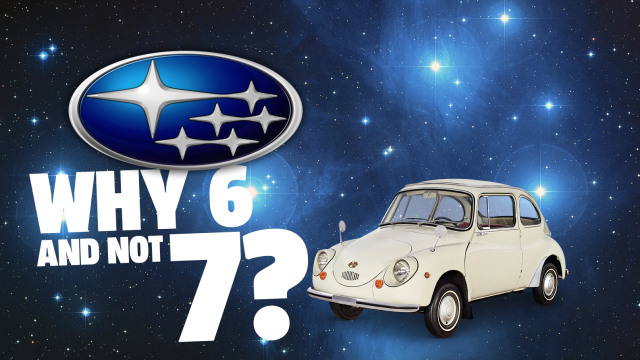
Physicists Finally Have An Answer For Why The Subaru Logo Has Only Six Stars Instead Of Seven

Have you ever been crossing a busy street and then suddenly dropped down to the tarmac because you thought a passing roach was the same one that stole part of your Fruit Roll-Up the other day, only to look up and see a Subaru Impreza screeching to a stop inches from your head? Sure, we…
-
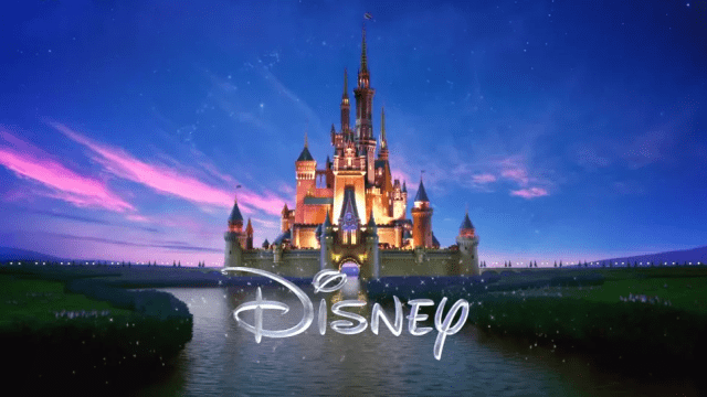
The Strange Mystery Of The Squiggles In The Disney Logo
A modern take on the Disney Pictures logo, still with that weird squiggly D. Tell me that’s not a J. Why is that not a J? So, what’s the deal with the ‘D” in the Walt Disney logo, anyway? It’s got this odd squiggly flair to it that’s kind of hard to read. That’s just…
-
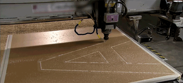
Here’s How Those Big Store Signs Are Made
Video: Here’s how channel signs — basically those big signs that hang above stores and restaurants across the world — are made. The Science Channel gives us a sneak of the way things are done and it’s surprising that so much of it still requires the help of a human. It’s not all robots! And…

-
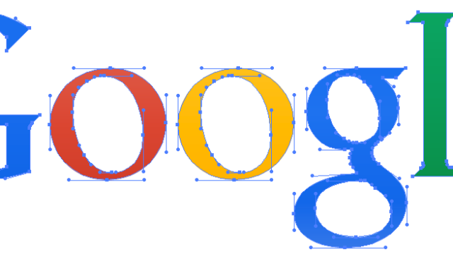
How Could Google’s New Logo Be Only 305 Bytes When Its Old Logo Was 14,000 Bytes?

The old logo uses a complicated serif font which can only be created using bezier curves. All together, it has 100 anchor points, resulting in a 6KB (6380 bytes) file. When compressed, the size comes down to 2KB (2145 bytes).