infographics
-

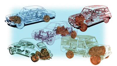
What Exactly Is Horsepower, Anyway?

Like almost any automotive publication, we use the term “horsepower” all the time. It’s one of those words that seems so straightforward. What is horsepower? Why, it’s the power of a horse! What does that mean? Physical power? Political? Sexual? What horse? How is it measured? Let’s find out, with pictures! Actually, not just pictures,…
-
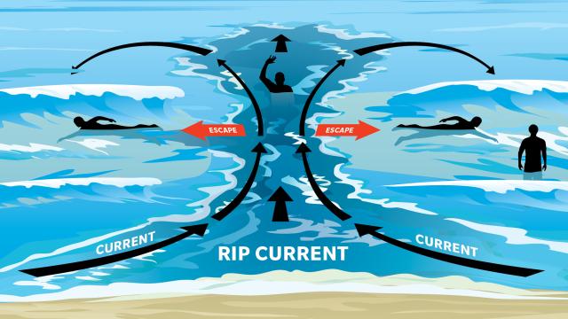
Learn How To Escape A Rip With This Handy Illustrated Guide
This post was originally published on January 3 2017 over on Lifehacker. This sponsored repost is brought to you by Surf Life Saving Australia If you’re planning on hitting the beach this summer, take a look at this handy guide before you dive into the water so you know how to escape a deadly rip…
-
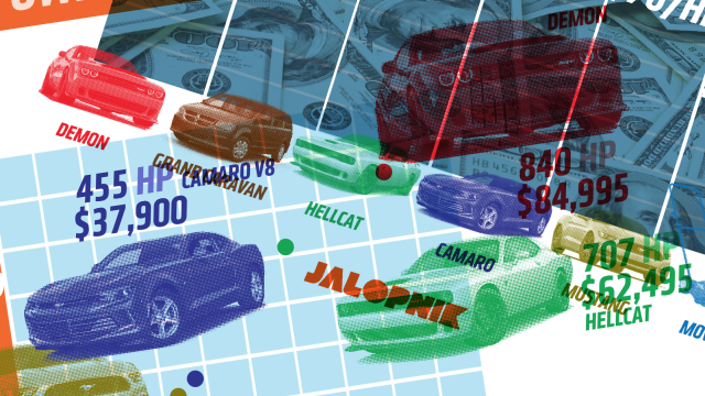
How The Dodge Challenger Demon Stacks Up In Dollars-Per-Horsepower
We finally know how much Fiat Chrysler’s unholy alchemy experiment, the 2018 Dodge Challenger SRT Demon, costs: $US85,000 ($113,673). Since we also know the car’s horsepower, that means we have all the constants needed to compute that most important of mostly useless automotive-metrics, the legendary cost-per-HP. Let’s see how it stands up against other muscle…

-
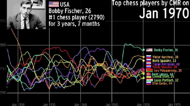
Beautiful Visualisation Charts History’s Best Chess Players

Since the early 19th century, many chess grandmasters have come and gone, some better than others. This elegant data visualisation by Abacaba shows which players were the very best, and how long they were able to maintain their dominance.