fonts
-
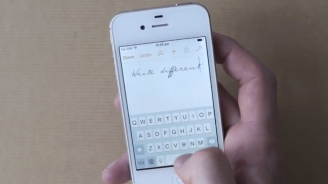
4 Typefaces That Let You Write Like Einstein And Other Famous Thinkers

The art of handwritten script is lost on most of us keyboard-attached slobs. But over the past few years, a small group of designers have dug into the archives of famous thinkers and artists to bring their script into the digital world — meaning that you, too, can write like Einstein, even if you can’t…
-
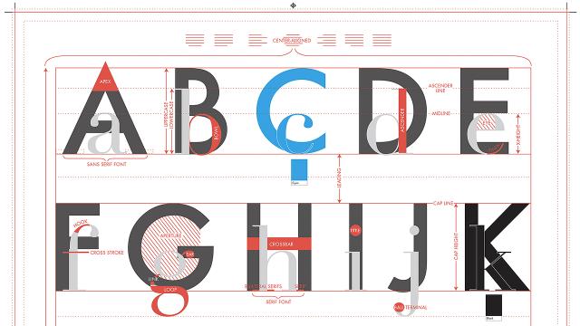
An Alphabet Poster That Teaches You The Fundamentals Of Font Design

If you can’t figure out why all your friends were snickering at your home-made wedding invites you carefully designed using Papyrus, Pop Chart Lab’s new Alphabet of Typography print will give you a much-needed crash course in font design, spacing, and terminology.
-
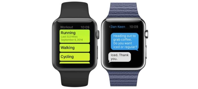
Say Hello To San Francisco, The Free Font Apple Designed For Its Watch
We’ve known for a while that the Apple Watch has a brand-new custom font designed by Apple, but now it has a name: San Francisco.
-
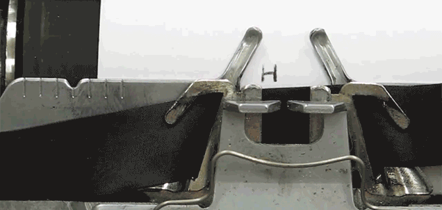
An Artist Perfectly Trolls Designers With A Comic Sans Typewriter
The easiest way to troll a pixel-pushing friend is to ensure you exclusively use Comic Sans for every email, message and homemade birthday card you send them. Graphic designers hate the font, but the rest of the world still seems to enjoy its sense of whimsy, which is what inspired artist Jesse England to hack…