fonts
-
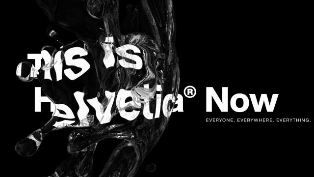
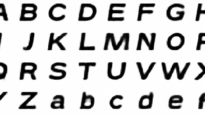
After 36 Years, Helvetica Gets A Much-Needed Facelift

Everyone has an Google have been shifting to their custom Helvetica-esque-but-not-quite fonts to deal with some of its quirks. Rather than let Helvetica die a slow death, all 40,000 characters in the world’s most iconic typeface have been revamped into a new font called — wait for it — Helvetica Now.
-
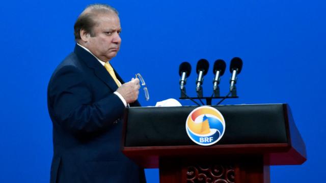
A Microsoft Font Really Did Take Pakistan’s Prime Minister Down

Pakistan’s Prime Minister Nawaz Sharif will resign his position immediately following a landmark decision by his country’s Supreme Court. Sharif has been under fire since last year, when leaked documents appeared to show his family had hidden wealth in shell companies overseas. Earlier this month, investigators revealed that crucial financial documents provided by the Sharifs…
-
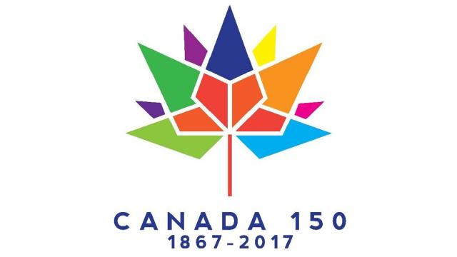
Snooty Canadian Designers Are Pissed Off At Their Government
Canada is celebrating its 150th birthday in 2017 and all sorts of preparations are being made for the big shebang. But the sesquicentennial has been sullied by news that the government is being real cheap when it comes to the graphic design.
-
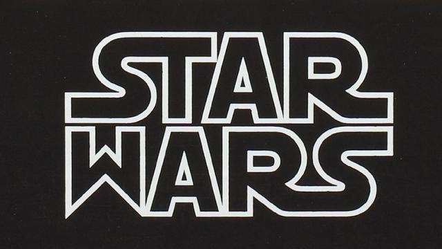
How The Star Wars Logo Got Confused With Nazi Typography
The history of the Star Wars logo has long been controversial for its purported connection to fascist or even Nazi typography. After all, the Star Wars saga is an apparent analogy for World War II, where the Empire is the Third Reich and Darth Vader represents Adolf Hitler.