branding
-
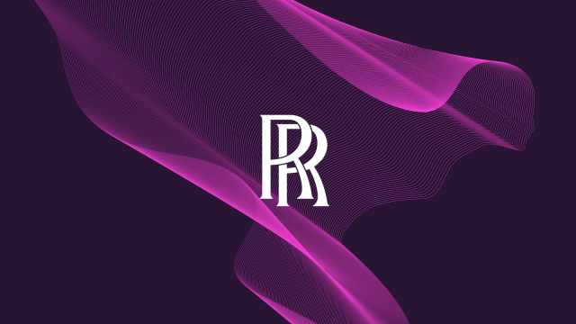
Rolls-Royce Reworks Its Logo And Branding So People Will Stop Assuming They’re A Budget Car Brand

You know how everyone who sees the Rolls-Royce badge and famous Spirit of Ecstasy flying lady hood ornament always asks “Rolls-Royce? Aren’t they Hyundai’s entry-level car brand?” Well, Rolls-Royce, the 116-year-old maker of the most carefully-crafted luxury auto-mo-carriages in the world has decided to finally put an end to all that by re-designing their famous…

-
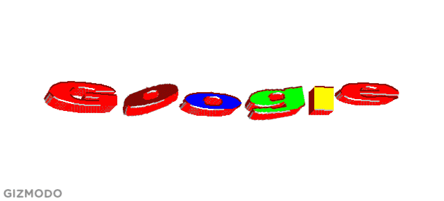
The Evolution Of Google’s Iconic Logo
It may feel like Google’s colourful lettering has been with us since the dawn of time, but it’s been a long, bumpy road getting there. When it comes to logo design, sometimes you have to face-plant before you can fly. And in Google’s case, there’s been plenty of face-planting.
-
Brilliant Packaging For Invisible Clear Tape Makes The Box Look Empty

When you wrap a gift in fancy paper, the last thing you want is ugly pieces of tape stuck all over it. That’s why 3M created its Scotch-brand tape that’s nearly invisible, and a selling point that Hamburg-based ad agency Kolle Rebbe perfectly drove home with this clever packaging for the product that looks like…
-

The New Branding For Rio 2016 Looks Like A Very Friendly Amoeba
Hundreds of thousands of people attend the Olympics, and millions more watch them. So there’s a lot riding on the way a city presents them, from advertising to stadiums. Rio just revealed what its 2016 Games will look like, and it’s done a great job — not just because no enterprising internet perv has compared…