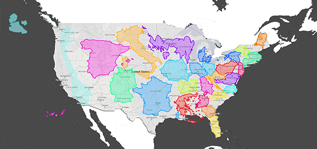
Video: Maps lie. We all learned this at some point in school, when we realised Greenland wasn’t quite the hulking beast of land mass we thought it was. I mean, Greenland isn’t even a third of the size of Australia. And the UK is teeny! Smaller than Japan, the Philippines and Madagascar. Come to think of it, all of Europe is way smaller than what we imagine it to be on the map.
This discrepancy between the map size of a country and the real size of a country happens because we try to project our world which is shaped like a sphere (which is 3D, you know) onto a 2D map. Basically, countries closer to the North and South poles will look much larger and distorted on a map than countries closer to the Equator (which will look smaller and scrunched up). This effect is seen on the Mercator Projection, a cylindrical map projection of our world.
RealLifeLore fills in the background of what we forgot in school about map size and then drops in fun and random comparisons that really drive in the difference. Just know that Europe is super small and Africa is a ginormous continent that could fit in a lot of damn countries with room to spare.