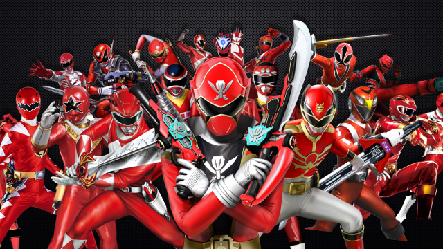
Over two decades of Power Rangers shows have brought us some amazing superhero costumes… and some less amazing ones. As dedicated followers of Ranger fashion, we’re embarking on a mad quest to rank them all, from best to worst — and that quest continues right now!
Image: Via Ranger Wiki
Last week we brought you our top 8 Power Rangers costumes, and this week we’ve got the middle of the pack. Positions 9 to 16 have got some great costumes, some all right ones, and a few stinkers, but we’re saving the worst of them for next Friday (July 15) at 11:00 am ET. Stay tuned!
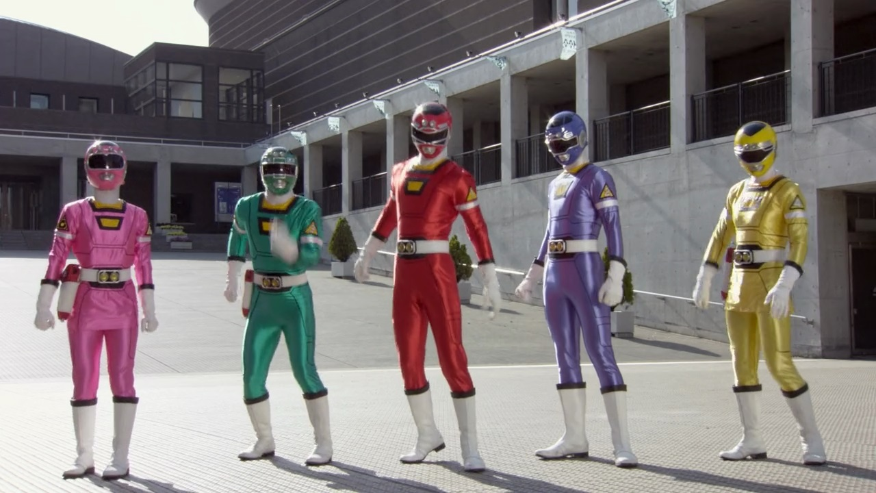
9) Overdrive
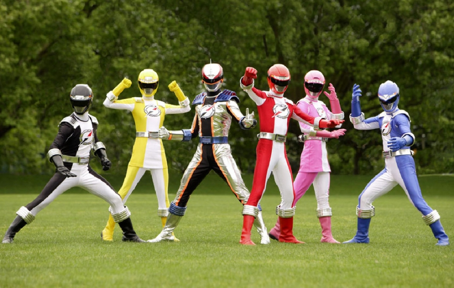
Image: via Ranger Wiki
James: A.k.a. The “We figured their helmets needed headlights for some reason?” Rangers. They weren’t even car-themed, they were world explorers!
Katharine: BUT HEADLIGHTS JAMES. Everyone needs headlights.
James: I guess if you’re a Power Ranger that goes cave-diving a lot, it would work. But man, it’s weirdly unnecessary on what are otherwise great helmets.
Also, I’m going to be a bit of a hypocrite, and say that for once they overdid it on using white to break up the primary colours here.
Katharine: See, I like these. There’s never enough white.
James: It works great on the women’s skirts, but having it on the legs is way too much. If it wasn’t for the helmet you wouldn’t be able to tell the Black Ranger was the Black Ranger and not the White Ranger!
Katharine: I was about to say that the white on the skirts and leggings make the skirts look way less interesting than usual.
James: Agree to disagree? I will say, though, I love their little shoulder pads. More Power Rangers teams need to add something physical to the suits to stop them having the spandex suit outline. These aren’t much, but they add enough to the look.
Katharine: Also the belts. The belts are actual materials rather than just sort of a flat design. But these are pretty solidly mediocre.
James: Yeah. Not too crazy, they’re just good middle of the road Ranger suits.
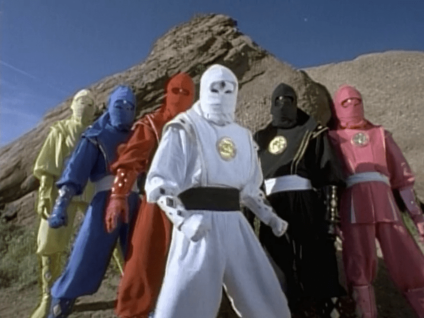
10) Alien Rangers
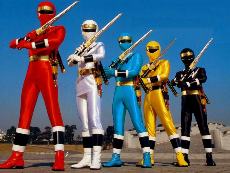
Image: via Ranger wiki
Katharine: Speaking of mediocre.
James: Oh man, but they’re so classically ninja! I love these.
Katharine: There’s just nothing to say about them, though
James: Even though they’re… alien ranger ninjas.
Katharine: They’re literally just colours with the ninja motif in the mask. They’re fine, just not particularly thought provoking.
James: Yeah. They’re solidly Ninja-esque, but the Ninja Storm and Ninja Steel Rangers did it better.
11) Megaforce
Katharine: I like these. They do deviate a lot from the standard Power Rangers look, though, in that it actually imitates pants and tops. But coloured boots! Gold logos!
James: These uniforms are great! Like you say, it’s very divergent from your standard Power Ranger suit, though the jacketed look is really nice.
Katharine: And one of the weird instances where the girls look less good, actually. The line of colour on the skirts does nothing but ruin the line.
James: It also retains the colouring enough but is broken up by the white REALLY well. It’s a perfect balance — except for, like you say, the girls. For once, having that line of colour on the skirt doesn’t look right. Maybe if it was gold like the lining everywhere else?
Katharine: It is really nicely balanced. Yeah, gold would help. Or just not putting them in skirts this time
James: “But then how would you tell they’re a lady????” – Nameless Male TV executive
Katharine: And look at the functional helmets! And the designs on the side are great, too.
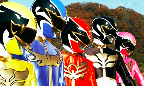
James: They’re gorgeous helmets, the black really works, and having the varied visors be subtly different helps unify the team’s look a lot more
Katharine: Yeah, if there is a knock other than being not traditional Power Rangery, it’s how many different designs there are
James: My only quibble with these is that these helmets look too big on the characters, proportionally. Especially the Red Ranger. They’re beautifully designed, but a little oversized, and it can look goofy sometimes.
Katharine: They’re a bit bobble-headed, yeah.
James: If they were scaled juuust a bit smaller, these would be some of the best suits in Power Rangers history. They’re very different stylistically but still intrinsically “Power-Ranger-y”, for want of a better word. Or an actual word, I guess, but it’s hard to describe!
Katharine: It really is, actually. Spandex, colours, helmets. That’s the Power Rangers way.
When the costumes look broken up instead of like unitards, they lose some Power Ranger magic.
James: Unitards are the Power Rangers equivalent of in-vogue.
Katharine: I even feel like the girls’ skirts are just sown on. And there’s still a unitard underneath.
James: Robo Knight, on the other hand, is a total mess compared to the Megaforce rangers:
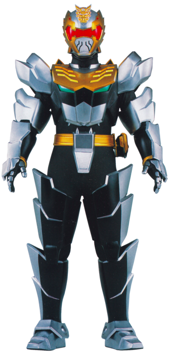
Katharine: I get that it’s a belt/chin… but that’s just a codpiece
James: Whereas Mystic Force nailed Power Rangers-style armour, this is a complete misfire for me. What is up with those greaves!?
And yes, the chin-codpiece does not look good at all.
Katharine: None of this looks moveable. And I keep looking at his dick.
James: EXACTLY what you want out of a costume on a kids show. It’s a shame, because the helmet is a cool spin on the Megaforce ones, but everything else about Robot Knight just does not blend with the Megaforce.
Katharine: Well, that’s the part that has clingy spandex!
James: “Tune in next week, for more awkward shots of Robo Knight’s armoured junk!”
Katharine: God, the feet are so bad. He looks like he’s wearing metal Birkenstocks. This particular costume is bad, but the real reason Megaforce is ranked here is because of it’s association with number 12.
James: I can see where this is going, and I already dislike it.
12) Super Megaforce

Katharine: Super Megaforce is at 12 because that is the exact middle. And represents that I haaaaaaaaaaate this. And that James, who is wrong, loves it.
James: THEY’RE SPACE PIRATES.
Katharine: THEY ARE NOT THEY ARE ELVIS.
And, I’m sorry to tell you, that you are outnumbered. I have showed this to everyone in the Gawker office and they all agree with me.
James: OK, full disclosure: I hated Super Megaforce, because it was a bad adaptation of the incredible 35th Anniversary Sentai series, Kaizoku Sentai Gokaiger, in which these suits were the suits of ACTUAL SPACE PIRATES. And they’re perfect as such.
Katharine: JAMES. Look at those collars.
James: The pirate helmets, the crossbones logos, the collars, the jackets.
Katharine: The belt buckles.
James: The collars are so good!
Katharine: JAMES. Pirates don’t pop their collars like they have just joined a frat. And they have somehow put collars on SPANDEX.
James: Oversized so you could nonchalantly pose holding them because YOU’RE A BADASS SPACE PIRATE
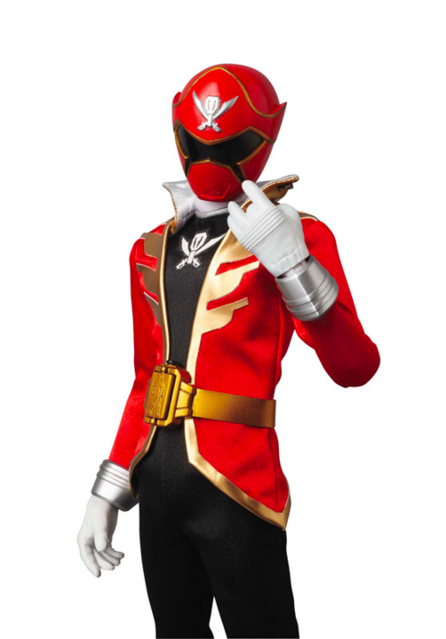
Katharine: I JUST GOT THE PIRATE HAT SHAPE ON THE HELMETS OH MY GOD KILL IT WITH FIRE. This is committing way too much to a theme. Way too much.
James: BUT IT’S SO GOOD. To me, a great Power Rangers theme is one that goes all in on its aesthetic. These guys picked pirates, and by god, they are goddamn pirates.
Katharine: They are awful pirates. Jack Sparrow is ranked above these pirates.
James: I love the flares on the boots and the gloves, I love the design of the jacket, the helmets are all unique but tied into that pirate-y theme.
Katharine: I cannot get over how wrong you are.
James: They ran around with laser flintlock pistols and laser cutlasses.
Katharine: EXACTLY. THEY RAN AROUND WITH LASER CUTLASSES.
James: Like, if I was five years old — not just mentally — these guys would be the coolest thing in the world.
Katharine: Look at all of this. This is not ok. I am not ok.
James: Pirates, from outer space, with a flying galleon that turned into a ROBOT WITH A PIRATE HAT.
Katharine: UGH
James: The one thing I will give you is that Orion, Super Megaforce Silver, has the most ridiculous super mode ever when he becomes this:
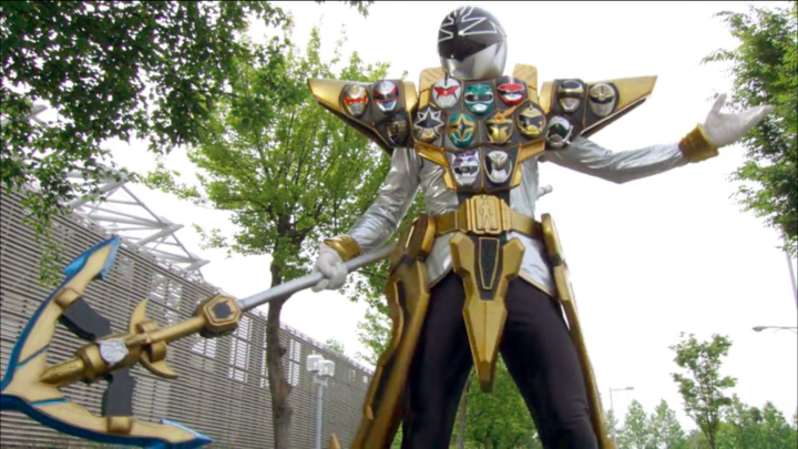
James: Which — UNLIKE THE NORMAL COSTUMES — is honestly terrible.
Katharine: Are those faces on his armour? See, this just adds insult to injury. All of these are awful. Every single design is awful. Did he earn a bunch of Power Ranger merit badges?
James: So, in this season, the big theme was that they could temporarily transform into past Ranger teams, and Orion could call upon the power of all the old sixth Rangers… or mush them all into one super mode in which he wears their faces into battle like armour.
Katharine: They should have called on the past Ranger teams with better outfits. And stayed like that.
James: In the alternate world where I am a despot with ultimate power specifically over list rankings, these guys would be number one in my books. We’re gonna have to agree to disagree.
Katharine: I put these idiots dead last. So here they are. Right in the middle. Satisfying no one.
James: (You’ll always be number one in my heart, space pirates.)
13) Turbo
Katharine: The theme for them was cars. Isn’t it obvious?
James: Ah yes, the precursor to Operation Overdrive’s flashlight helmet mania.
Katharine: Ironically, their lights are too small to actuallY be useful.
James: That said, for as cheap as the suits look, I really like the helmets? The intricacy works where the flat simplicity of the suits doesn’t.
Katharine: The suits are sooo flat, I get nothing from them. The lines are too thin to actually do anything
James: Exactly — they just sink into the colour and make these suits look way too plain. They should have made them silver like the detailing on the helmets to tie them together more.
Katharine: They should have made them so I don’t need a magnifying glass to see them. It makes the big gold rectangle even weirder
James: It’s such a shame, because if they were more visible, the paneling they give to the suits would probably work really well!
Katharine: At the very least it’d work with the helmets
James: Swing and a miss, Turbo.
Katharine: Stalled out for sure.
James: Nice.
14) RPM

Katharine: I swear these being next to each other is a coincidence.
James: Fun fact: This season starred not only Eka Darville of Jessica Jones fame as the Red Ranger, but also Rose McIver of iZombie as the Yellow Ranger!
Katharine: I was about to say that! Some great people in this one. These costumes, though. They have tires on their boots and gloves. Why. It looks so disproportionate.
James: Remember how I said a good Ranger uniform goes all in on an aesthetic? This is what happens when you half-arse it and mix an animal theme with a car theme.
Katharine: The helmets are the prime example of that. Oh god, the animals WITH the headlights
James: Either would be fine! But it so does not work for RPM. Red Ranger’s got the best of a bad deal, but everyone else, it does not work. Especially poor Green, who is basically a car shark. A pale green car shark.
Katharine: The seatbelt harness… over the animal symbol. It’s so bad. And there’s too much gold and silver. Everything here is wrong. Like, I want to Coco Chanel them all: take off the first thing that catches my eye
James: It’s such a mishmash that it falls apart. You’re either animal Rangers or Car rangers, not both. I will say though, as silly as it is, I love that the wheels on the side of the helmets could spin around when they morphed.
Katharine: Also, is the fit on all of these off? They look like they’re sagging.
James: Green Ranger looks like he picked up a suit one size too big, especially.
Katharine: It’s spandex, how is this possible? I think there’s just so much stuff hanging off of these that it looks sloppy.
James: RPM has a lot of great ideas on their own, but they’re all executed poorly.
Katharine: Let’s move on from these.
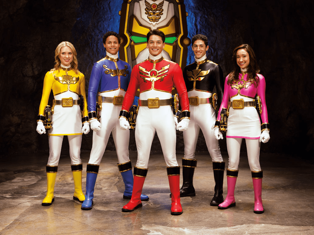
15) Mighty Morphin’ Power Rangers Movie
Katharine: Hey, remember when we were talking about the ineffable Power Ranger-ness quality of the costumes? …These do not have any of it
James: Good lord.
Some background: They gave these to the Rangers when they gave them the mecha from Ninja Sentai Kakuranger… which was meant to be the mecha of the suits used by the alien Rangers.
Katharine: Which makes total sense, those were also a very clear ninja-theme.
James: These are just too much Ninja, and not enough Power Ranger.
Katharine: Because these scream of a Western movie company hearing “ninja” and nothing else.
James: The headgear is just absurd, they barely have eye slots!
Katharine: Bad eyesight is one of the things they did get right, I guess.
James: Once again, though, the girls come off better than the guys — having the “skirt” here looks like a natural continuation of the gi they’re wearing The poor fellas just look like they’re wearing colour coordinated parachute pants.
Katharine: I get that the diamonds on the gloves are supposed to mimic the original MMPR suits, but… still no.
James: There’s a reason that these uniforms are the one and only time Power Rangers diverged from its Super Sentai source material, and then never did so again.
Katharine: Thank god.
16) Space
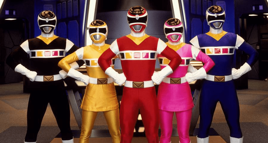
James: In the ’90s, the way you told people you were from outer space was through having random cubes running across your chest, naturally!
Katharine: Yeah, the cubes. The cubes are what make me the angriest with these.
James: These suits would be a little plain without them, but the cubes just do not work with the rest of the suit.
Katharine: I think the more the costume incorporates colours other than the Ranger colour/black/white/metallic the worse it gets. Also, they’re really rubbery looking.
James: It’s weird that the aesthetic is triangles everywhere else but the cubes. It makes them look even more out of place! Kudos to the helmets, though. Simple, but really solid designs, and the visors are great.
Katharine: I just feel like I’m looking at a printer’s test page. And there’s a weird finish on the suits. It’s just bad.
James: Unfortunately, in space, no one can hear you scream at these shitty Power Rangers suits.
Remember to check back for Part Three! And read Part One here!