
Last week Instagram began testing a new monochromatic design, and yesterday Mark Gurman from 9to5Mac reported that one of the major changes coming to Apple Music in June will be a black-and-white makeover. It’s like the evolution of television in reverse. We’ve never had more beautiful smartphone displays, why would we dumb down the designs of our staple apps? It turns out that stripping colourful hues out of an app actually makes a ton of sense.
Though we tend to focus intensely on the new features of the apps and mobile operating systems we use every day, the underlying design ideas have also seen some big changes. Apple’s operating system became much flatter with the introduction of iOS 7, meaning it lost some of its frills like 3D-like effects on apps and other examples of skeuomorphism, and instead favoured elegant simplicity. A year later, Google debuted Material Design, a stripped-down approach to digital interfaces that ditched bubble icons and included smooth, animated transitions. Far from regression, reverting to a simpler colour palette is actually an evolution.
“At the beginning, mobile interfaces were really, really in the foreground… they were the star of the show” Khoi Vinh, director of product design for mobile at Adobe, told Gizmodo. “We’re in a trend now where we’re scaling back from that with flat design, making the content step forward and making apps a lower burden on the smartphone and the user.”
Vinh says that in many ways, a lack of colour is just as distinctive as filling up all our screens with an assortment of different hues, except that it doesn’t have the negative consequence of distracting the user from the content. It’s the reason why black-and-white design is so popular among photo apps like 500px. It’s probably not the best idea to have UI fighting for attention with the content your users are creating.
Stripping out colour also comes with other inherent advantages. “Once you’ve desaturated the interface, you can then use colour for your own purposes,” said Nicholas Felton, a former Facebook designer who has work in the permanent collection at the Museum of Modern Art. When you use colour sparingly, it becomes a tool. For example, in a subdued app design, you can use colour to guide users through menus, mark specific features or just make your logo big and bright, like what Spotify does with its black and lime-green colour scheme, says Felton.
Apple Music, in particular, could use the upgrade. Design was one of the its biggest shortcomings. For example, colour schemes would change to match the art of each album. Cool on paper, but a jumbled visual mess when looking at it on a screen. It also made the app’s already confusing navigation even harder to use. We don’t know precisely what a redesigned Apple Music would look like, but a simpler concept can’t hurt.
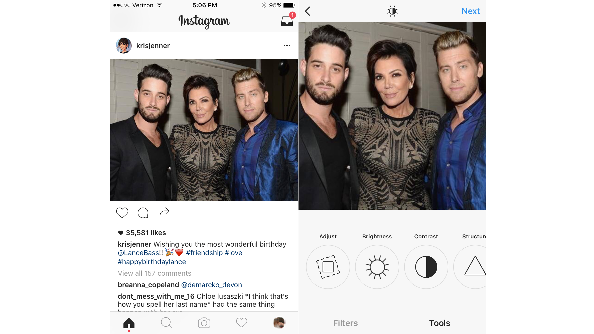
Instagram’s experiment.
However, we have seen pictures of Instagram’s black-and-white test. In addition to abandoning that dated-feeling blue theme in favour of the elegant grayscale, the icons and buttons have been simplified. The design becomes a distraction-free frame, so that your eye is unavoidably drawn to the multi-coloured content in your feed.
Though there’s no guarantee that either company will eventually adopt black-and-white, there’s definitely evidence that change is afoot. Bloomberg originally reported that tensions between the acquired Beats team and Apple could be driving a design shakeup. There are also murmurs that Apple will introduce a “dark mode” (giving the frost glass shade a darker hue for example), which plays nicely with the Apple Music rumour. Meanwhile, Instagram tells us that its own black-and-white experiment is a “design test only”. It looks so good that they would be crazy not to adopt it.
As for the question of timing — Apple Music and Instagram have one thing in common: They’re popular and entrenched. “These apps are in a position to do this kind of design stuff,” Vinh says. “By blending into the background, they acknowledge that they’re basically an indispensable utility.”
Image: Instagram / Gizmodo