Finding a logo for Tokyo’s 2020 Summer Olympics has been a difficult process, fraught with delays, plagiarism and U-turns. But after having to scrap one official logo, the event’s organiser’s have revealed this new one. Hopefully it’s original this time.
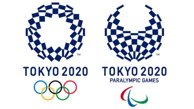
The new design is called Harmonized Checkered Emblem — catchy, guys, I like it — and its design is built up of three different indigo blue quadrilaterals. The geometries are said to represent “different countries, cultures and ways of thinking”. Meanwhile the colour choice is traditionally Japanese and is said to express a “refined elegance and sophistication”. What do you think?
You may remember that the original logo for the games, designed by Kenjiro Saro, was quickly axed after it was alleged that the concept was stolen from the branding of the Théâtre de Liege in Belgium. The resemblance was, admittedly, uncanny.
Tokyo withdraws 2020 Olympics logo after plagiarism allegations: http://t.co/Q4VfmXfpmG #design pic.twitter.com/6g5QyK1jvv
— Dezeen (@Dezeen) September 1, 2015
The search for a new logo was opened up to the public as a design competition. The organisers of the games received 14,599 entries, from which the Harmonized Checkered Emblem by Asao Tokolo was chosen as the winner.
Speaking to Associated Press, Tokolo explained that his “mind has gone blank as I just found out my design won… I put a lot of time and effort into this design as though it was my own child.” Hopefully he wouldn’t copy the idea for his own child.