A new fractal analysis of London’s dense network of streets and intersections reveals that a green belt meant to encourage migration to the suburbs had the opposite effect. The city has just became denser. People really seem to love urban living, especially in a thriving city like London. The work could shed light on how modern cities evolve, and help guide future urban growth policies.
Fractal patterns are self-similar across many different scales, such that if you zoomed in on part of a fractal image, that smaller piece would look like the larger one. Such patterns are useful mathematical tools for describing certain complex structures, like how blood vessels branch out, networks of brain cells, and rivers and coastlines. They’re also useful for analysing city streets.
In a recent paper in Physical Review E, Robert Murcio and several colleagues at University College London described how they statistically analysed nine digitised maps of London from 1786 to 2010, focusing on the number of street intersections. They found in 1786, most intersections were located in Central London. By 2010, anywhere you look in the entire city has roughly the same number of intersections.
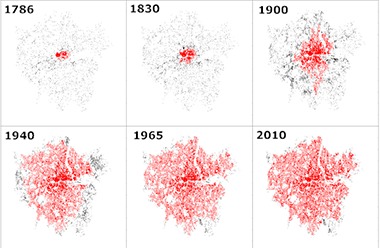
Specifically, they found the distribution pattern changed from a so-called “multi-fractal” distribution (a combination of multiple fractals) to a “mono fractal” distribution.
This is a tricky concept, since the distinction between mono- and multi fractals depends on what features you choose to measure. Murcio drew an analogy to a crack in the ice. “If we measure the way the crack fills the space — a typical fractal dimension — the crack is a mono fractal,” he told Gizmodo. That means you only need one number to describe the network. However, “If we measure the probability of growing in each part of the crack, then the crack is a multi fractal. We need many numbers, as the probability of growing is different in the middle part of the crack than in its tips.”
The UCL researchers attribute the shift in London’s street network to one urban planning decision in particular. In 1935, the city imposed a green belt to combat urban sprawl, in hopes that this would encourage more people to move to rural areas. It didn’t work.
“Ideally, cities would grow to a point where, as there’s no more space for organisation, people would decide to settle elsewhere,” said Murcio of the rationale behind the strategy. “In reality, London attracts so many people that every single space is filled.” Local authorities responded by providing more transportation services, adding more streets and hence more intersections.
“As the city grows, the street network progressively fills the available space contained within the green belt, thus creating over time a more homogeneous pattern,” the authors write in their paper. “This process results in the gradual loss of multi-fractality, in the sense that in the most recent time layers, the London street network could be described by a single fractal exponent.”
It’s not clear whether this should be considered a good or bad thing in terms of how well cities function, according to Murcio. “One could be tempted to say ‘It’s bad,’ in the sense that there’s some evidence that less multi-fractality implies a deficient process,” he said. Past research, for instance, has found evidence that a multi fractal pattern in the circulatory system indicates a healthy heart, while a mono fractal pattern could be a sign of a failing heart.
But this might not be applicable to networks of city streets, or the evolution of modern cities in general.
The UCL team chose to study London’s street network in part because it is their home turf, but also because they had access to a rare digitised historical data set. “One of the major impediments in social sciences is the lack of historical data,” Murcio said. “Beyond 1900, it is really rare to find any reliable information, or the amount of work [required] to digitize maps is just too much.” In fact, it took a team of scientists five years to reconstruct by hand the maps used in the UCL study.
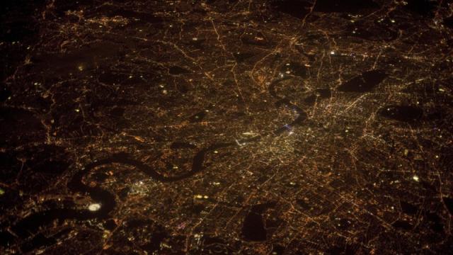
Images: (top) Aerial photograph of London at night. Credit: Philip Chidell/Shutterstock. (bottom) Murcio, R. et al.