What lies beneath the deep blue sea? So much more than you might think.
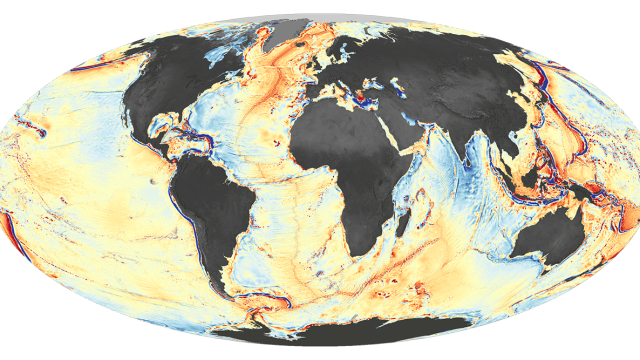
The results that let this new, marvelously-detailed map of the seafloor from NASA’s Earth Observatory be made were actually first published last year as part of a paper in Science from researchers at NOAA and Scripps Institution of Oceanography. They were also made available in a series of area maps and even as a Google Earth interactive. This latest incarnation, though, offers — in a single glance — perhaps the most complete unified view of the Earth’s seafloor to date, showing not just the mountains beneath the water, but also the crevices cracking the watery ground.
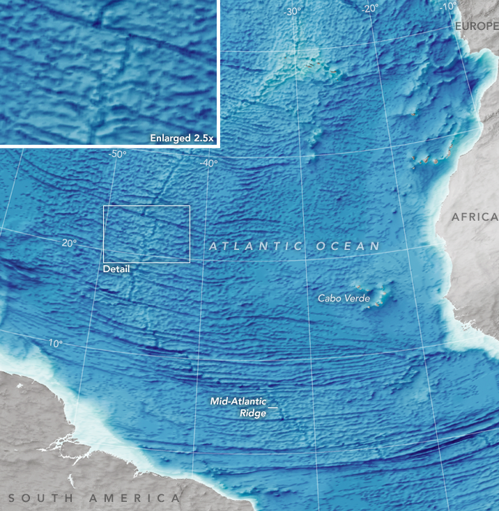
The detail of the map is particularly impressive. Not only does it show features that had previously not been seen, it’s also capable of catching any feature larger than 5km, which has been especially good for capturing some of the smaller ridge features.
It’s not just the map itself that’s interesting, though — it’s how they finally managed to make it.
So, how do you map what you can’t see?
Typically, finely-wrought ocean maps have been the result of extensive sonar. This is expensive and time-consuming, so sonar maps are mostly only made of places where ships spend the most time. The problem with that approach is that our oceans are vast and ships are small — meaning only a tiny percentage of the ocean floor (between 5 – 15 per cent, NASA estimates) was mapped.
So, instead of depending on sonar, researchers looked to something else: Gravity. Using existing satellite data of the ocean, researchers searched for gravity anomalies as measured by sea surface heights. Where gravity was slightly stronger (those red/orange areas), they found mountains rising upwards, in the weaker areas (those blue patches) they were deep cracks.
This isn’t the first time researchers have made use of gravity as a measurement tool. A similar method has been used in the past to measure changes to ice cover in the Antarctic (yes, ice cover is changing so rapidly that you can even read the results in Earth’s gravitational field).
What’s exceptional about this effort is really the scale of it. Instead of just looking at changes to one area, the technique was used to chart the single largest unexplored area on our own planet. You often hear that Earth has already been extensively mapped, and certainly for inhabited areas that’s true. But for the remote regions, we’ve only begun to scratch the surface of our planet — and this map is a tantalising clue to just what the future of earth exploration may look like.
Maps: Joshua Stevens / NASA Earth Observatory