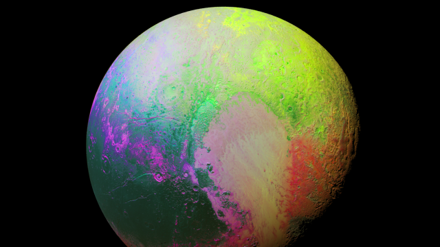
Image Cache: Do not adjust your monitors. While this view of Pluto looks like it’s all screwed up, in fact it’s an image from New Horizons that brings out the subtle variations in colour on its surface.
The image uses a technique that NASA calls principal component analysis. It’s designed to “highlight the many subtle colour differences between Pluto’s distinct regions.” In other words, it brings out the main colour components across the surface, to show how they vary. So while the image is false colour in the truest sense of the words, the image does at least show how the main colour of Pluto varies.
The image was captured on July 14, but presented at the meeting of the American Astronomical Society on November 9.
[NASA]
Image by NASA/JHUAPL/SwRI