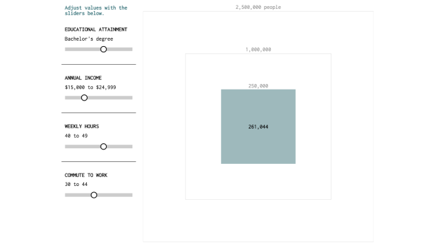
In theory, the US is a land of opportunity, where success isn’t constrained by background or education — but the reality is a rather different. This visualisation digs into that a little, allowing you to see how many people have the same education, income, work hours, and commute as you do.
Nathan Yau of Flowing Data wondered how common it was for people with, say, no schooling to earn a six-figure salary, or for someone with a PhD to earn less than $10,000. He explains the path which that thought set him on:
Then I got to thinking about other aspects of work, namely work hours and commute times. How many people in the United States have an education of high school or less, earn a higher than average salary, work regular hours, and have no commute? Are there people who work single-digit hours per week but are rolling in dough Scrooge McDuck-style?
So he dived into the American Community Survey 5-year estimates from 2013 and sample data from IPUMS to create this visualisation. It’s neat to play around with, adjusting the sliders to see how many people share a similar style of education and working life to you. Have a go.
One point: the income is salaried money “received as an employee,” so it doesn’t take into account freelance work at all. That likely screws up some of the results, but probably not too much.
So, how does your cohort stack up?