It’s been a big day in the world of logos: First, Google revealed its brand new, sans serif emblem. Meanwhile, the scandal-stricken icon for Tokyo’s 2020 Summer Olympics was officially killed today following plagiarism allegations. Fortunately, the Internet already has had some replacements in mind.
Not long after designer Kenjiro Saro’s logo was revealed last June as the Games’ official emblem, he was accused of stealing the idea from designer Olivier Debie. Debie created the logo for a theatre in Belgium called Théâtre de Liege. Here’s what the two look like, side by side:
Tokyo withdraws 2020 Olympics logo after plagiarism allegations: http://t.co/Q4VfmXfpmG #design pic.twitter.com/6g5QyK1jvv
— Dezeen (@Dezeen) September 1, 2015
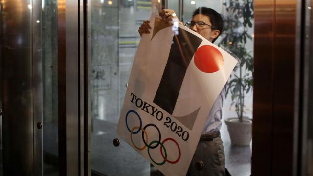
What do you think? Apparently, the Olympic Committee thought it was too controversial to remain the face of the Games, so down it goes. Sano, who agreed to the removal and won’t get paid for the work, the Japan Times reports, contends that he didn’t steal the idea. The icon was already being widely distributed on official Olympics materials, but now a competition will be held to pick a new design.
The fracas is the second embarrassing one for Tokyo, and the event is still five years away. Earlier this year, plans to build the outrageously expensive Olympic Stadium were scrapped after the $US2.1 billion price tag became too prohibitive. (It also followed the city demolishing the historic one from the 1964 Summer Games.)
The former logo left some fans cold in the first place, though. So the Twitterverse was already prepared to suggest plenty of alternatives.
This one, from Twitter user vivakankan, was a huge hit online:
扇は末広がりで縁起がいいものとされ、古くから応援するときの道具として使われてきたので、オリンピックのモチーフとして最適&「和」も感じられていいかなと。「多くの人で支えられている日本(日の丸)」を扇の中で表現しています。 pic.twitter.com/4i0WJiInfj
— かんかん (@vivakankan) August 17, 2015
The Internet also responded to this beautiful one, which is reminiscent of Japanese family crests, from Twitter user umegrafix:
東京五輪エンブレム梅野案(私案)をブラッシュアップしました。 1.色の整理と明度彩度の微調整 2.形状の精度アップと合わせ、中心部を白円に変更。 3.パラリンピック版のデザイン変更 より「多様性と連帯」という意味合いを出す方向に変更。 pic.twitter.com/ym2WVRLBiF
— umegrafix-梅野隆児 (@umegrafix) August 16, 2015
And to be honest, I’m really digging this one as well. It was used as the city’s logo during the application process, and now seems to be holding a temporary position, but I’m down with making it official:
What do you guys think?
[The Japan Times and RocketNews24]
Pictures: Getty, Twitter