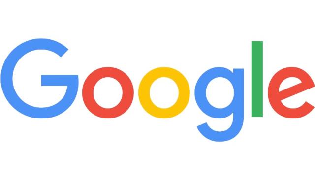
Google debuted a serif-free logo today — the first real change to its logo since 1999. And although it’s much prettier than the 16-year-old wordmark, the company claimed it was more about functionality than looks. The Google logo has become more and more problematic throughout its existence, and it had everything to do with those serifs.
AU Editor’s Note: This story came from our friends over at Gizmodo US; their site uses a serif font, where we’ve gone for sans serif over here. Basically, over here in Australia, we’re already living in the future. — Cam
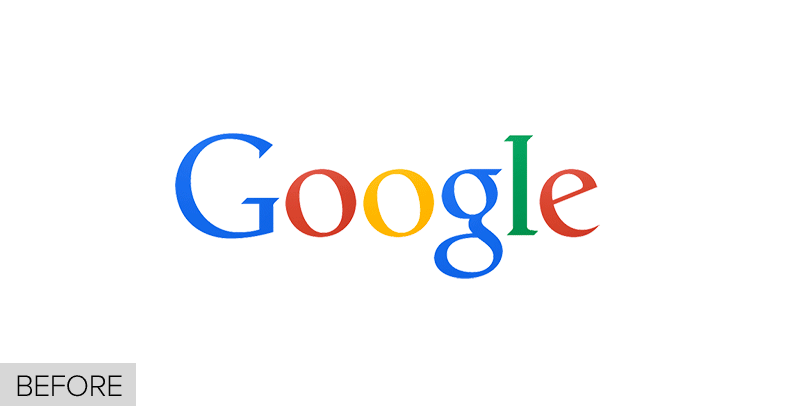
First, a quick primer on serifs: The text you’re reading right here, has serifs, the tiny decorative lines attached to the edges of many of the letters. It helps your eyes with readability when you’ve got a lot of text. But it’s not as useful on text that needs to be shown at many different sizes, like, um, logos. Here’s the before and after of Google’s logo. See the serifs disappear?
So if you watch the evolution of Google’s logo in this video, it’s all serif for 17 years. You can see it getting simpler and simpler, but through mostly stylistic decisions. First, that so-1990s inflated balloon type. Then the Y2K-era version with the beveled edges. Then the same logo, flattened, thanks to Google’s own Material Design language evangelising flat design.
But after a tiny tweak a year ago, it was clear the designers were kinda stuck. Google’s logo had a problem.
Serifs don’t scale
First and foremost, scalability. Google’s old logo did not shrink well. A serif-y “Google” with all those nubbins is not going to be readable at small sizes, for the same reason that Helvetica sucks for screen text. The spindly letterforms start to disappear, and when it’s really tiny, it’s essentially useless. The G almost turns into a C. The l looks like i. Coogie!
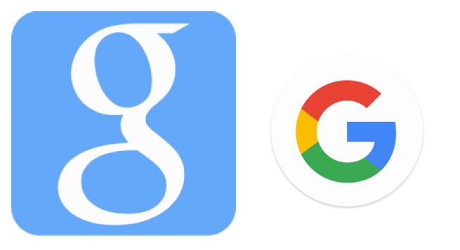
Old favicon (it looks like an 8!) and the new sans serif G, which looks like a G even at half the size
This is the same problem that many logos have on smartphone and smartwatch screens, of course, so designers make a version of the wordmark that’s just a single letter, known as a favicon. Google had a blue lowercase serif “g” for just these occasions, but it had the same problems as the wordmark (nubbins, spindly). Now, the new singular primary-coloured capital “G” will be used as a favicon, and different applications (Google+, Google Maps, etc.) each have their own customised G:
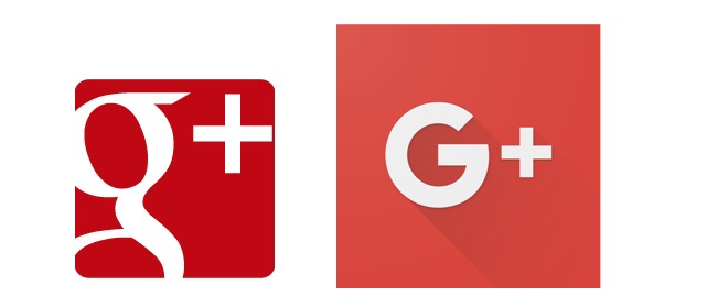
Old serif Google Plus (what the hell is that half-g?) and the new Google Plus logo
Again and again, you’ll see — serif begone.
Serifs suck up bandwidth
So the new sans serif G favicon takes care of the scale issue. But the logo itself — the wordmark — still needed to be fixed. When viewed at low resolution, the logo started to degrade in the same way. Google actually has known this for years and had even implemented a workaround for their own identity. Those using low-bandwidth connections would see not the image version of the logo but a close text approximation. Well, not even that close!
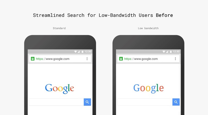
Instead of giving their low-bandwidth users a crappy experience, a choice was made to not only redesign the logo but also generate a new logo using a vector-based file type called a Scalable Vector Graphic (SVG), which was populated across the company for consistency. SVG is the best file format for logos; it’s the way all logos will appear soon. But Google’s designers also claim that without the serifs, the new logo was a smaller file size, meaning it can be viewed just fine by Google’s low-bandwidth friends:
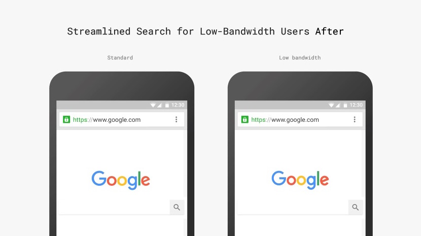
Losing the serifs is a big part of makes Google more accessible to all users, writes the Google Design team. No more giving the low-bandwidth users the short end of the typography stick:
This helps us make the design pixel perfect everywhere it’s used, and it allows us to optimise these assets for size and latency, including building a special variant of our full-colour logo that is only 305 bytes, compared to our existing logo at ~14,000 bytes. The old logo, with its intricate serifs and larger file size, required that we serve a text-based approximation of the logo for low bandwidth connections. The new logo’s reduced file size avoids this workaround and the consistency has tremendous impact when you consider our goal of making Google more accessible and useful to users around the world, including the next billion.
So that last part sounds a little BS. Google has been busy pushing its “next billion” agenda with tools for people with connectivity issues, like optimising websites for text and offline browsing capabilities for videos and maps. It sounds humanitarian — and it has great intentions, I’m sure! — but it is all just a plan to get more Google products into more hands in more emerging economies, of course.
Is redesigning the logo really just so the next billion can have the same experience as the current billion (which I’m pretty sure no one really cared about)? It’s also reminiscent of when Facebook simplified its logo ever so slightly (and they also like to make these kinds of “next billion” announcements).
Serifs aren’t the future?
But Google could have simply redrawn the serif typeface as an SVG, right? Did they really need to shave off the serifs from a performance perspective? I asked designer Khoi Vinh, who recently joined Adobe as Principal Designer. He sees it as yet another example of Google’s engineering-driven decisions.
“I think part of what Google, as a massive organisation populated by incredibly smart people (read: nerds), needs to do in order to make a big subjective shift like this is to root it in objective benefits,” he says. “So what makes sense to an engineer when you’re redoing a logo? You’ll save time and bytes.”
Remember that story from a few years back about Google testing 41 shades of blue for its search bar, and going against the recommendation of its designers because a certain blue was deemed more clickable by the data? This is a more advanced version of that, says Vinh. “I frankly think that if they went with a more gut instinct approach it would have been fine,” he says. “But the bigger story about Google and design for the past several years — since Larry Page took over — has been if they can retrofit design into their org. This is a great example of how they grok design.”
Yes, Google is taking great strides to embrace design — the designers talk about how these choices fits into the Material Design ethos, Google’s larger push for making design more robust — but they still have to rationalise all of it with data.
Still, there’s something to be said about serifs and readability. Is the age of the serif logo over? Why would a company add the typographical equivalent of bells and whistles when those superfluous spindles will have to be shed eventually for screen optimisation? We’ve seen the same changes happening in other tech logos, especially the ones that will need to be summoned on a smartphone or smartwatch: simpler, streamlined, always sans serif.
But Vinh doesn’t think serifs will ever be completely gone. “Serifs are sort of like men’s neckties. Movies have long predicted their demise because in the future everything would be about efficiency,” says Vinh. “But they never go away, because they remind us that we’re human.”