My graphic design students love to design posters using the classic eye chart composition, and they frequently ask “What typeface should I use for this?” Not having a definitive answer has always been frustrating, so I decided to investigate to find out what typeface is used on eye charts.
I started my quest by asking my ophthalmologist, who enthusiastically provided a dizzying amount of technical information about the variety of eye charts and tests designed for different audiences and eye conditions. Suddenly, a simple question became a series of discoveries. Not only is there no one letterform design or font used for eye charts; the letterform designs are more appropriately called optotypes, of which there are several versions. There is a science to the design of optotypes and their legibility at specific distances.
Since I am a graphic designer and not an eye or vision expert, I will forgo the technical explanations and focus on optotypes used on several significant charts to provide a better understanding of this complex and fascinating subject.
Eye charts are designed to test visual acuity, or clarity of vision. Each chart design has limitations and advantages, depending on the clinical setting, patient profile, and diagnostic objective. To understand the differences between the charts, it is helpful to know a little historical background of standardised visual acuity testing.
The First Standardised Tests
Heinrich Küchler is one of the first individuals credited with creating an eye chart to test visual acuity.
Küchler, a German ophthalmologist, designed a chart in 1836 using figures cut from calendars, books, and newspapers glued in rows of decreasing sizes onto paper. These figures included cannons, guns, birds, farm equipment, camels, and frogs. This system was limited because the figures were not consistent in visual weight or style.
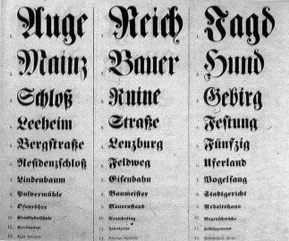
Dr. Küchler continued to refine his chart, and in 1843, published a new version using 12 rows of Blackletter letters decreasing in size. This chart was not widely adopted (hard to imagine why) and was published only once in 1843.1
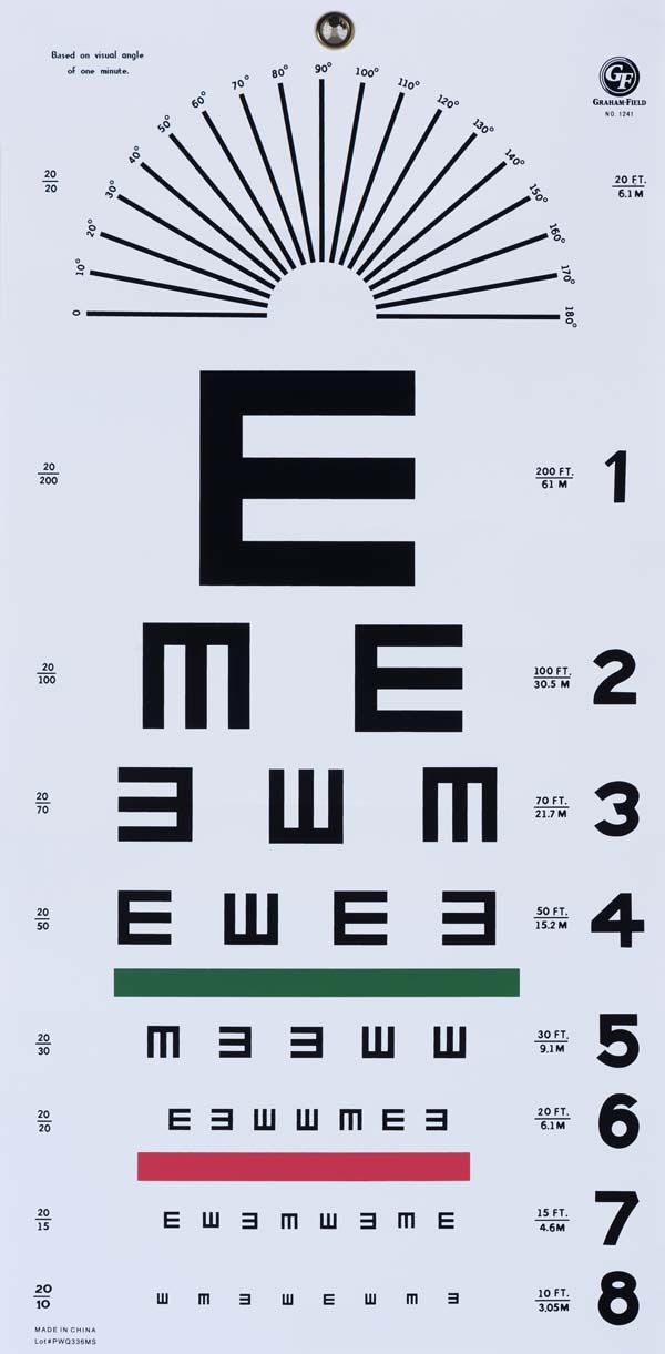
The next significant development in visual acuity chart design was the Snellen Eye Chart, which is recognisable to most Americans from visits to the DMV.
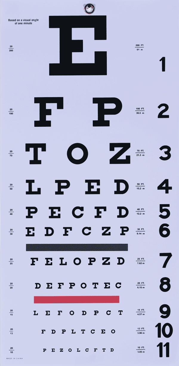
The Snellen Eye Chart was designed by Dutch ophthalmologist Herman Snellen in 1862 as a means to improve the subjective nature of vision testing, which was usually accomplished by having patients read a passage of text held their hands, or held at a distance by the doctor. This test had obvious limitations: the results were dependent upon the reading ability of the patient, the legibility of the typeface used, and the fact that the patient could guess the next word by reading a sentence. According to Dr. August Colenbrander, a scientist at the Smith-Ketterwell Eye Research Institute and an expert on eye chart design, Snellen began experimenting with dingbats, or symbols such as squares and circles for his eye chart, but found that it was difficult for test subjects to describe the symbols accurately.2
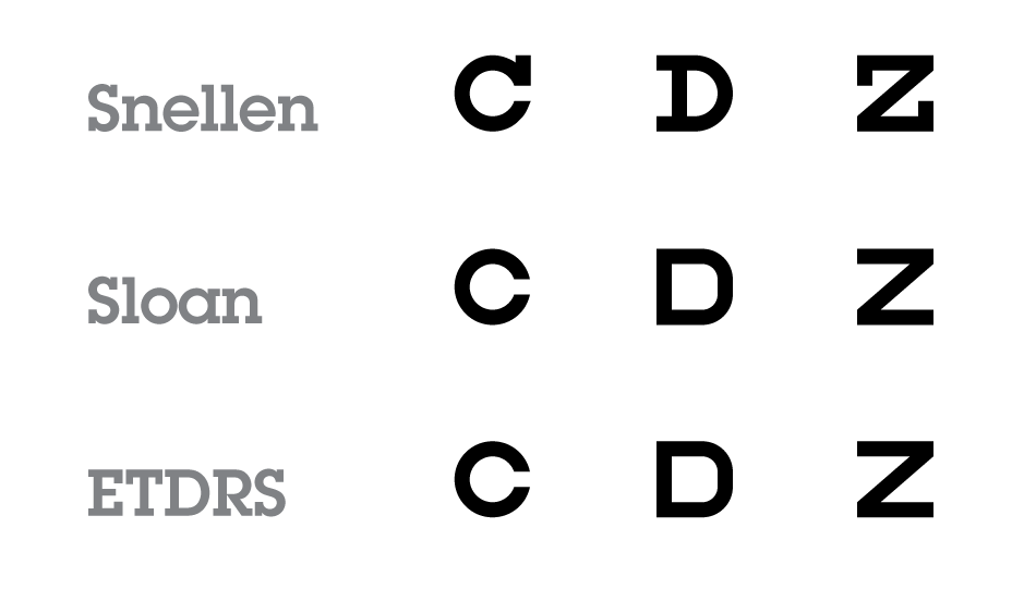
So, he moved on to using letters. The characters on the first Snellen Charts were: A, C, E, G, L, N, P, R, T, 5, V, Z, B, D, 4, F, H, K, O, S, 3, U, Y, A, C, E, G and L. The letters used were Egyptian Paragons or slab serifs of contrasting line thickness with ornamental cross strokes on terminals. Snellen then theorised that test subjects would be able to identify non-ornamented, monoline/equally weighted letters of consistent visual size more easily, and so he created optotypes.3
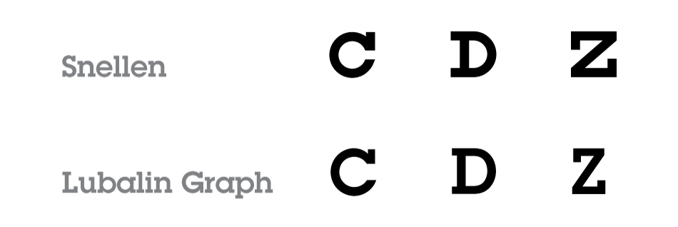
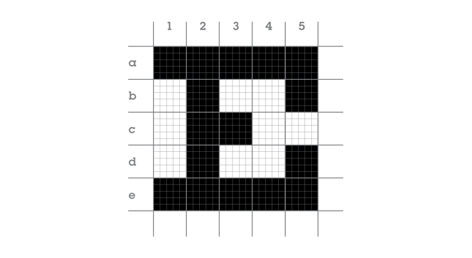
At first glance, it may appear that the Snellen optotypes are Lubalin Graph or Rockwell. But upon detailed examination, it is evident that these characters are rather atypical. Unlike typical typefaces in which letter proportions are determined by ‘family’ groupings (such as n, r, m, h and u), Snellen optotypes are designed on a 5 x 5 grid. Furthermore, they comprise a very limited character-set of just 9-10 letters. Optotypes are designed using a simple geometry in which the weight of the lines is equal to the negative space between lines. The height and width of an optotype is five times the thickness of the line weight.4 These design considerations create inconsistently and oddly proportioned letters. For example, in a typical typeface, C and D would appear wider than Z, but in the optotype scheme, the opposite is true.
Dr. Snellen created Optotypes using minutes of arc instead of a typographic measuring system. This made it possible for his charts to be reproduced easily. The first large order for Snellen Charts was from the British Army in 1863. From there, the Snellen Eye Chart became the standard for vision testing for almost a century. In addition, Snellen’s 5 x 5 grid optotype design is the foundation upon which all other eye chart systems are based. The Snellen Eye Chart is still the most recognised design, which can, to some extent, negate its effectiveness, if, for example, the test subject has memorized the chart.5
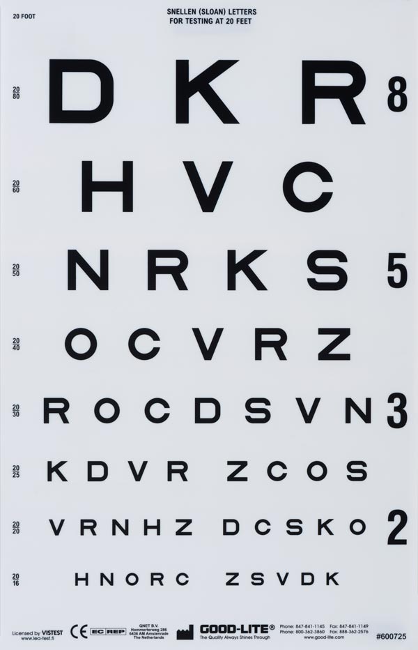
Most Snellen Charts contain eleven lines of block letters. The first line consists of a single large letter, most often an E. Subsequent rows have increasing numbers of letters that are progressively smaller in size. The test subject, from a distance of 20 ft, covers one eye, and, beginning at the top, reads aloud the letters in each row. The smallest row that can be read accurately indicates the visual acuity in that particular eye.6
Current Snellen Charts use nine letters, C, D, E, F, L, O, P, T, Z. Note that with the exception of E and O, the letters are all consonants. The diverse shapes of the optoypes allow test subjects to identify verticals, horizontals, and diagonals. These letter shapes are also highly effective in identifying astigmatism.
Although today’s Snellen Eye Charts may vary in the number of rows, size gradation, and serif or sans serif design,7 their commonalities include the rectangular shape. This dictates the varying numbers of optotypes appearing on each line as space permits.8
As a result of continual refinements, most of today’s Snellen Charts follow logarithmic progression, have improved letter designs, and a uniform 25% progression from line to line.9
Refinements and Variations
In 1868, Dr. John Green of the St. Louis College of Physicians and Surgeons in Missouri decided to make some changes to the Snellen Eye Chart. He designed a more structured grid featuring a consistent logarithmic geometric progression of 25% for successive lines, and with proportional spacing. He also changed the style of the optotypes from the blocky slab serif to sans serif. His concept became known as the “Preferred Numbers Series,” but his system did not become widely recognised until the next century when sans serif typography gained popularity. Ironically, in response to criticism that his letters looked “unfinished”, Dr. Green abandoned them in 1872, and returned to the serif optotypes.10
In 1959, Dr. Louise Sloan of Johns Hopkins University created ten new optotypes using sans serif letters preferred by Dr. Green. These optotypes included the letters: C, D, H, K, N, O, R, S, V, and Z. Like Snellen letters, Sloan Letters are formed within a square, with the stroke width equal to one-fifth of the letter height and with equal visual weight. The Sloan Chart has consistent spacing between letters and rows that are proportional to letter size. Spacing between letters is equal to letter width, and spacing between rows is equal to the height of the letters in the subsequent, smaller row.11 Notice that, as in the Snellen Chart, all of the characters are consonants with the exception of 0. Also note that the letter selection used on the Snellen Chart is not the same as that in the Sloan Chart. In both cases, the diverse shapes of the optoypes allow test subjects to identify verticals, horizontals and diagonals — an aid to identify or differentiating individual letters. The ten Sloan Letters are considered to be the most effective letter selection for equal legibility. What’s more, they are particularly effective at identifying astigmatism.
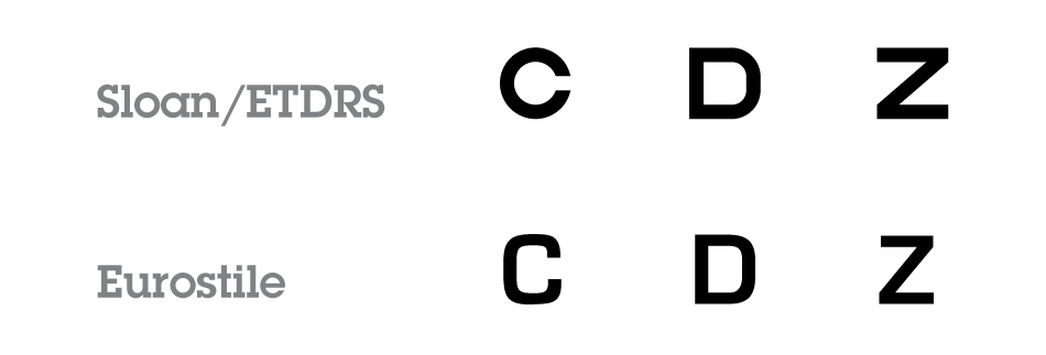
The Sloan Letters may at first glance resemble Microgramma or Eurostile fonts, but upon closer examination, it is evident again that the grid format imposed upon these optotypes produces some odd and inconsistently proportioned letters.
New Charts and Methods
In 1976, Ian Bailey and Jan E Lovie-Kitchin of the National Vision Institute of Australia proposed a new chart layout, describing their concept as follows:
We have designed a series of near vision charts in which the typeface, size progression, size range, number of words per row and spacings were chosen in an endeavour to achieve a standardization of the test task.12
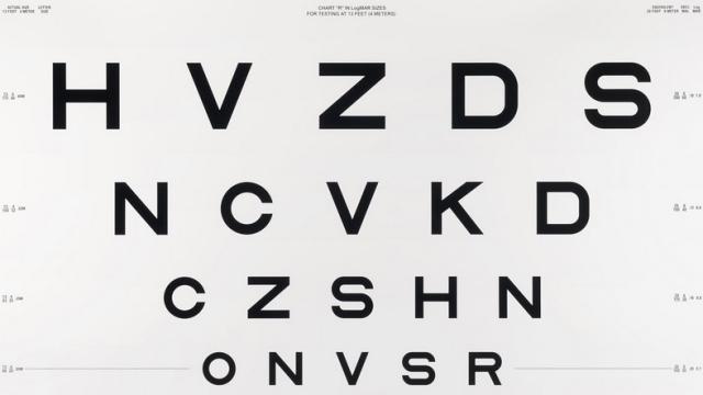
This layout replaces the Snellen rectangular chart format with a variable number of letters per line with a triangular one with five proportionally spaced letters on each line. The ten Sloan Optotypes appear on the Bailey-Lovie Chart using the same letter ratio of the letter-height equal to five stroke widths, excluding serifs.
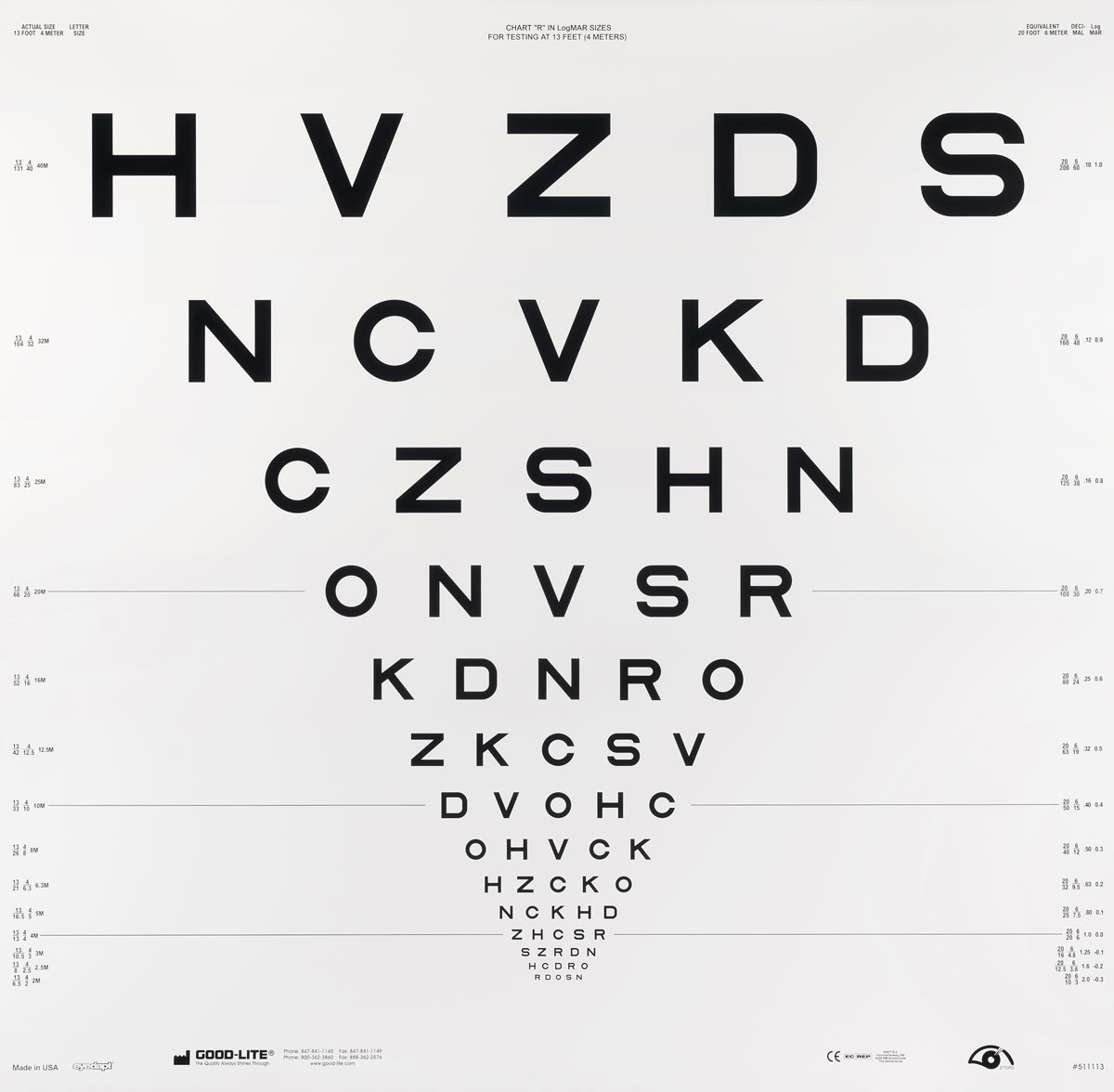
The Bailey-Lovie Chart is an example of a LogMAR test, a term describing the geometric notation used to express visual acuity. “Logarithm of the Minimum Angle of Resolution” or (LogMAR) tests, were selected, in 1984, as the standard for visual acuity testing by the International Council of Ophthalmology.13
In 1982, when the National Eye Institute needed standardised charts for its “Early Treatment of Diabetic Retinopathy Study” (ETDRS), Dr. Rick Ferris combined the Green and Bailey-Lovie Charts’ logarithmic progression and format with the Sloan Letters. ETDRS charts use equal spacing between letters and lines, making the acuity chart more balanced.14 This chart format has been accepted by the National Eye Institute and the FDA, and is mandated for many clinical trials performed worldwide.
The ETDRS test is more accurate than either the Snellen or Sloan versions because the rows contain the same number of letters, the rows and letters are equally spaced on a log scale, and individual rows are balanced for letter difficulty. There are also three different versions of the test available to deter memorization.15
One limitation of the original ETDRS chart is its use of the Latin alphabet, making it difficult to use throughout all of Europe. To address this limitation, the Tumbling E and Landolt C charts are used for populations who are unfamiliar with letters of the Latin alphabet. Recently, a modified ETDRS chart was developed using Latin, Greek, and Cyrillic alphabets. For this chart, the standard letters C, D, N, R, S, V and Z have been replaced by the letters E, P, X, B, T, M, and A. These letters are created using the same 5 x 5 grid and the Sloan Letters.16
In more recent years there has been a move to create electronic charts, including the British-designed Test Chart 2000, which was the world’s first Windows-based computerised test chart. It overcomes several difficult issues such as screen contrast, and provides the opportunity to change the letter sequence, so that it cannot be memorized.17
These fonts, for Mac and Windows OSs, are available for research purposes. The fonts are based on Louise Sloan’s designs, which has been designated the US standard for acuity testing by the National Academy of Sciences, National Research Council, Committee on Vision.18
Charts for Non-Readers
For testing patients who cannot read or for those unfamiliar with the Latin alphabet, the Tumbling E Eye Chart and the Landolt C or Broken Ring Chart are used.19
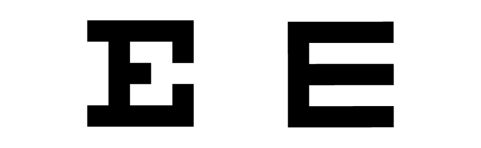
The Tumbling E Chart was designed by Professor Hugh Taylor of the Centre for Eye Research Australia (CERA) in 1978 to test the vision of Australian Aborigine individuals in an attempt to identify those with the eye disorder, Trachoma.
Professor Taylor, using the Snellen proportions, designed a shape resembling an uppercase E, which he arranged in four directions (up, down, right, and left) in progressively smaller sizes. The patient then simply describes the direction in which the Tumbling E is facing.
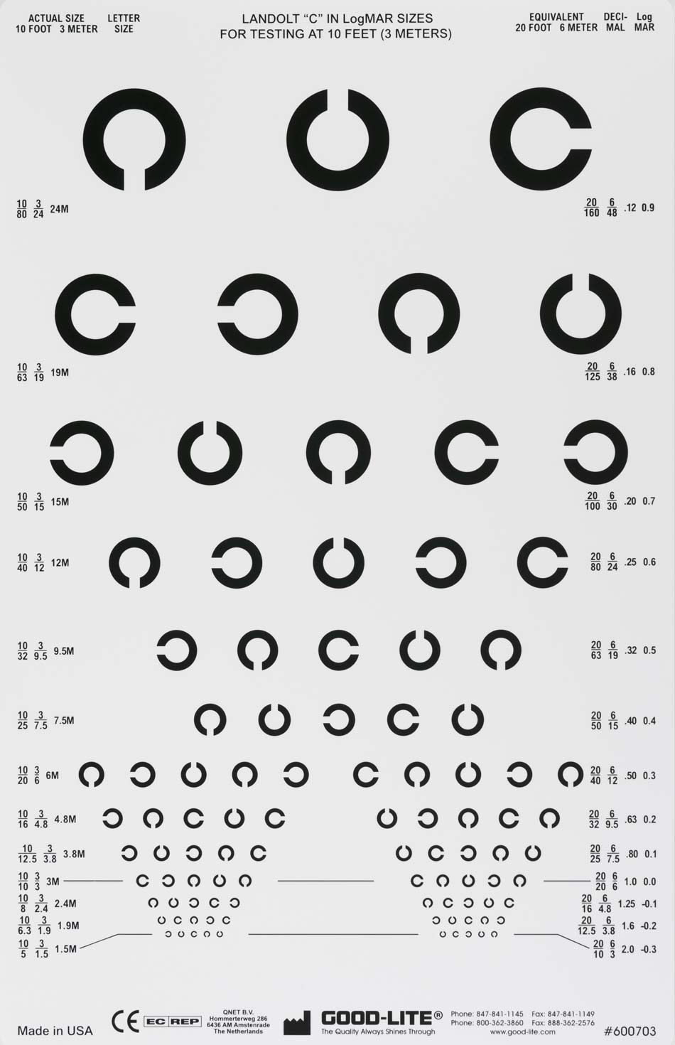
The Landolt C or Broken Ring Eye Chart is also used for illiterate individuals or those persons unfamiliar with the Latin alphabet. Created by Swiss ophthalmologist Edmund Landolt, this test is now considered the European standard. The Broken Ring (which is the same proportions as the C from the Snellen and Sloan Charts) is rotated by increments of 90°. The minimum perceivable angle of the C-gap is the measurement of visual acuity.20
In addition to the Tumbling E and Landolt C tests, there are charts for children in which progressively smaller, simple pictograms of objects are used. The challenge in designing these charts is creating recognisable pictograms of equal visual weight, consistent style, and design.

This article is not an exhaustive research study into the subject of eye charts or their efficacy. There are many more examples of eye charts. My objective was to explore the archetypes of optotype design in the evolution of the eye chart as a diagnostic tool. Now I can tell my students that there is, technically, not a single typeface to recommend for their designs; and I can refer them to this article for more information! Examining optotypes has been an eye-opening experience.
This post was originally published on the excellent site I Love Typography and is syndicated here with permission.
Go here to see additional footnotes and sources.