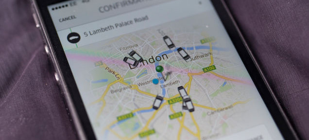
If you use Uber, you’ve seen the map that comes up when you want a ride. The map shows little car graphics hovering adorably around your location and the wait time for a pickup. Once you request a ride, you can watch a little car creep closer to your destination as you wait. It’s a marvel of technology! Except it’s bullshit.
Alex Rosenblat and Luke Stark, researchers studying Uber’s user interaction, discovered that the map Uber shows passengers of its available local drivers isn’t very accurate/may be intentionally misleading. I know — Uber, doing something sketchy?! We inhabit a wild world. But read on:
Rosenblat interviewed Uber drivers as research, including an Uber driver “Heather” who noticed that the passenger map wasn’t showing correct information, and published an account on Motherboard:
When Heather asked an Uber Help staff member, however, she was told that the rider map was just a “screen saver.”
“The app is simply showing there are partners on the road at the time,” the staffer wrote in an email. “This is not a representation of the exact numbers of drivers or their location. This is more of a visual effect letting people know that partners are searching for fares.”
“I know this seems misleading to you but it is meant as more of a visual effect more than an accurate location of drivers in the area. It would be better of you to think of this as a screen saver on a computer.”
A screen saver on a computer! What a fantastic excuse. The next time anyone tells me, “Kate, the blog post you wrote is bad and you are bad,” I am going to say, “It would be better of you to think of this as a screen saver on a computer.” Ditto for if I accidentally make a seXXXt-tweet, Anthony Weiner style. “Excuse me. It is just a screen saver on a computer my friends, carry on.”
There are two different maps that Uber drivers can see: The driver map, which shows where people are requesting rides, and the passenger version, which ostensibly shows passengers where cars are but is apparently a screen saver on a computer.
Since Uber drivers have access to the driver app map as well as the passenger version, they can check the discrepancy between the two. Drivers have been wondering about why Uber puts “phantom” or “ghost” cars on passengers’ maps for a while. In one of many driver forum threads about the “ghost cars,” a driver said that Uber claimed it was just a technical issue:
This came up in our weekly virtual Uber webinar. They claim this is a new technical issue and are looking into it. Yeah, just like the ETA’s doubling after accepting it. Funny how all these ‘technical issues’ work in Uber’s favour and against drivers.
When Rosenblat asked about the issue, however, an Uber representative gave a very different answer:
“The map is as accurate as possible in the close vicinity of your location,” the representative wrote.
Other drivers haven’t been buying that, because they’re not stupid:
And now that this research corroborates suspicions that Uber is manipulating its passenger maps to make it look like there are more drivers, more Uber drivers are noticing:
I’ve asked Uber for clarification on its map/screen saver. I don’t know if we’ll get a straight answer about this, but there is a good reason why Uber would want to manipulate its passenger map results: When you open the app and see a bunch of available cars nearby, it makes it seem like it’s definitely the quickest way to get a ride, which makes Uber seem more attractive.