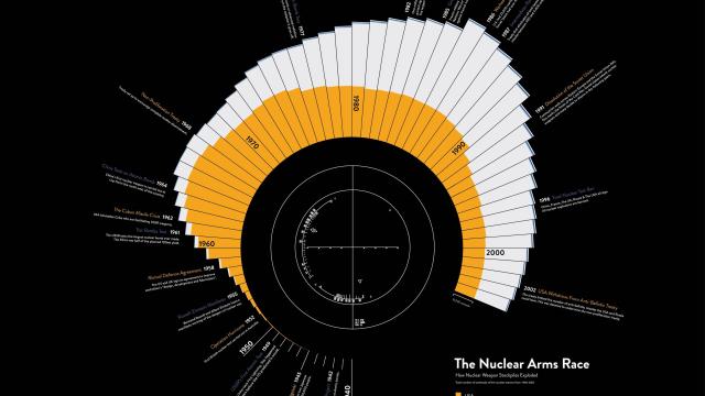
This visualisation by drwtsn breaks down the nuclear arms race starting from the 1940s until now. The countries shown are the countries who have historically had the most nuclear weapons: the US, Russia, the UK, France and China (a few other countries have nukes too but are not represented).
You can see the arms race explode in the 1960s with the US taking an early lead and then hit into an even higher gear during the Cold War when the former USSR caught up and surpassed the US. I wished the visualisation was able to show the specific number of nuclear warheads each country had throughout the years but we just have to eyeball it. For reference, the number stood at about 5000 for Russia (down from 21,000 in 2000) and 4000 for the US (down from 10,577) back in 2009. So there were heaps of warheads in the ’80s.