The history of the Star Wars logo has long been controversial for its purported connection to fascist or even Nazi typography. After all, the Star Wars saga is an apparent analogy for World War II, where the Empire is the Third Reich and Darth Vader represents Adolf Hitler.
So it wouldn’t be a surprise if elements of the film, like its logo, were pulled from fascist sources, right? Not so fast.
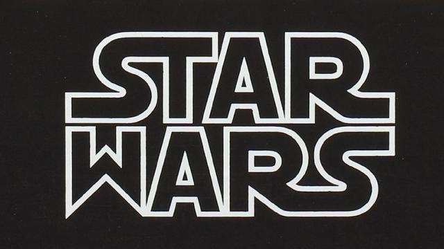
In a terrific Hopes&Fears feature on fonts and movie posters, Garbriella Garcia revisits the controversy over the Star Wars logo’s origin. Garcia explains how George Lucas originally told designer Suzy Rice to create a logo that looked “very fascist.” Rice’s recollection of her process later appeared in The Star Wars Poster Book, where she chose what she says she “reckoned to be the most ‘fascist’ typeface I could think of: Helvetica Black.”
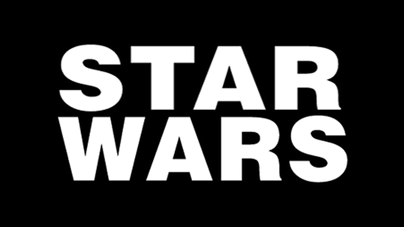
Rice used Helvetica Black as her inspiration for the original version of the Star Wars logo — though of course, she altered elements of the logo drastically as you can see when you look at “STAR WARS” rendered in Helvetica Black without any alterations:
So why did Rice reckon Helvetica Black to be the most fascist-looking font? Apparently she’d been reading a book about German typeface design the night before Lucas asked her to design something that would have “an intimidating impact” on the audience, and thought she remembered the book saying something about how Helvetica grew out of typefaces Joseph Goebbels had selected for Nazi propaganda.
“Apparently, the book established Helvetica Black as the inevitable evolutionary product of a typeface design that Joseph Goebbels had ordered to represent the German Nationalist party on all of its signage,” Garcia explains.
Over the years, Rice has been sharply criticised for implying that Helvetica is a fascist typeface, and that it had any connection to Nazi typography. She responded to this criticism in multiple blog posts clarifying the issue.
“‘Helvetica came much later but was described in this book I’d been reading as somewhat similar visually to that earlier signage,” Rice clarified.
Rice wrote in 2011 — emphasis hers:
My original statement that Helvetica Black “was the most fascist font I could think of” was as to the ENVIRONMENT FROM WHENCE THE FONT ORIGINATED, the “general environment” of culture and time prior to, during and directly after World War II, and, as to the severity in appearance of the font itself. It was “fascist” based upon what I’d learned about how that font was developed and within what history epoch it originated — not “a fascist font” in and of itself but from a period of human, political history born of certain severe conditions WHICH ATMOSPHERE PROVIDED ME WITH AN INSPIRATION FOR THE DESIGN.
As she alludes to in the caps-heavy text above, it wasn’t the provenance of the Helvetica typeface itself that seemed fascist to her, but rather the “severity in appearance.” In another post, she explains that Helvetica wasn’t inspired by Nazi typography — it was just visually similar to some of those poster typefaces:
To state the obvious — contrary to bizarre gossip as if I’d stated otherwise — Helvetica wasn’t used by Goebbels nor was Miedinger, to my knowledge, associated with Goebbels. Meidinger’s ‘Helvetica’ came much later but was described in this book I’d been reading as somewhat similar visually to that earlier signage.
Indeed, Helvetica was decades away from being designed when fascism drove Europe to war. It was designed by Zurich type designer Max Miedinger and renamed “Helvetica,” which is Latin for “Swiss.” The Haas Type Foundry, where Miedinger designed Helvetica, didn’t release the typeface until 1957.
And ironically enough, despite its distinctly timeless appearance, Helvetica was actually a throwback design — a throwback to, you guessed it, a German typeface from decades before the war. In the late 19th century, so-called Grotesk fonts became fashionable. (Grotesk means “sans serif” in German.) Berthold, the biggest type foundry in Germany, released the Aksidenz Grotesk family in 1896 for use as a display type.
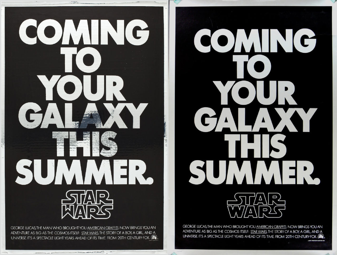
Futura is the main typeface on the first poster that would bear Rice’s logo. The more familiar logo to the right, as you can see, as been slightly adjusted.
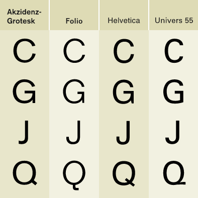
It’s widely accepted that Helvetica is largely based on Aksidenz Grotesk, with little details borrowed from other German and Swiss typefaces of that era. In fact, when you look at the two side-by-side, it’s hard to tell the difference. To the left is a handy comparison chart between Aksidenz Grotezk and other popular san serif fonts, made by Wikipedian Geared Bull. This is all to say that none of these fonts are really fascist — they’re derivative of a period that dates back decades before fascism rose in Europe.
The Grotesk tradition kicked off over a century’s worth of sans serif typeface designs. These typefaces were originally designed to appear in titles and on signs, so there’s an inherent emphasis on legibility. That doesn’t necessarily translate into the typefaces seeming intimidating. It would even make some sense that Goebbels used san serif typefaces on his posters — because these typefaces are designed to appear on posters.
So no, the Star Wars logo nor the Helvetica font that inspired it do not have actual origins despite the pervasive myth. If you want to get even deeper in the controversy over the Star Wars logo and Nazism, there’s an excellent and in depth blog post on the issue over at Star Wars Modern. (The TL;DR version is basically that the Nazis actually favoured Gothic typefaces, though some sans serif and modernist stuff did pop up here and there.) If you want to learn more about the surprisingly lengthy history of the Star Wars logo itself, check out this Gizmodo post all about it.
If you want to nerd out a little harder on movie poster design, you should definitely check out Hopes&Fears’ feature “From Psycho to Jurassic Park: exploring iconic movie poster typography.” (It even includes the story on the historically awesome Back to the Future poster.) You’d be surprised what a ruckus a movie poster can cause.
Top art via Gizmodo