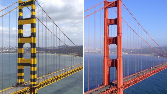
The Golden Gate Bridge’s iconic “International Orange” paint job was a bit of a happy accident. If the United States Navy got its way, the landmark stretch of infrastructure would look like a bumble bee. That would have been just sad.
The black-and-yellow stripe colour scheme, of course, was a design that emphasised practicality and visibility. Since it’s built out of a steel alloy, the Golden Gate Bridge needed a sturdy paint job in order to protect it from rust and corrosion. The salty air and characteristic San Francisco fog made these problems worse. The fog, in particular, raised the visibility concern. The last thing anyone wanted was for a tall ship to crash into the $US35 million bridge, taking out cars and pedestrians in the process.
So, during construction in the 1930s, the War Department got invovled. The military initially objected to the bridge altogether for fear that Navy ships would get stuck in the Bay if the bridge collapsed, due to tall ship or bombers or otherwise. Once it had been dissuaded, the Navy proposed the bumble bee design. This was just a few years after the dawn of “dazzle” camouflage, an avant-garde design practice intended to hide things — even massive ships — in plain sight.
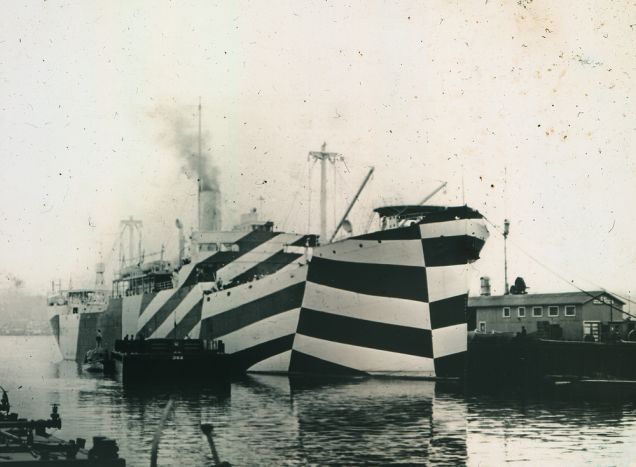
A “dazzle” ship in 1918
The Army Air Corp also favoured the dazzle-inspired approach and proposed a red-and-white stripe colour scheme. In conclusion, the military either wanted the Golden Gate Bridge to look like a bumble bee or a candy cane.
Thankfully this didn’t happen. When the steel beams arrived to the bridge construction site, they’d already been painted with an international orange-coloured primer. The original plan was to paint over the primer with a black or grey or (God forbid) military-order dazzle design. Consulting architect Irving Morrow actually wrote a lengthy “Report on Colour and Lighting” that analysed every aspect of the bridge’s appearance. Ultimately, Morrow decided that the international orange looked pretty damn good. The reddish hue provided a pleasing contrast between the bright blue California sky as well as the golden hills on either shore. Most importantly, the colour was bright enough to stand out in the fog.
And so, the international orange primer stayed. It’s actually refreshed on a perpetual basis to ensure that the bridge’s steel stays protected. Every piece of the bridge gets a fresh coat of paint every 20 years or so, though painters are constantly painting due to the sheer size of the landmark. By 1990, the original lead-based paint had been completely replaced by zinc-based paint. As the bridge’s website explains:
The zinc protects the steel, because zinc corrodes more easily than steel. Zinc serves as a sacrificial metal, so the steel does not rust when zinc is present. On top of that zinc primer is a top coat of paint in the Golden Gate Bridge’s signature colour called International Orange.
The formula for international orange is no secret. The specific CMYK formula and colour codes are published on the bridge’s website. You can also buy a close approximation off-the-shelf from Sherwin Williams. It’s called “Fireweed” — a name that’s frankly a little more fun than international orange. It’s certainly better than “Bumble Bee” ever would have been.
Picture: Golden Gate Bridge, Highway & Transportation District / Flickr / Lucas Maystre