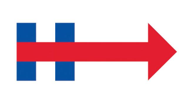
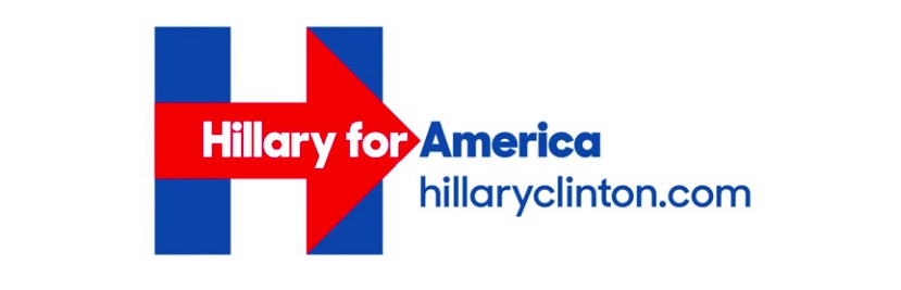
Since the announcement of Hillary Clinton’s presidential campaign was no secret, it was her campaign design that was the big reveal of the week. The giant blue H marched its way to the forefront of the breaking news, but at the centre of Clinton’s logo is another, far more critical graphic element: The arrow.
The logo itself is bold and contemporary, and pretty enough that it won’t annoy us when we’ve been looking at it for 18 months straight. It’s lacking all traces of flag-like elements, which is great, and it’s also flat, which is nice. It’s not Obama ” O” good (actually, I always found Obama’s logo packing a little too much heartland/waves-of-grain for my taste), but an H is awkward letter — it isn’t nearly as iconic or cool. It needed something else.
Per usual, the internet was peppered with plenty of off-topic commentary — it’s a hospital sign, an old NBC logo, a UK grocery store, a WikiLeaks ripoff, a 9/11 Rorschach test??? — including an entire typeface made in the logo’s style.
The identity — which is reportedly designed by Pentagram’s Michael Bierut, although the designer would not confirm or deny this to me — was mostly picked apart for the very specific placement, shape, and colour of that arrow. Why is it so big? Why is it so red? Shouldn’t it actually be pointing left?
But the arrow has a heck of a lot of value in today’s world, maybe more than ever.
Arrows have been a critical part of logo design through the years. Inferring motion, speed, precision, they often appear on sports-related brands.
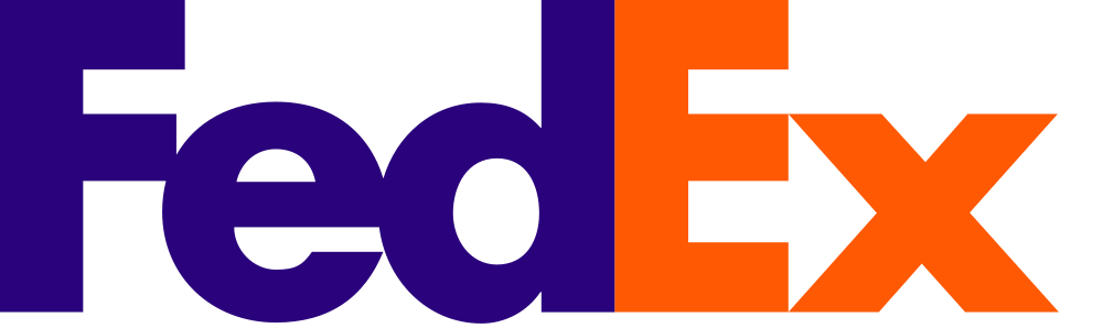
The most famous graphic design arrow is a hidden one. Embedded in the FedEx logo is a white arrow created with negative space, if you know where to look (right between the E and the x). In fact, the arrow is such a beloved part of this logo that people were comparing Hillary’s H-> to the hidden E — >x pretty much instantly.
An arrow works perfectly here because it infers action, and perhaps a sense of urgency. Your package is going out, quick! It will be there tomorrow! There it goes!
But with the advent of screen-based media, the arrow has taken on another role: That of the cursor. Arrows are now what we use to do confirm our actions online: to send, to load, to buy.
The arrow is kind of a win-win, graphically. In the 2D design world where logos are merely slapped on posters and t-shirts, the arrow still symbolises progress, pointing towards the future. But it’s the arrow as an interaction design element which offers the most value — and this is the one that the vast majority of Hillary supporters are most likely to engage with during the campaign.
Now, instead of just forward movement, the logo infers clickability. “YES.” Which I’d argue is something that you definitely want for a political candidate.
One problem with an arrow — any arrow — is the inevitable situation where it points at something to which the designer did not intend. Call it the “I’m with stupid” effect. But so far, the arrow seems to be extremely well-positioned for screen interactions.
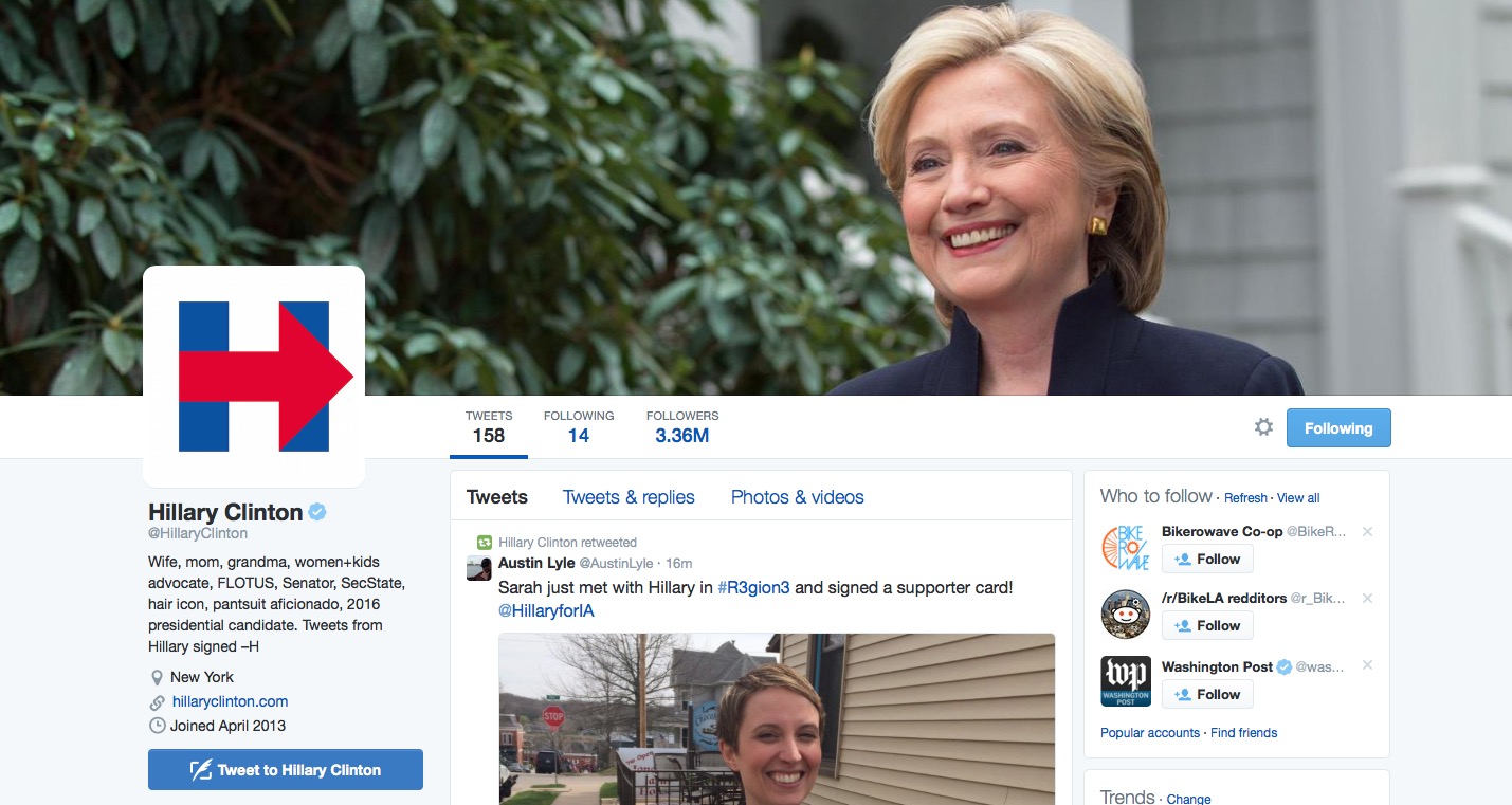
On her Twitter page the logo points to her face; in the timeline, it points to all her tweets:
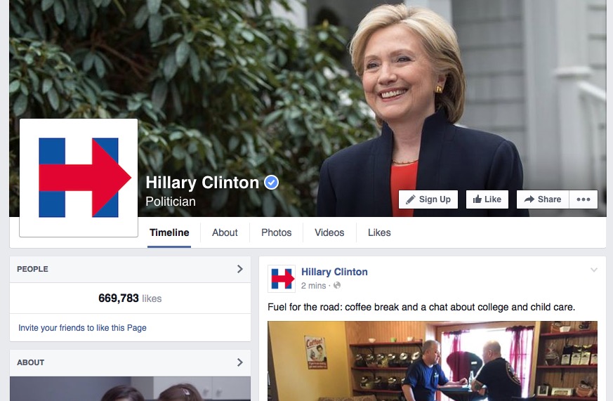
Same on Facebook:
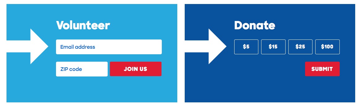
It works well on the website for drawing attention to volunteering and donation forms:
In customised logos, the arrow points directly at what Hillary stands for:
That’s the kind of beauty happening here:
https://twitter.com/hashtag/HillaryInIA?src=hash
It’s not the H that everyone’s obsessing over — not at all — rather it’s the arrow that’s pointing the way.
I suspect we won’t see the full range of this logo and the thinking behind it until a few months down the line, but one thing is clear: Hillary Clinton just became synonymous with the arrow in visual culture.