They found them in a file cabinet. The original masters for a legendary typeface called Haas Unica, designed in the late 1970s and killed shortly thereafter by what amounts to bad luck — and the digital age.
The person who found them was Dan Rhatigan, the Director of Type at the foundry Monotype. He was actually looking for old materials to include in an exhibition about the transition from traditional typefaces to digital ones. But in the process, he had accidentally uncovered a lost typeface that perfectly encapsulates that story.
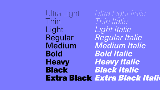
Today, Monotype is releasing Unica as a web font after spending almost 40 years in obscurity — and it could rival giants like Helvetica and Univers, as it was originally designed to do.
Ancient History
So, what exactly happened to Unica? Why isn’t it the household name Helvetica or Univers are today? “The 20th century is filled with lots of lost typefaces,” Rhatigan told me today. “In the case of Unica, it was an unfortunate bit of timing.”
A phototypesetting machine by Derivat graph.
It all began in the 1970s, when a technique called Phototypesetting overtook traditional metal as the way most foundries made their fonts. It worked a bit like developing a photo in a darkroom; the film letters could be enlarged to the perfect size, then light would expose the space around them to create an imprint. It was the bridge technology between traditional metal typesetting and the digital age, where type is made up of pixels. And unfortunately, it didn’t last very long.
And it was during those short years when Phototypesetting reigned, a foundry called Haas Type set out to design an alternative to the monster hits of Helvetica and Univers. Both typefaces had enjoyed massive success for decades (as they have since), but Haas had the idea of creating a tertiary design based on the two. It tapped a trio of designers known as Team ’77 to create a lovely alternative to two of the most popular (and some would say overused) typefaces of the 20the century.
What resulted was a hybrid called Haas Unica. It wasn’t quite as precious as Helvetica — it has fewer details that some call “mannered,” the things that make Helvetica so instantly recognisable. But it also has a little more personality than the cool, calm Univers, seen on the right above.
Even its name was a combination of its two predecessors. It was a hit amongst designers, too. “The details were just beautiful,” says Rhatigan. It was “Univers with a heart, Helvetica with a soul,” as the designers Beatriz Cifuentes and Yoshiki Waterhouse said in a release today.
Unfortunately, it was also destined to die an early death.
The Computer Age
The invention of the computer not only skyrocketed certain typefaces to household status (hello, Wingdings!), it relegated others in the dusty annals of ancient history. Like Unica.
“It passed down through a chain of companies that are part of the murky history of type foundries in the 20th century,” says Rhatigan. Smaller foundries went out of business, their portfolios were absorbed by bigger companies, and decisions were made about what to digitize and what to leave in the pre-computer era. Some typefaces — especially new, unproven ones like Unica — didn’t make the cut.
Through a long and contrived series of events, Unica ended up being owned by Monotype. It had simply fallen through the cracks thanks to industry-wide turmoil and technological upheaval. In the years that followed, it never quite disappeared completely. “Most type designers know if it,” Rhatigan tells me, and perhaps its inaccessibility even increased the mystery surrounding it.
After Rhatigan pulled the original film out of the cabinet, he turned it over to a designer named Toshi Omagari, who has spent the past few years redeveloping it and building on the original “intent” of its 1970s designers. Today, the company is selling a web font version of it — Neue Haas Unica — in the very format that could have easily launched it to the same kind of global resurgence that Helvetica and Univers have enjoyed since the 1980s.
“Monotype is in a unique position because it’s so large, and we’re comprised of so many other foundries that have existed over the years,” Rhatigan adds. What other half-forgotten legends are stuffed into cabinets and into basement archives? Only time will tell.