Occasionally, we get to catch a glimpse of the hidden tests that ensure our technology-infused world runs smoothly: colour bars on TV or blocks of “lorem ipsum” gibberish text. There’s a fascinating story behind how each of these tests came to be and how they work.
Some standard test files are well-known; others have played a quieter but still crucial role behind the scenes. Take the Utah teapot, a standard test object for 3D rendering, which Pixar animators paid sneaky homage to Toy Story. Where did it come from?
Here are the largely-untold stories of the standard test files that make our world run.
Lorem ipsum
Not quite real Latin but not quite total gibberish either, Lorem ipsum is the dummy text you seen in almost any sample layout. The text comes from Cicero’s De finibus bonorum et malorum, but words have be removed and altered so actual readers of Latin would find it nonsensicle. The original begins like this, “Neque porro quisquam est qui dolorem ipsum quia dolor sit amet consectetur adipisci velit…”
What you have in the end is a body of text that roughly approximates the letter frequencies and word lengths of English. It’s unclear exactly when typographers first started using Lorem ipsum, but the current version was popularised by PageMaker on the Apple MacIntosh.
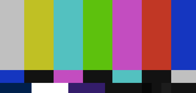
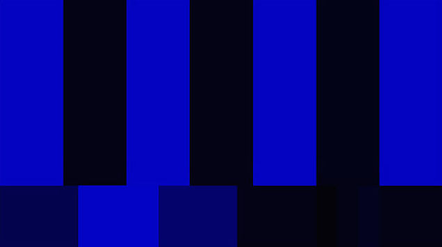
SMPTE colour bars
If you’ve done a lot of TV surfing in your day — particularly late at night — then you’ve probably encountered this set of colour bars accompanied by a loud monotone. The “bars and tone” are more formally known as the Society of Motion Picture and Television Engineers (SMPTE)’s Engineering Guideline EG 1-1990, used to calibrate monitors.
What looks like random blocks of colour to the untrained eye is actually a carefully laid-out test pattern. For example, the colours yellow, cyan, green, magenta, red, blue actually goes from most luminous to least, and that’s used to find the proper white level. And “blue only” mode, the middle strip of blue, black, magenta, and white rectangles look the same as the bars above them. This is used for colour balance (below). There’s a lot more to geek out over if you’re so inclined. The test pattern, developed by CBS labs, was awarded a technical Emmy in 2001-2002.
Indian-head test pattern
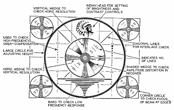
TV test patterns existed for black and white television too, and they were, um, very much a product of their time. The pattern was developed by the Radio Corporation of America (RCA) to help viewers tune their television screens. Presumably, the thick and thin lines of the Indian head were chosen for test purposes, though the exact story is lost to time.
Harvard sentences
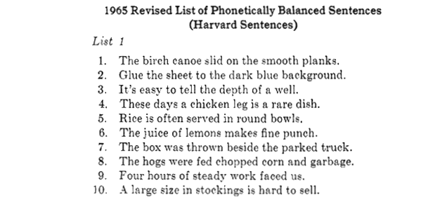
During World War II, the Harvard Psycho-Acoustic Laboratory developed a set of sentences to test military communications equipment. Each list of 10 sentences is phonetically balanced, approximating the frequencies of phonemes in natural spoken English. As quaint as these Harvard sentences sound to modern ears, are still widely used to test voice communications, from VoIP to mobile phone network quality today. If you want to learn more about the history of the Harvard sentences, here’s a whole article from Gizmodo’s archives.
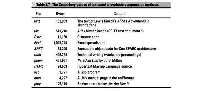
Canterbury Corpus
Screenshot via Data Deduplication
One of the weird things about going from analogue to digital storage that it is possible to compress a file into less space — with no loss of data at all. That’s what happens when you turn a folder into a .zip file on your computer. And to test this type of algorithm, researchers use the Canterbury Corpus, a collection of 11 files developed at the University of Canterbury in 1997. (Alas, while it does contain the works of Shakespeare and Milton, it does not have any Chaucer. Different Canterbury.) The Canterbury corpus supplanted an earlier version called the Calgary corpus, which turned out not to be entirely representative of text files.
Utah Teapot
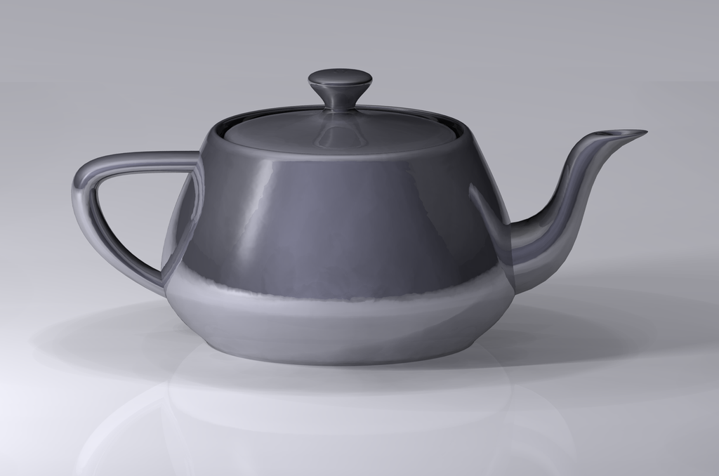
A rendering of the Utah Teapot. Dhatfield/Creative Commons
Back in the 1970s, graphics researcher Martin Newell sat down to sketch the teapot he had at home. Newell was figuring out how to represent 3D shapes as data that could be rendered into an image by a computer. That sketch, complete with the 3D coordinates of the teapot’s shape, is the basis for a computer model that graphics researcher will still recognise today.
The actual teapot is now at the Computer History Museum in Mountain View, California. But the virtual teapot? You’ll see it snuck into animated movies like Toy Story and episodes of the Simpsons.
“The quick brown fox jumps over a lazy dog”
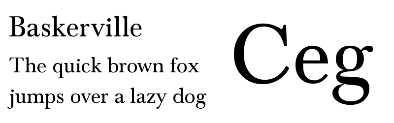
Pangrams contain each letter of the alphabet at least once. “The quick brown fox jumps over a lazy dog” was used in early typing lessons, and it’s since crept into increasing popularity, with many typographers using it to show off their work.
“The quick brown fox…” is the most famous English test sentence, but it’s hardly the most efficient. That honour would go to the perfect pangram, “Cwm fjord bank glyphs vext quiz,” which uses each letter exactly once. Good luck remembering it though.