NASA’s Earth Observatory has spent over 15 years using satellites to collect hordes of real-time data across our planet’s surface. They reveal everything from temperature and energy use, to how much radiation we beam into space. Here’s how to understand satellite data maps to understand our planet’s vital signs.
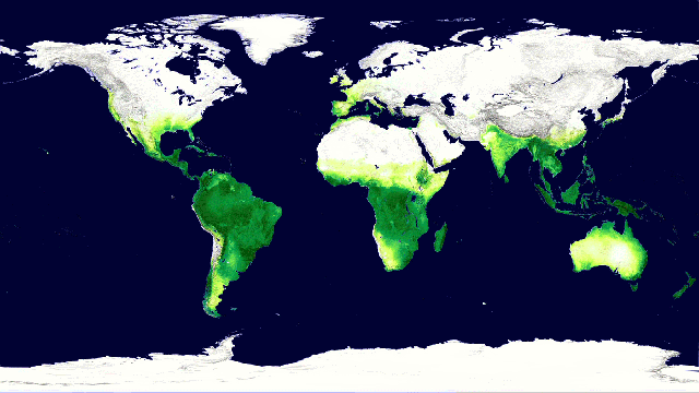
Above: Carbon dioxide absorption by Earth’s vegetation over the course of a year. Image: NASA Goddard’s Scientific Visualisation Studio
The maps I’m presenting below represent data collected across planet Earth, averaged for the entire month of December, 2014. Most of this data was collected by Terra and Aqua, NASA’s flagship Earth-observing satellite missions, which crisscross our planet every day, using a variety of remote sensors to track Earth’s vital signs.
Powering Up

Average solar insolation hitting Earth’s surface in December 2014, in Watts per square meter.
Looking at these maps, the first thing you’ll notice is that the Earth is basically a giant engine. No engine can do work without a fuel source, and ours is the sun. Without its constant burn, life on Earth would soon flicker out. On this solar insolation map, lighter colours indicate regions that received more sunlight during the month of December. The solar energy that hits our planet consists mostly of visible and ultraviolet light — high-energy stuff that scientists have collectively termed shortwave radiation.
Over the course of a year, our planet absorbs an average of 240 watts of solar power per square meter. Of course, that energy isn’t distributed evenly across Earth’s surface. The sun heats the equator more than the poles, and because of our planet’s axial tilt, one hemisphere always receives more sunlight than the other, resulting in seasons. When the south pole faces the sun directly in December, it enjoys nearly 24 hours of brightness.
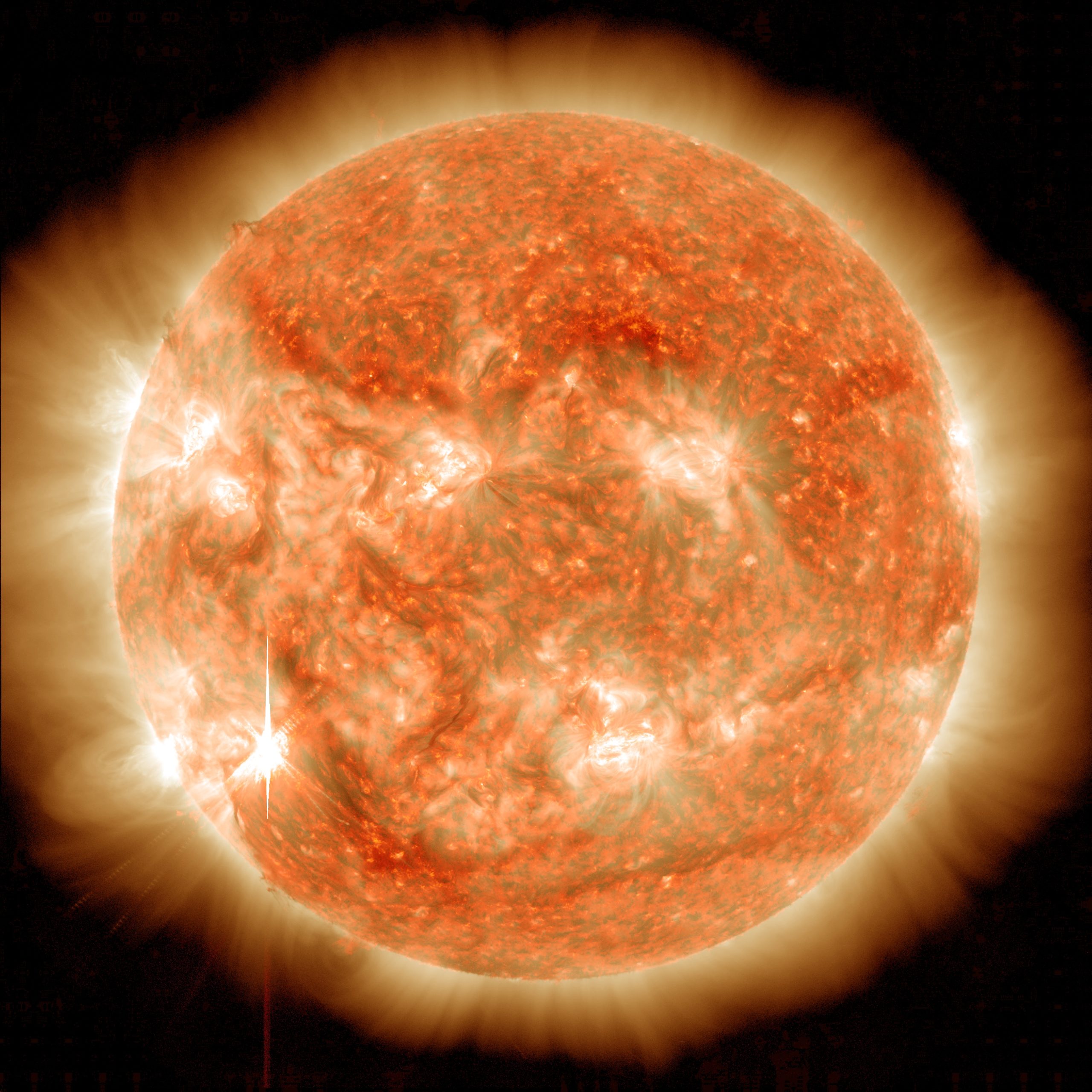
The sun, our beloved energy source. Image: Goddard Media Studios
Fun Fact: You’d need to explode one hundred billion tons of dynamite every second to match the energy produced by the sun.
Staying Cool
For the sun’s energy to be any use to us, it needs to be absorbed by our planet. Nearly a third of the shortwave radiation that enters our atmosphere never makes it into the heat engine — it’s expelled right back into space, by clouds, aerosol particles, and bright, reflective ground surfaces. This energy plays no role whatsoever in our climate — if it did, Earth would be a much toastier place.
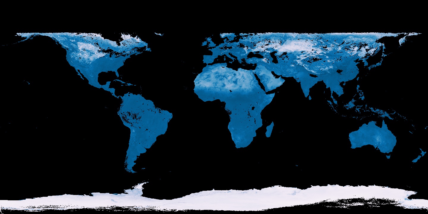
Surface reflectivity, or albedo, on a scale of zero (dark blue) to 0.9 (white), in December 2014. Black regions indicate no available data
The map above shows planet Earth’s reflectivity, or albedo, as the proportion of the sun’s energy that’s bounced back to space. Ice-covered regions are the most reflective, reflecting nearly 90 per cent of incoming sunlight. Desert sand reflects about 40 per cent of the sun’s energy, followed by vegetated land surfaces and finally, the ocean, which absorbs nearly everything.
One of the chief concerns with melting sea ice is the concurrent decrease in Earth’s albedo. When bright ice is replaced with dark ocean water, the planet absorbs additional solar energy. This creates what climate scientists call a “positive feedback,” which can accelerate warming and ice loss even further.
Average shortwave radiation reflected by the Earth in December 2014, in Watts per square meter.
This map shows the total shortwave radiation that Earth kicked back into space in December, with brighter colours indicating more outgoing energy. In addition to ice-covered surfaces, clouds and light-scattering aerosols play a big role in keeping our planet cool.
If you’re able to see Mars in the night sky, it will look like a bright, glowing dot. Most of that glow is actually reflected sunlight. To aliens studying Earth from a distant planet, we’d probably look like nothing more than a faint blip of reflected starlight, as well.
Fun fact: Without an atmosphere and cryosphere to scatter sunlight, Earth’s surface would get blisteringly hot. How hot we talking? Well, the moon’s barren surface reaches temperatures of over 250 degrees Fahrenheit under direct sunlight. So yea, it’d be no picnic.
A Radiant Planet
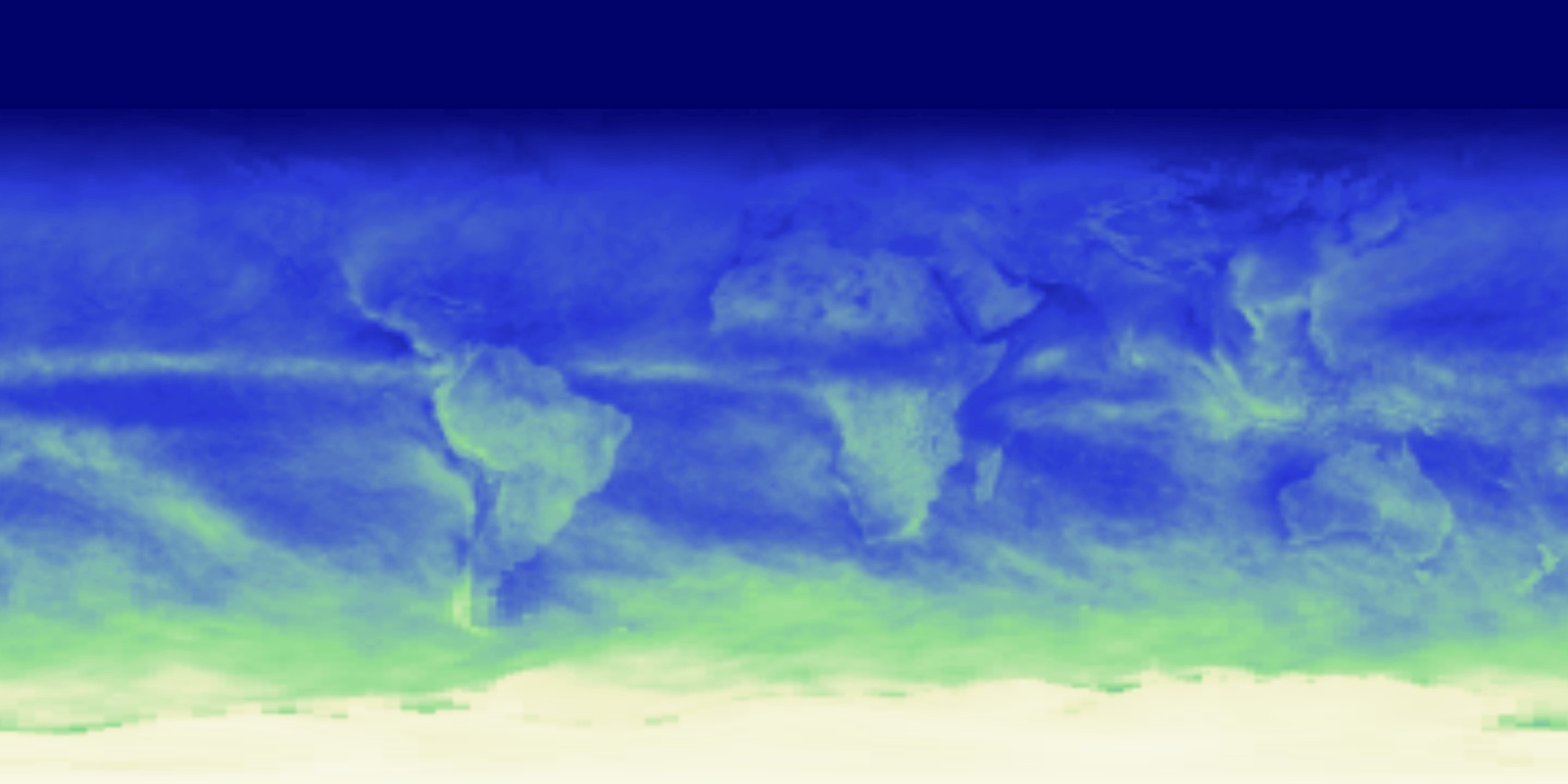
Average long-wave radiation emitted by the Earth in December 2014, in Watts per square meter.
We can’t see it, but in addition to reflecting sunlight, our planet pours massive amounts of heat into space. Indeed, the 48 per cent of solar radiation that Earth’s surface actually absorbs causes a near-equivalent amount of long-wave, infrared radiation — or heat — to escape back to the atmosphere. What’s more, the amount of heat Earth’s surface radiates scales to the fourth power with temperature, meaning that if Earth’s surface temperature doubles, the heat it radiates back increases by a factor of 16. Without this efficient heat-releasing mechanism, Earth’s surface temperature would constantly climb.
The map above shows the amount of outgoing long-wave radiation leaving Earth’s atmosphere. Hotter regions of the planet, like the tropics, always radiate more than cooler regions, and drier regions like north Africa and the middle East tend to emit more heat than wetter regions like the Amazon.
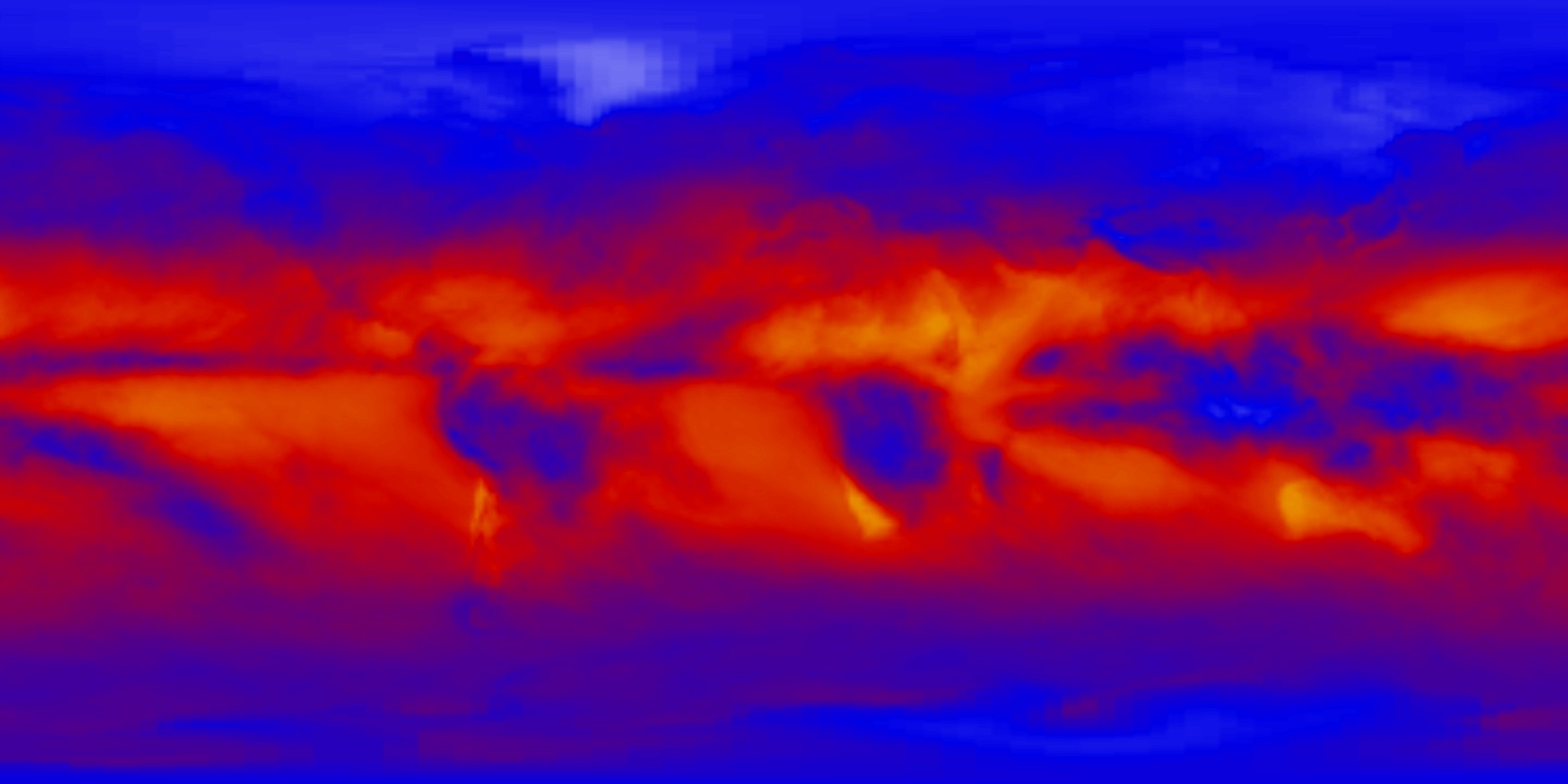
An Energy Budget

Net radiation contained within the Earth in December 2014, in Watts per square meter. Scale runs from red (+ 280) to blue (-280).
Behold Earth’s energy budget: This map shows the net radiation, or total amount of absorbed sunlight and heat energy, that didn’t manage to escape from the top of Earth’s atmosphere back into space this past December. In other words, it’s the energy that kept our planet’s biosphere alive.
Glowing With Life
There’s a lot more complexity to Earth’s heat engine than what I’ve shown here. Ocean and atmospheric circulation redistributes energy all over the planet, creating local climate and weather. But of course, the reason we care about any of this is because of what it means for life.
That’s why I’ll leave you with one of my favourite Earth Observatory images which underscores just how far a little heat and sunlight will go.
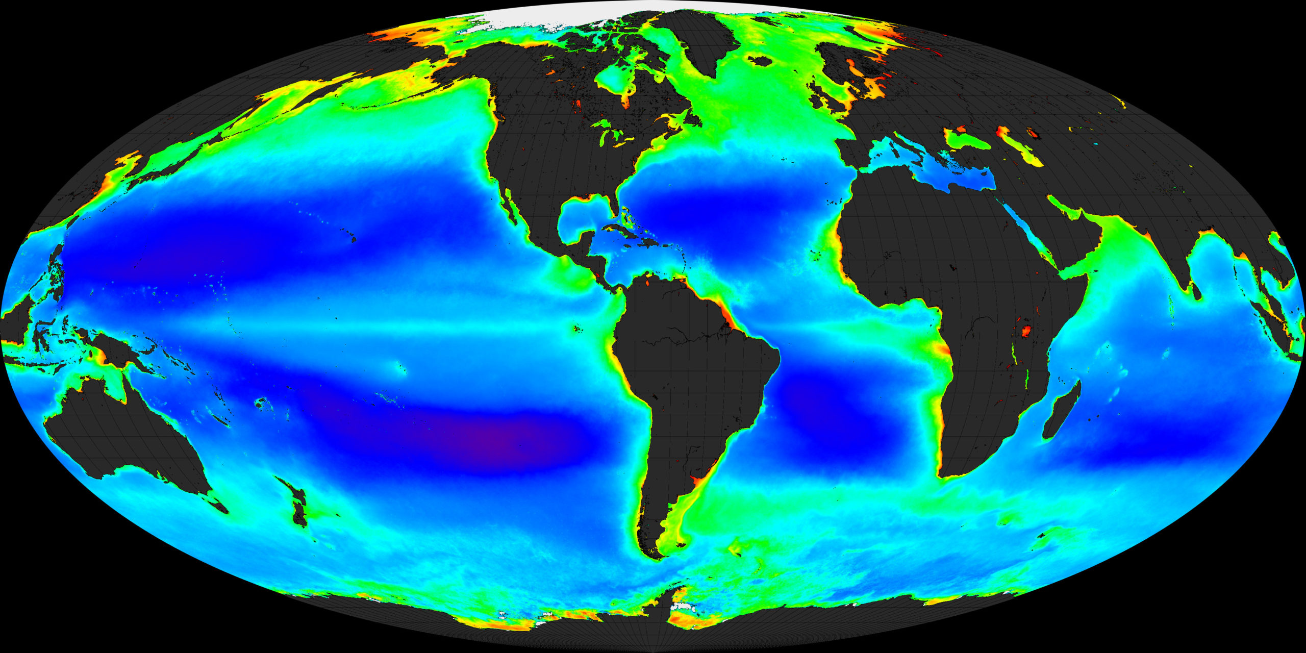
Global chlorophyll concentrations in the ocean. Warmer colours indicate higher concentrations. Image: NASA
This map shows chlorophyll concentrations in Earth’s oceans. Chlorophyll is the light-harvesting pigment used by microscopic phytoplankton to convert sunlight into energy. Scientists can measure chlorophyll from space because a) it’s incredibly abundant and b) it reflects light at very specific wavelengths.
Heat supplied by ocean currents keeps these planktonic sun machines alive, while light hitting the ocean’s surface affords them energy. Across the globe, phytoplankton pull nearly 50 billion metric tons of carbon out of the atmosphere every year, account for roughly half the world’s oxygen production, and form the base of marine food chains. It’s fair to say that life as we know it wouldn’t exist without them.
Our planet is, quite literally, aglow with life. Thanks for taking a moment to appreciate it.