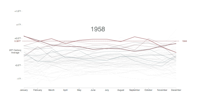
Last week, NASA and NOAA announced that 2014 was the hottest year in Earth’s recorded history. This animation by Bloomberg brings that finding into sharp focus.
Most graphs of the planet’s rising temperature just show one bar, averaged out over the year. In this animation, though, we see monthly records for each year overlaid on top of each other with a new time series in each frame. The dotted line which represents the year’s average moves each year too, while old records fade into the background.
The overall effect? Well, both a neat data visualisation and the terrifying truth that our planet just keeps getting hotter. Thirteen of the fourteen hottest years were in the 21st century — and that statistic looks unlikley to improve in the coming years if we don’t act hard and fast. [Bloomberg]