What does a world-class city need these days? Museums, skyscrapers, leafy parks, and, perhaps, a custom typeface.
Only the design nerds among us (hello there!) might scrutinise a city’s typeface, but beautifully designed letters exert a subtle power over us. The geometric lettering of the London Underground or the Art Nouveau stylings of the Paris Metro are as distinctive as the cities themselves.
The Guardian recently ran a fascinating article on cities that have branded or rebranded themselves with custom typefaces. We’ve looked at city branding before, but we were curious to see what more of those typefaces looked like, so here they are, along with some of our other favourites from around the world.
The typefaces rarely have creative names, which makes sense for, you know, branding. But they are varied and weird and capture something unique to each city.
Chattanooga — Chatype
Picture: Chatype
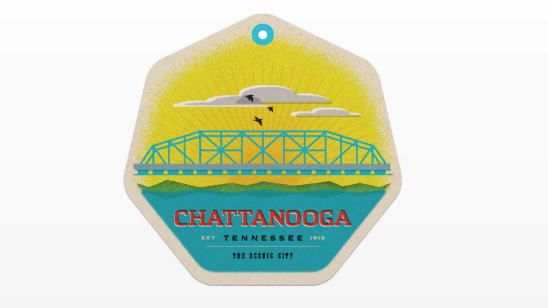
A few years ago, a band of designers raised more than $US11,000 on Kickstarter to create a typeface unique to the city. The former industrial city had fallen on hard times, and the designers wanted to do their own small part in revitalising it. They ended up with Chatype, a modern, geometric typeface that also manages to evoke the city’s old frontier spirit. The city has since adopted the typeface for its online presence and local public signage. The typeface is also available to download for free.
London — Johnston
Picture: pisaphotography / Shutterstock
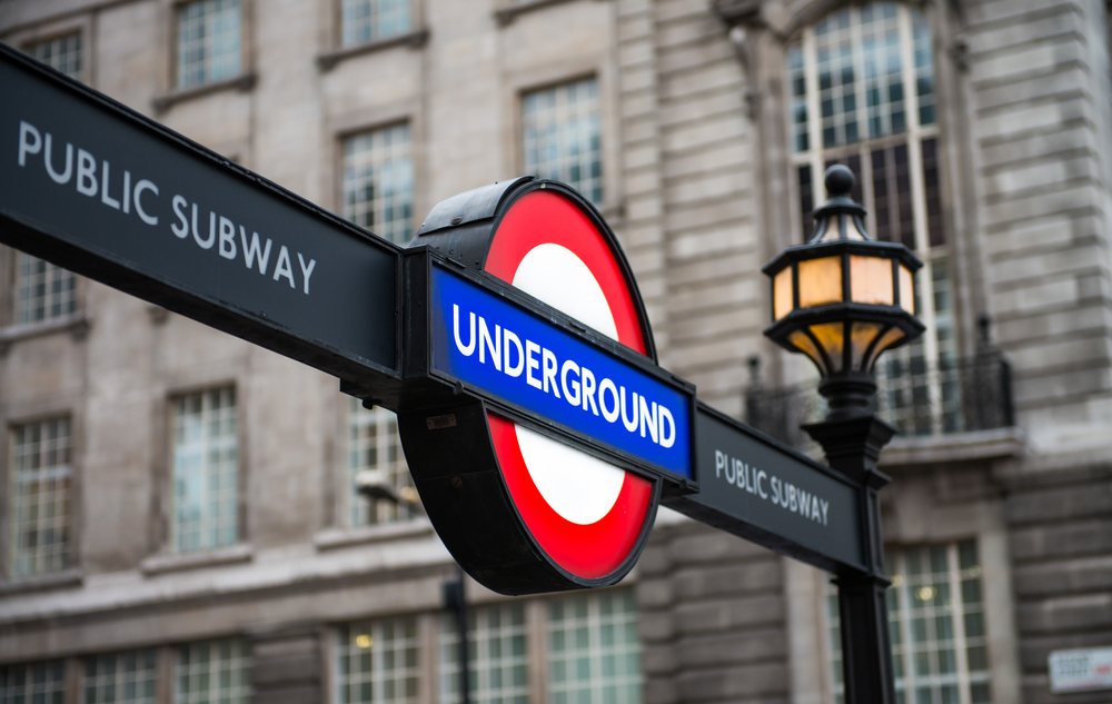
As in many cities, the typeface that looks most recognisably London is the one adorning its transit system. Designed by Edward Johnston, the namesake typeface has been used in London’s public transport since 1933.
Johnston’s student Eric Gill created a very similar version of the typeface called Gill Sans that has since been dubbed the “Helvetica of England.” You can find Gill Sans everywhere from the trains of the London and North Eastern Railway to Penguin books to the Microsoft Word program likely already on your computer.
Berlin — BMF Change
Picture: Alessio
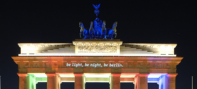
Projected here onto Brandenburg Gate, BMF Change was designed especially for the “Be Berlin” campaign that kicked off in 2008. It’s also emblazoned onto humbler parts of the city: trash cans, billboards, t-shirts. The typeface is designed by Alessio Leonardi, who is actually Italian.
Milan — Milano City
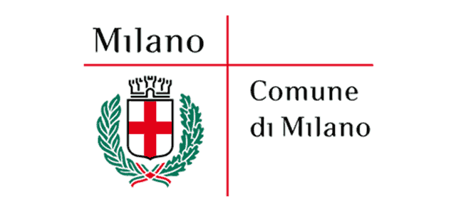
So many of the fonts commissioned by cities are sleek and geometric, obviously meant to have a modern edge. Milano City created by Inarea Strategic Design stands out as a typeface that is rounder and softer, evoking history without seeming fussy.
Eindhoven — Eindhoven
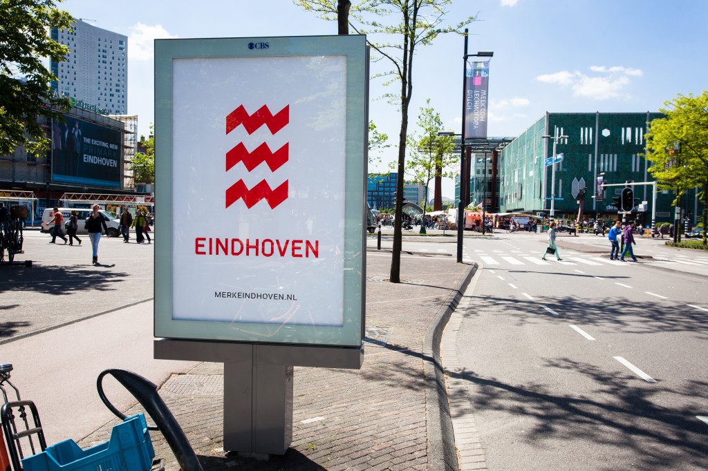
Pictures: Edhv and Eindhoven 365
When Eindhoven redesigned its logo to be a trio of red zig zags in 2013, they created a typeface to match. The typeface (also called Eindhoven) has the same jagged edges, giving it a dynamic and unfinished quality. The Guardian notes the original sketches were made of out of sticky tape, the resulting influence of which you can still see in the letters’ missing corners.
Stockholm — Stockholm Type
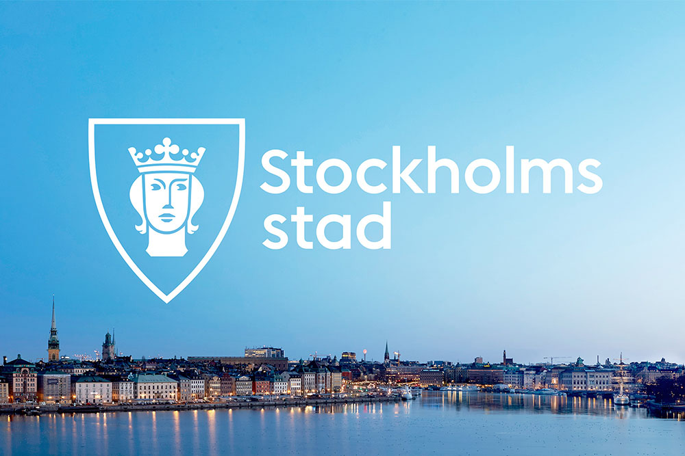
Picture: Essen International via Brand New
In 2014, the design agency Essen International was tasked with giving the Swedish city a whole new look. So they gave St. Erik, Stockholm’s patron saint, a facelift and came up with Stockholm Type, a clean geometric typeface. Stockholm Type has appeared everywhere from city museum signage to the brochure of the Stockholm Kulturfestival. It is also proudly on display all over the City of Stockholm’s website.
Minneapolis and St Paul — Twin
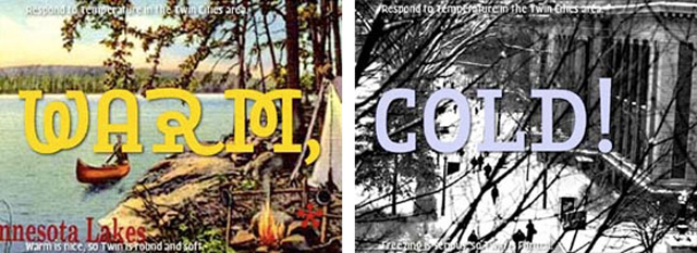
Picture: Nevolution
Back in 2003, the Twin Cities held a competition inviting six design firms to create a new municipal typeface. The competition was ultimately unsuccessful — none were chosen — but it did inspire one spectacularly weird typeface by the Dutch firm LettError. Most typefaces come in a handful of weights and styles (bold, italic, light etc.), but Twin would come in ten wildly different ones. The designers even suggested the typeface could morph with the cities’ weather when displayed on digital screens. There was a digital revolution coming — why cling to the limits of print?
Berkeley — Rennie Mackintosh
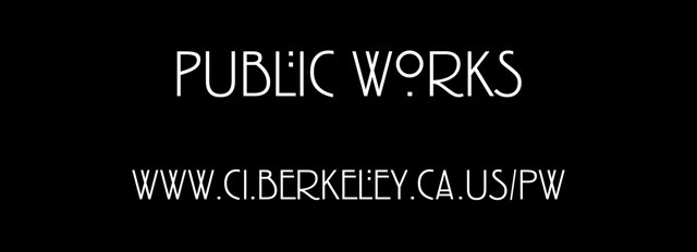
Picture: City of Berkeley Public Works Promo
One for the home team. When I first moved to Berkeley, I was surprised to find the city’s official signage rendered in such a whimsical typeface. (But then again, maybe I shouldn’t have been surprised.) Rennie Mackintosh is named after the Scottish artist of the same name, a seminal figure in the Art Nouveau movement in the U.K. It wasn’t actually created by Mackintosh himself, but you can see the influence of his distinct Art Nouveau style in it. Berkeley has been using the typeface since 1996, though now it might be more popularly associated with American Horror Story. Hmm.
