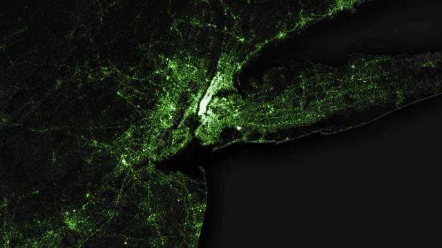
If you’ve tweeted in the past 3.5 years, you’re probably on this map. A data artist named Eric Fischer has spent the past few years on the seemingly Sisyphean task of tracking every single geotagged tweet, and he recently posted the final product: A lovely light map of 6.3 billion tweets.
Fischer, who works at the mapping startup MapBox and has produced some pretty incredible maps in the past, pulled almost four years of data from Twitter’s API to make the map. He gives a detailed rundown of how it works in this blog post, and explained how we should interpret the data. For example, if 300 people tweeted from the same location, the map only draws one dot — it wouldn’t make sense to put 300 dots on top of each other. Even getting rid of the duplicates, his final map is still extraordinarily huge: He says it’s “nearly three terabytes of compressed JSON.”
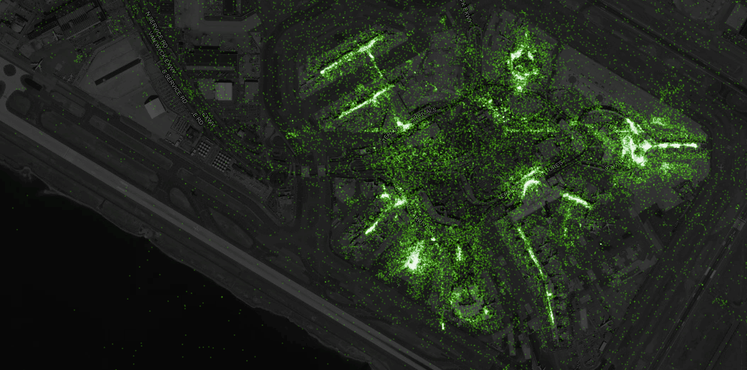
While it’s not as though you can glean very much information from the map — after all, it’s essentially a massive picture of years of Twitter use, not showing change over time or any other metrics — it’s a beautiful and fascinating project. Particularly cool are zoomed-in portraits of city infrastructure. Here’s a shot of JFK airport, the terminals of which are clearly outlined by tweets:
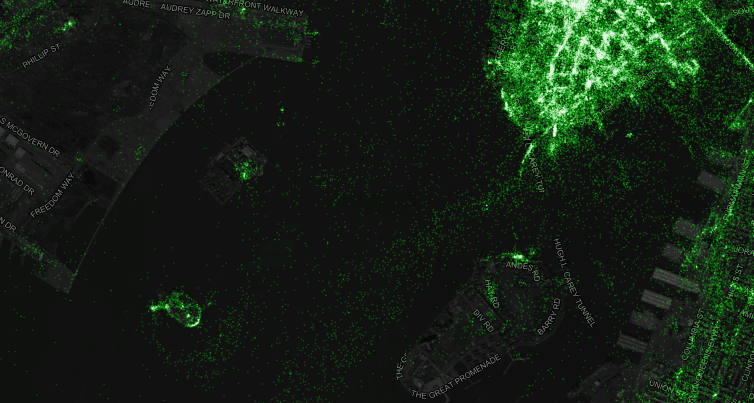
Or the water-bourne tweets, which are shown in this detail where ferries leave from Manhattan to other parts of the city:
Another interesting detail from his explanation is the fact that Fischer has watched Twitter evolve over the past four years: He says that at the beginning, users generated about 3 million geotagged tweets per day. Now, they generate about 10 million per day, or 120 tweets per second. Wonder how many we’ll be generating in another four years? You can check out the full rundown, and learn how to make your own map, over on MapBox. [MapBox]