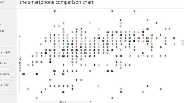
Picking out a new phone involves weighing a lot of different variables, from screen size to storage to price. That’s why so many tech blogs offer comparison charts to help readers figure out what makes sense for them. We might as well just give up though, because Gnod (“The Global Network of Discovery”) already invented an ideal tool.
You only want to look for phones under 5 ounces (142g)? No problem, Gnod’s comparison map will helpfully arrange all lightweight phones on a chart showing price and size. Only want to look at Samsung’s offerings? There’s a brand filter. And a CPU filter.
Gnod released a set of product comparison maps to help people figure out which smartphone, laptop, flash drive, MP3 player and SSD drive is right for you. The maps adjust based on what you’re looking for, so they take all the top available products and let you fiddle around with the features you’re looking for until you’re presented with an easy-to-read chart of options.
Marek Gibney, who created the charts, plans on doing tablets and 3D printers next.
I haven’t seen a better way to narrow down a gadget search than these charts. I do not normally get excited about spec comparisons but these maps are very well done and genuinely useful and I wish I could embed them so you could use them on our site but I highly encourage you to use them on Gnod’s website. [Gnod]