Yesterday the overhauled Google Maps app rolled out for iOS and Android, giving us access to new features like the ability to book restaurants inside the app. But it also gives us a peek at how Material Design will transform the whole suite of Google-built products.
The release of Lollipop this week was our first comprehensive look at the design framework laid out by Google’s Vice President of Design, Matias Duarte, earlier this year. But anyone not running Lollipop — which is to say almost everyone, at this point — has been relatively insulated from Duarte’s vision for UI design. Google Maps 4.0 is our best glimpse yet of how the ideas laid out by Duarte will change Google’s entire family of products.
So what’s changed? Here’s a little walk through the process of getting directions. As you can see, the address line is bigger and cleaner, and the UI has been wiped of the pinstripes and shadows of yore:
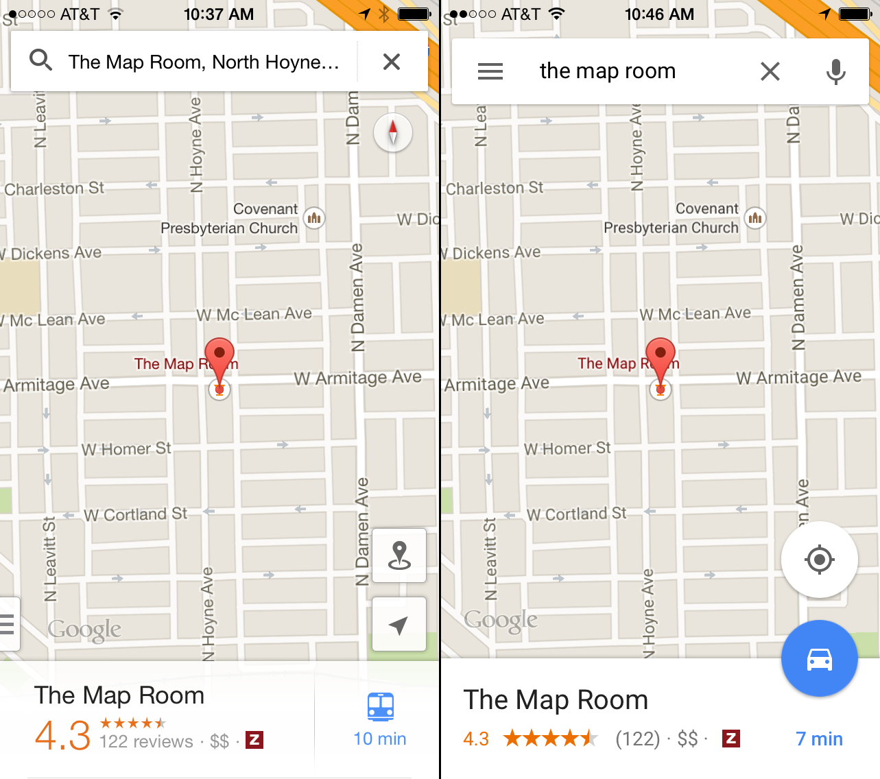
There’s also a push-to-talk button in the address box now while other options have been corralled into a hamburger icon. Also notable? The bigger buttons for directions and my location, which are circular now and overlaid between the map and the dialogue box.
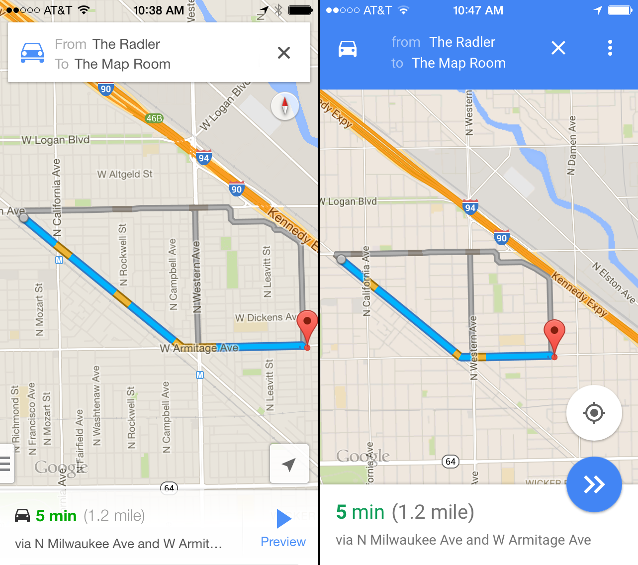
Google has also replaced its drab grey colour scheme with a poppy blue version, as you can see from this shot of the directions page:
Another big update is visible in the options, where you choose between various routes to your destination. Interestingly, the old version of Maps laid each option out as a card with shadows. That’s a thing of the past now, and the 3D effect has been flattened and boosted with some colour:
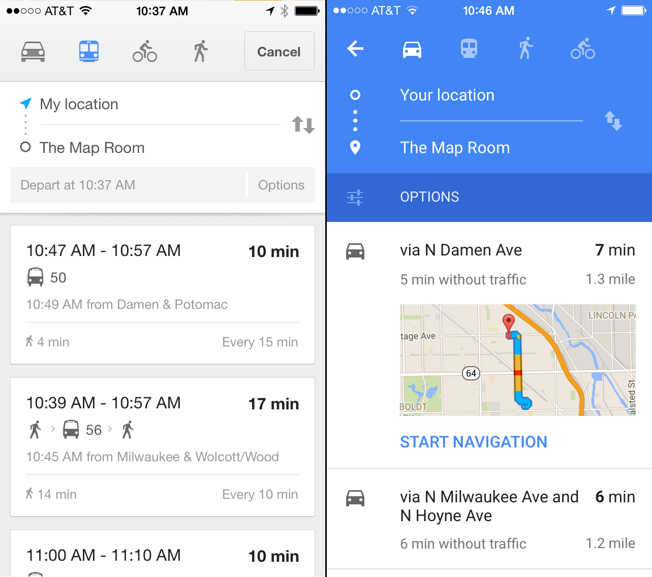
The actual route page gives us a good overview of the major changes. The icons are bigger, cleaner, and more rationally placed on the page. Google’s drab old colour scheme has been punched up. The proportions between the dialogue boxes and the maps are finally more even.
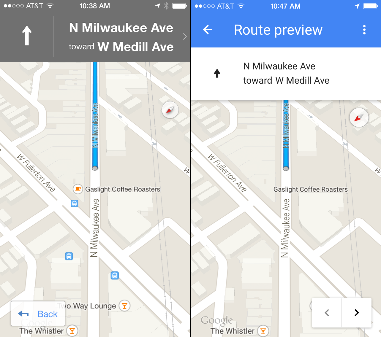
And finally — finally! — all those arrows are differentiated. Now we know which one means direction, which one means “back,” and which one lets you preview the next step. Clarity.
While we’ve all been excited to see the big, beautiful changes Material Design will wrought, it’s nice to see that the underlying logic of Duarte’s manifesto is the rational display of information. These aren’t earth-shaking changes, they’re a group of tweaks that make Google Maps better for users — which, amidst all the hype, it’s easy to forget it the ultimate end goal. [iTunes; Google Play]