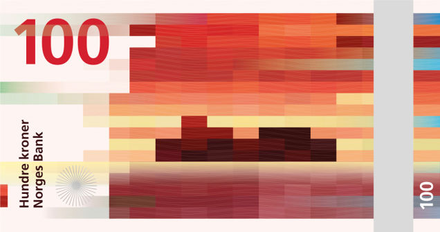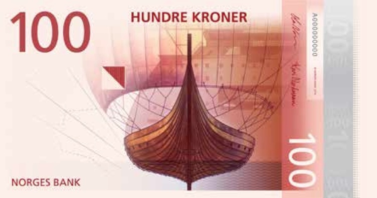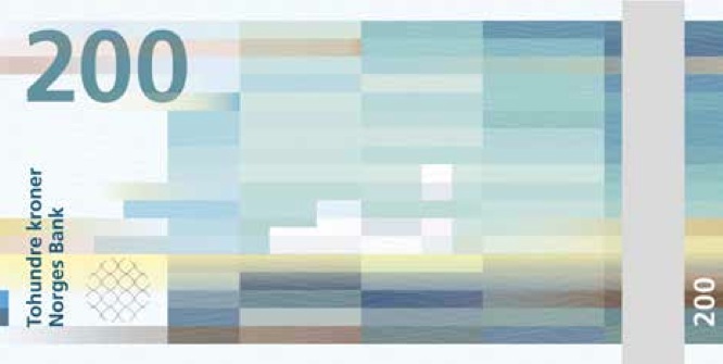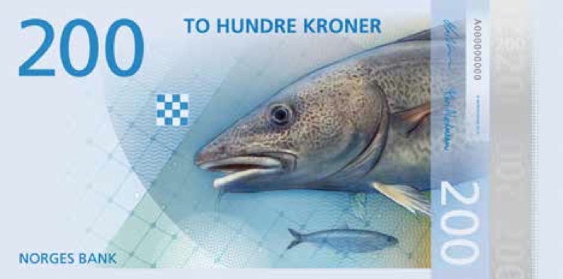
Earlier in the week, we learnt that Norway had chosen a new design for its banknotes — a pixelated little number by the architects at Snøhetta. While their design is tasteful and restrained, it can’t possibly live up to the charm of sea life drawn by kids. Which was exactly what one designer proposed.
The competition held by the Norse central bank stipulated that all designers stick to a theme: The sea. And while the winning design is lovely, we’d be remiss if we didn’t honour the genius of some of the runners-up, as Qz pointed out yesterday. Check them out below.
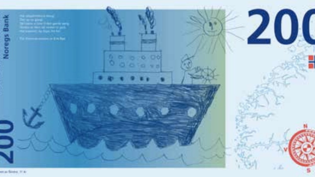
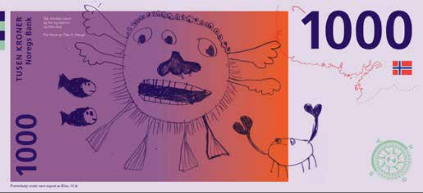
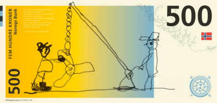
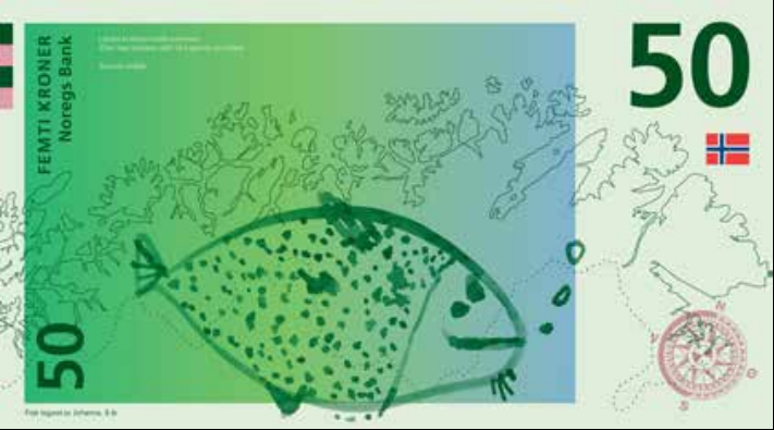
Aslak Gurholt Rønsen
Rønsen’s contribution involved having children redraw the sea life on each side of the note, resulting in masterpieces like these:
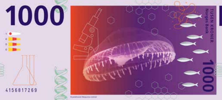
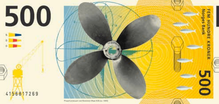
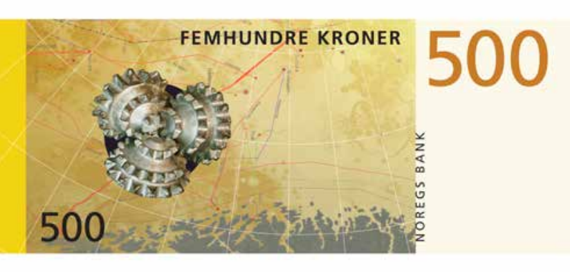
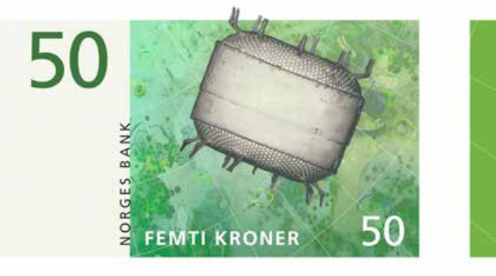
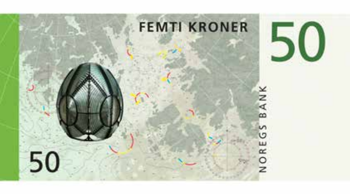
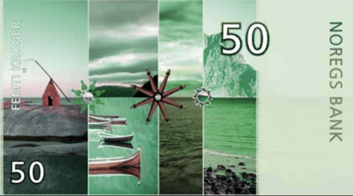
Ellen Karin Mæhlum
Meanwhile, designer Ellen Karin Mæhlum also played on the dual-sided theme by blanketing each note with a piece of sea life on one side, and a formally similar marine tool on the other — from fish hooks to drill bits to lighthouse lenses.
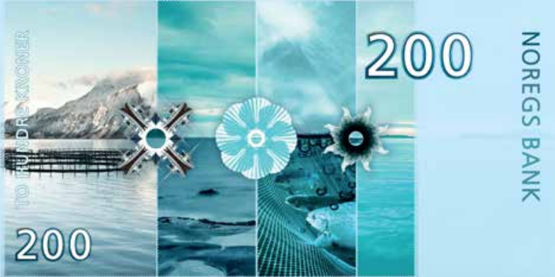
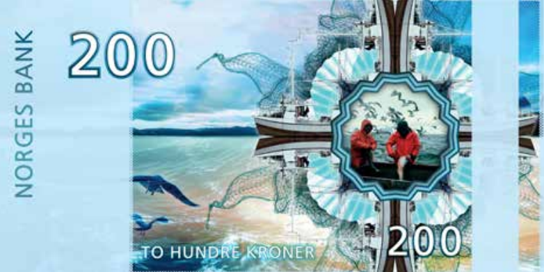
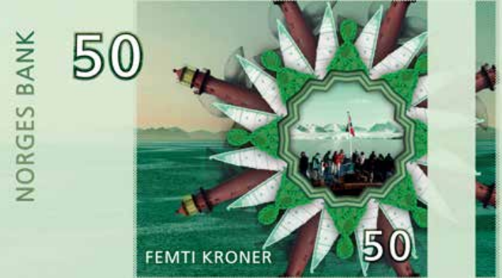
Blæst Design
Blæst Design went PoMo, cutting up pieces of more traditional banknote design and turning them into wild rosettes of patterns, colours, and Norwegian symbolism. Look closely, and you’ll see long ship tails, fishing nets, and other details woven into each starburst.
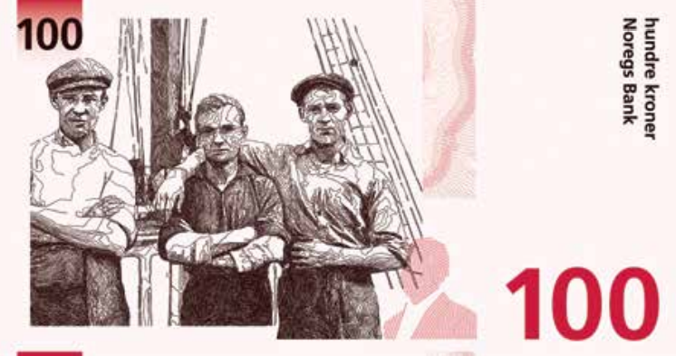
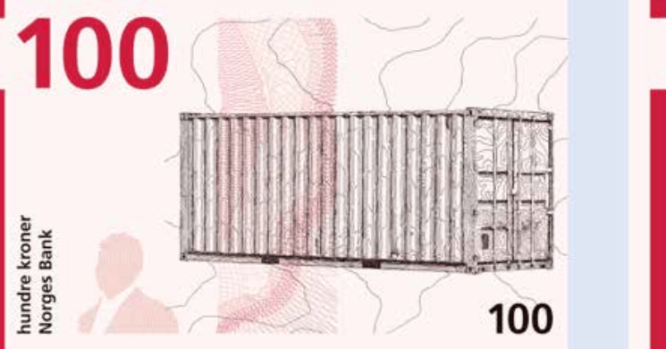
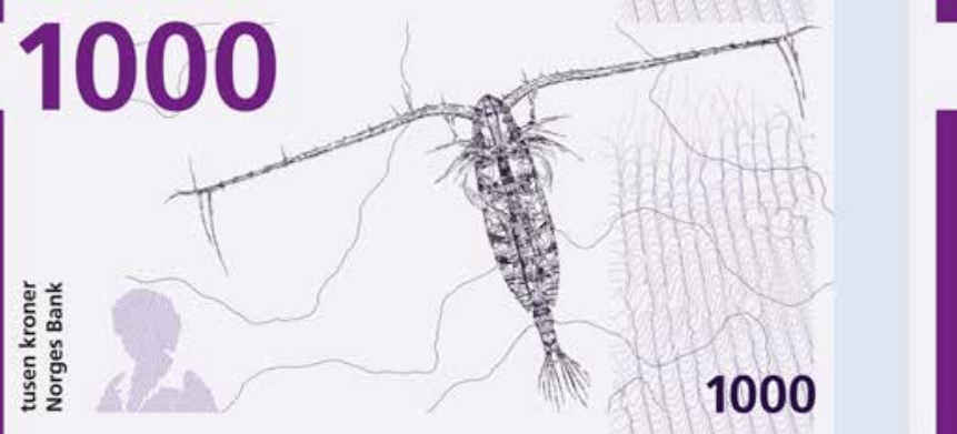
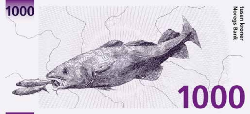
Pati Passero and Christian Messel
Designers Pati Passero and Christian Messel took the sea brief very literally, lining their notes with moody, wispy drawings of the day’s catch, fishermen, and even a shipping container.
In the end, the submissions from two other teams ended up winning — check them out below. You can see the entire series of entries considered in this PDF. [Qz]