Just a year and a half ago, we noted the demise of skeuomorphism in Apple interface design. Today, Co.Design’s John Brownlee points out that “the most-hated design trend” is back with Apple Watch’s clock-like interface. But skeuomorphism never really went away. In fact, we should all hope it never does.
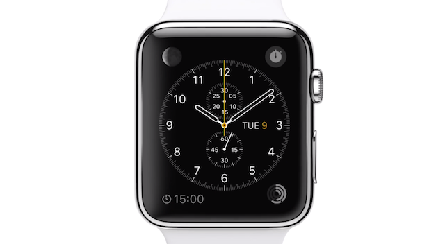
Brownlee’s interesting post points out that the face of the Apple Watch looks a whole lot like a real watchface, and that the watch itself is designed to feel and act like a traditional watch. It’s the return of skeuomorphism, a little more than a year after Jony Ive banished it to the island of lost design trends. But is skeuomorphism just a trend that emerged over the past few years? In reality, it goes back centuries, and it has played an incredibly important roll in modern culture.
Barring some extraordinary evolutionary jump in the brains of humans (and iPhone users), it’s never going away. Thank goodness.
What we talk about when we talk about skeuomorphs
There are so many different definitions of skeuomorphism pinging around the internet, and the Apple Watch gives us a second to talk about what we mean when we say it.
The most obvious definition is all about visual style: The tacky leather bindings on the old iOS calendar. The gaudy green felt on the Game Center. The shadows and reflections on every single UI button and object, thanks to some hidden, never-setting sun.

All of these details are mimetic; they mimic real-life objects in digital space. When Jony Ive cut them out of iOS 7 with surgical precision, it was hailed as “the end of skeuomorphism”. And now that a very photorealistic clock face has made its way back into Apple’s design language, it’s being hailed as the return of the same. That oversimplifies things a tremendous amount. It’s definitely true that Apple is using some mimetic design details in its Apple Watch. But this is a superficial way to talk about skeuomorphism, which goes much deeper than the textures and style of graphic elements on your screen.
If skeuomorphism was just an ugly-arse, past-its-prime visual style, we wouldn’t need to write about it. But there’s a more structural function for skeuomorphism, as Brownlee also points out, and it deals with teaching users how to use new technologies.
They’re clues, not clutter
It might help to give this tool another name. And for that, we can go all the way back to a time when computers were just emerging. In the 1970s, an environmental psychologist named James J. Gibson described it as The Theory of Affordances. Humans perceive the environment around them, Gibson argued, as a series of “affordances“, or objects that offer some clues to a potential use or action. They help us understand what it possible in our environments.
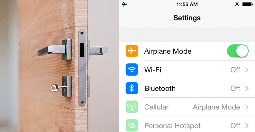
In the real world, a handle on a door is an affordance. In the digital world, a button that looks like we can slide it, like the one used across iOS 7, is an affordance (here are some other examples, courtesy of Quora). We perceive these visual clues about our world and act on them.
Picture: VOJTa Herout
But you didn’t click on this article for Cognitive Psychology 101, so what do affordances have to do with design? It’s simple. Each use of skeuomorphism represents what usability expert Don Norman, author of The Design of Everyday Things, describes as a “perceived affordance“, or a design detail that tells you, the user, that some action is possible on your screen. Another great example of digital affordances, from iOS 7, is the use of tabs in Safari or buttons on the calculator:

Perceived affordances have absolutely nothing to do with minimalism or clutter or the reigning style. They help the user understand what a particular device, button, or app is even capable of, every bit as intuitively as the handle on a door might.
Apple Needs Skeuomorphism, and So Do We
So skeuomorphism isn’t a trend or a binary. It’s not Forstall against Ive, or shadows versus flatness.
It’s more like a spectrum, or a colour palette, that designers have at their disposal. At one end, we have gross misuse: Fake wood, fake leather, fake shadows. At the other, we have thoughtful use of perceived affordances: A digital clock face that looks a lot like a normal watch, because it’s easier to read. Great design assumes users are smart enough to do without the fakery — but it also knows how to use existing cultural references to its advantage.
So before we call out Apple for letting a little skeuomorphism leak back into the interface of the Apple Watch, consider that our very fallible human brains need those door handles — those perceived affordances — to function. We will still need them, decades from now, when we’re all excited awaiting the release of Apple’s iContact Lens, or whatever interface we’ll be blogging about from the comfort of our flying cars.
Skeuomorphism is not a design crime. It’s the language that human designers have written to let humans talk to machines. That’s not something we should hate. If anything, its return marks the settling of new technological frontiers, unexplored territories that we need a little help to navigate.