
Apple just released OS X Yosemite. It looks pretty nice. The typeface is new. The menus are frosty. The new “Dark Mode” is dashing. And, best of all, the icons are fresh and delightful. Well, most of them are.
In order to separate the improved icons from the terrible ones, we ranked them. All rankings are based on intensive objective analysis and are final and indisputable.
In order to keep things from getting out of hand, we’ve limited our ranking to the dock icons. There are, of course, more new icons in Yosemite, so if you have strong feelings about those — looking at you Game Center — then please let us know in the comments.
21. Keynote

20. Pages

19. Numbers

18. Contacts

17. Facetime

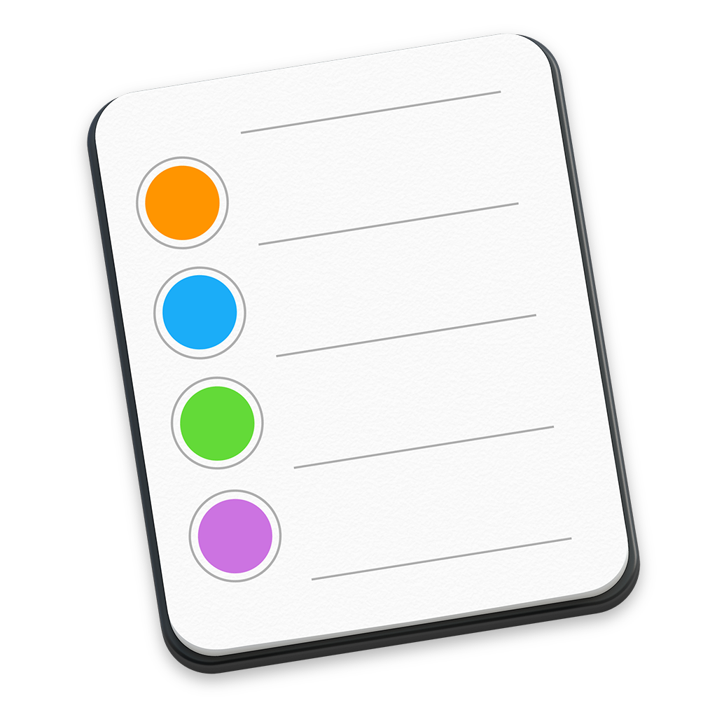
16. Reminders
15. Downloads Folder

14. Mail

13. Maps

12. Messages

11. Notes

10. Calendar

9. App Store

8. iBooks

7. Launchpad

6. Finder

5. iTunes

4. Trash Empty

3. Trash Full

2. Safari

1. System Preferences