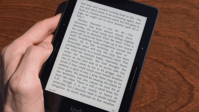
Amazon’s $US200 Kindle Voyage ereader is as good as it gets. But just how good is that new glass screen compared to the Paperwhite’s plastic panel? You may (or may not!) be surprised at the difference.
DPI
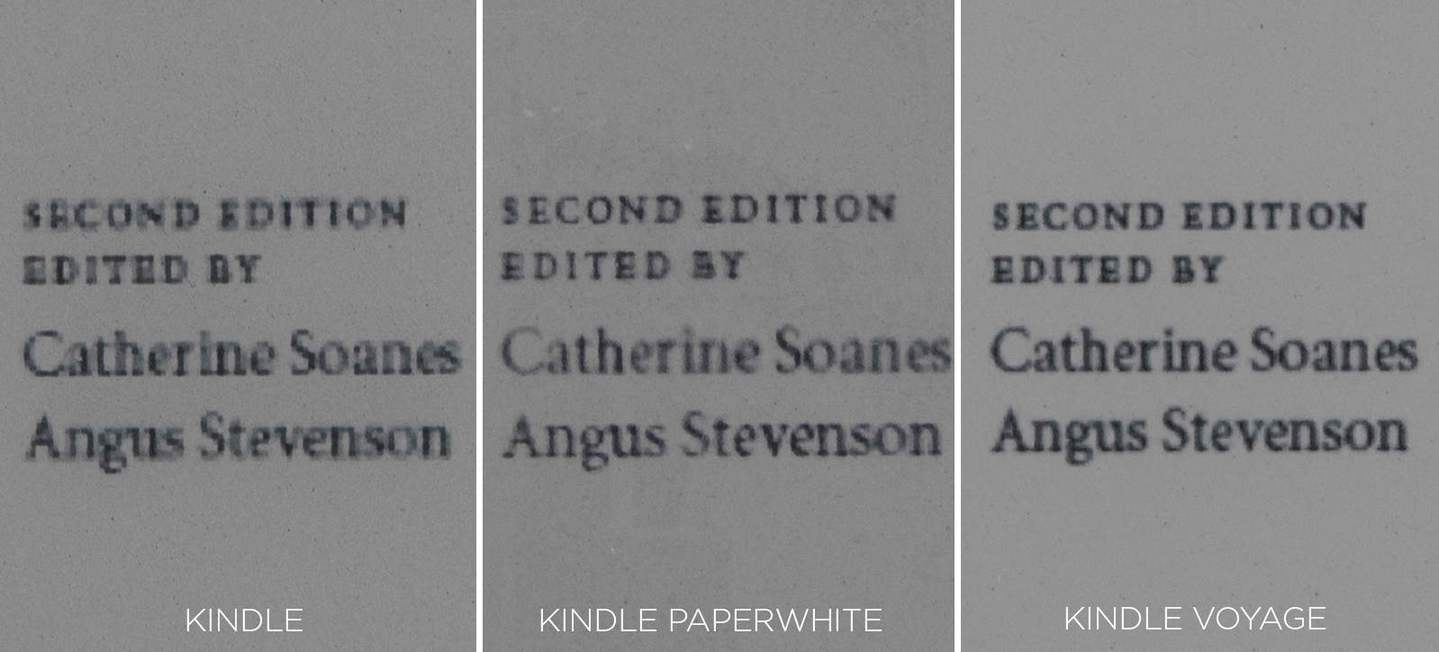
There’s no question: if you’re reading books with tiny fonts, the Kindle Voyage’s 300 dot-per-inch (DPI) screen makes words look a little bit better. The letters appear fuller, deeper and blacker thanks to better defined edges — because fewer pixels are accidentally displayed as white in the attempt to accurately display the shapes of each letter.
Clarity
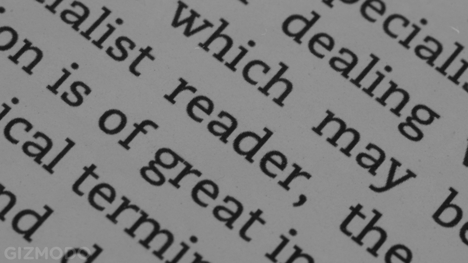
Kindle Voyage
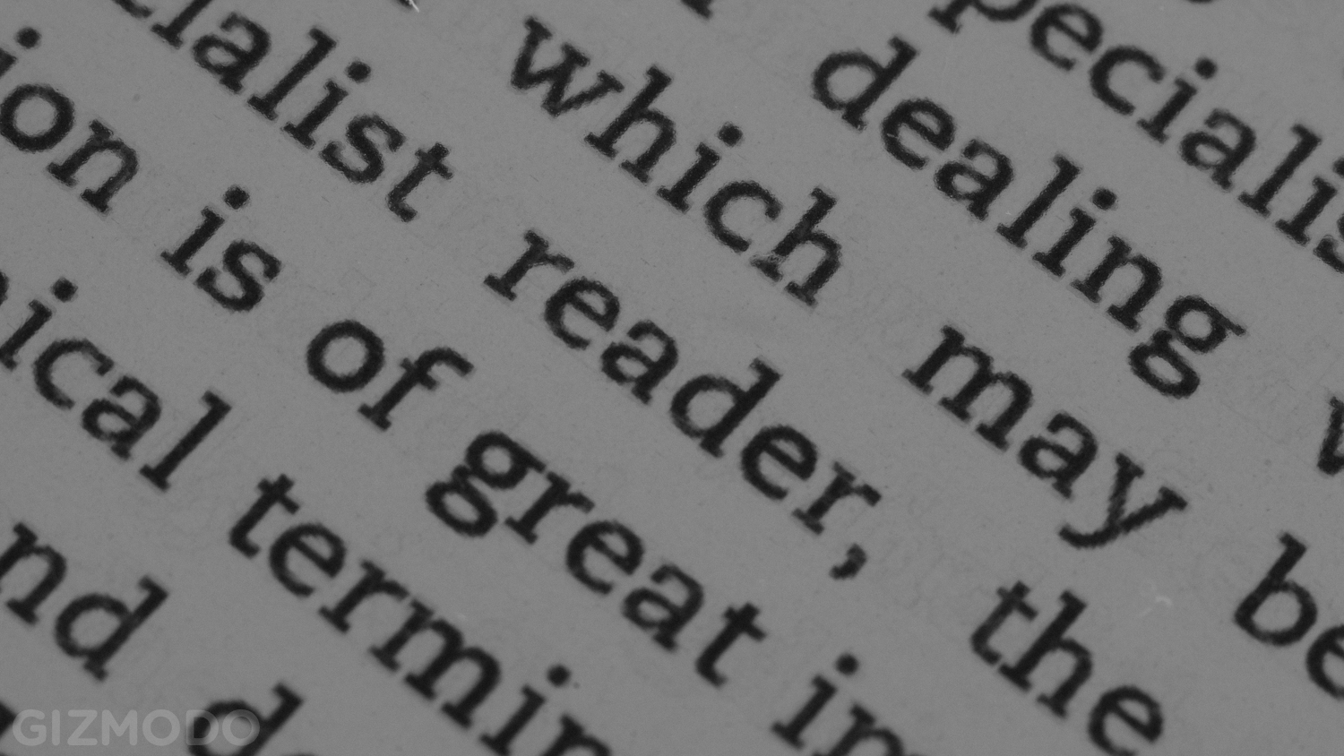
Kindle Paperwhite
Not all of the Kindle Voyage’s clarity comes from higher DPI, though. The actual construction of the touchscreen display contributes to the screen’s clarity. Tap the Expand button on the images above to zoom in, and take a good look at the word “reader”. See the optical distortion?
Glare
Kindle Voyage
Kindle Paperwhite
Pretty self-explanatory. The Kindle Voyage’s micro-etched glass display diffuses light shining on the screen, meaning less sun in your eyes when you’re trying to read. Sure, you could just move somewhere with less glare, but why lose your perfect spot on the beach?
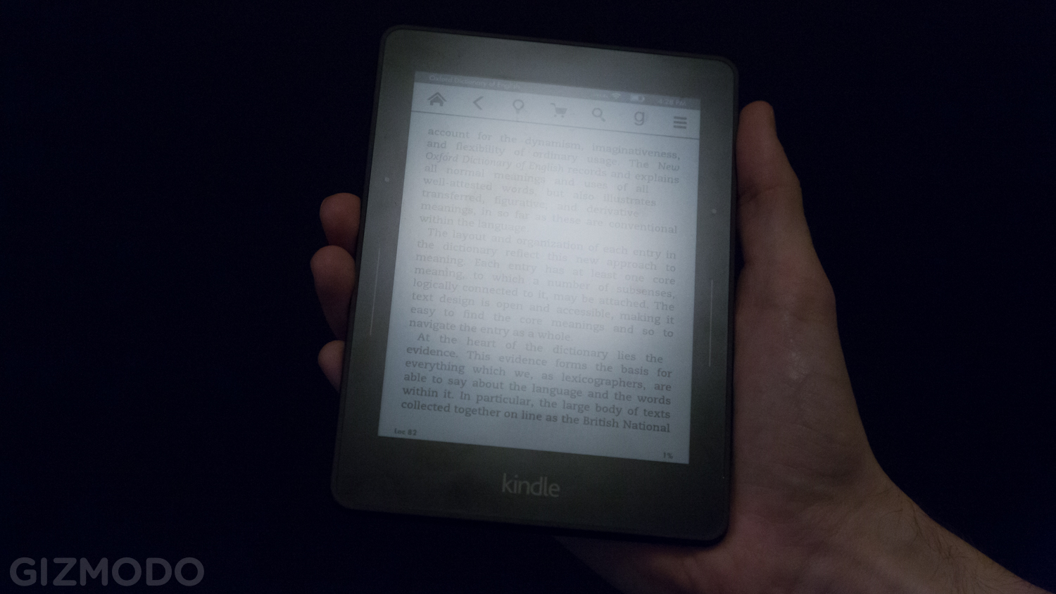
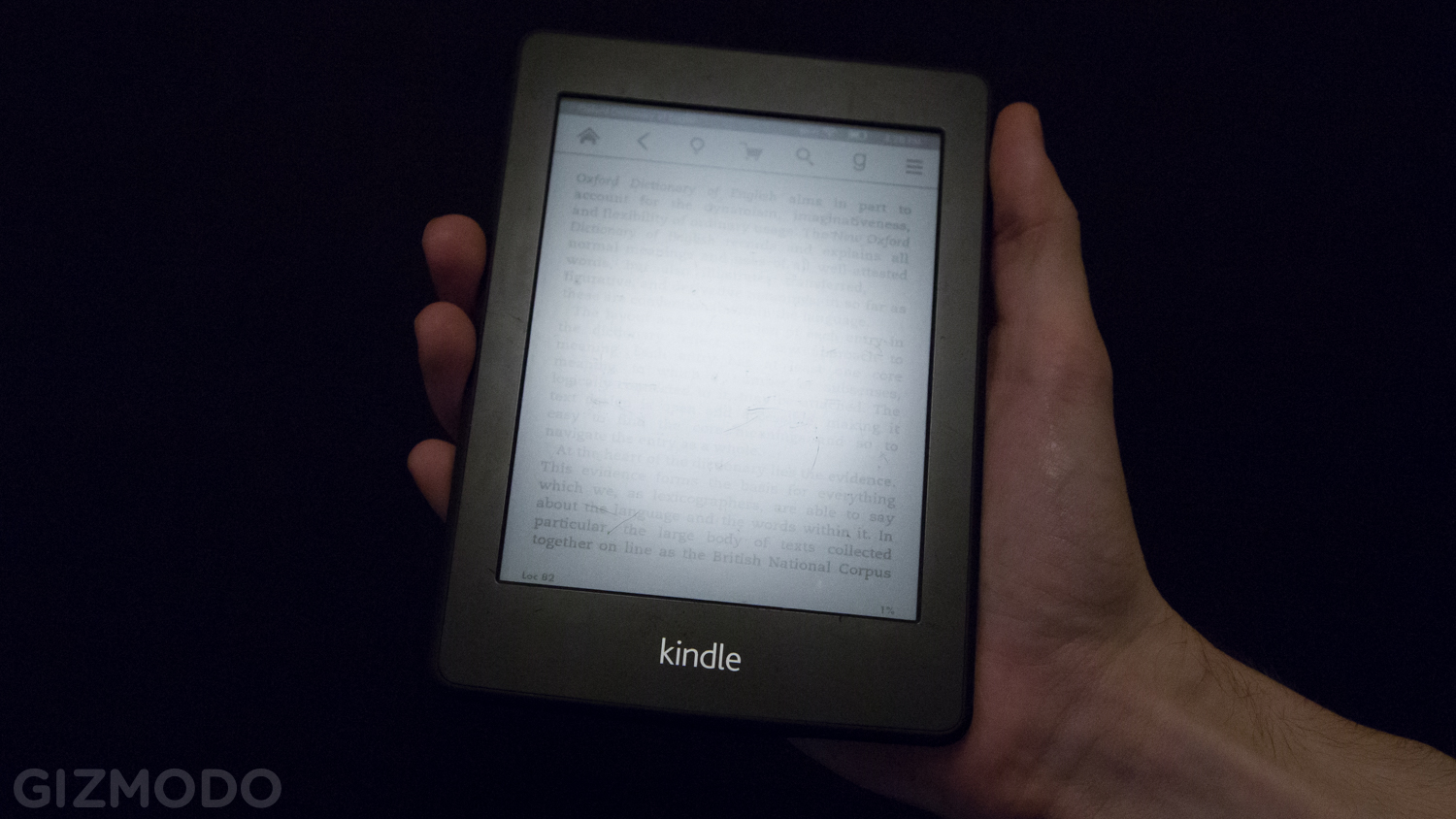
Night Light
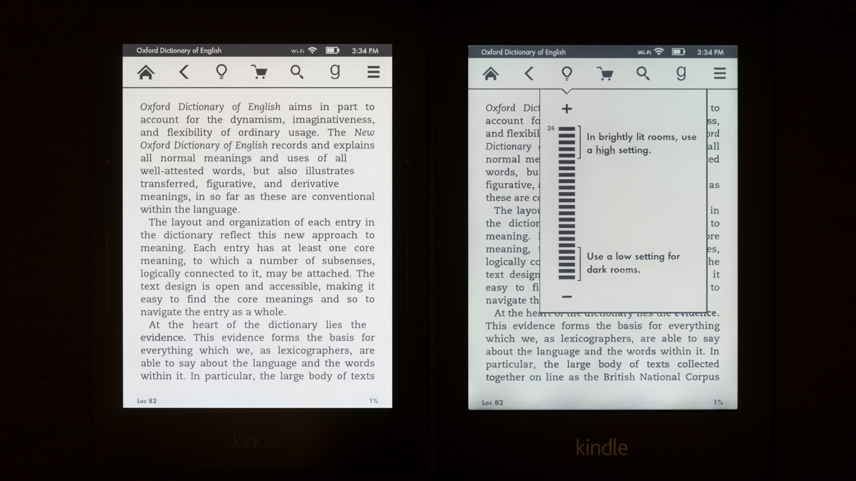
Voyage (left) vs. Paperwhite (right)
When you’re reading in the dark, the Kindle Paperwhite’s lighting tends to bleed a little unevenly across the page, creating bright spots and dark spots. It’s particularly noticeable at the bottom edge of the panel. Does the Voyage tolerate that? Hell nah. Spot-free and proud.
Is It Enough?
That’s up to you. None of these differences will wreck your day. The Kindle Voyage is currently only available in the US.
Pictures: Michael Hession