There’s been a swift and concerted backlash against terms like “infographic”, and for good reason. But that doesn’t mean that there aren’t data journalists and designers doing fantastic work — from The New York Times‘ Graphics Desk to National Geographic‘s design team.
The Best American Infographics 2014, a new book from Houghton Mifflin Harcourt, collects some of the best visualisations of the year in lovely large-format. In an introduction, FiveThirtyEight‘s Nate Silver describes how data design isn’t just about numbers — it’s inherently linked to journalism; to telling a story visually. “At the core of journalism is the mission of making sense of our complex world to a broad audience,” he writes. “Newsrooms from The New York Times to Buzzfeed place emphasis on gathering information. But they’re also in the business of organising that information into forms like stories.”
Below, you’ll find several graphics included in the book — many pulled from newspapers and magazines — that each use data to parse a broader narrative about the world that goes far beyond numbers.
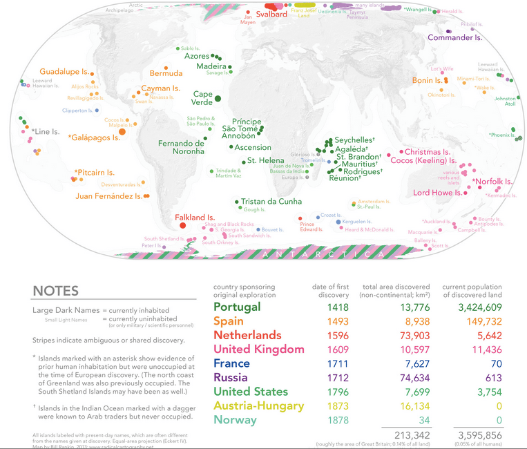
The Things Europeans Actually “Discovered”
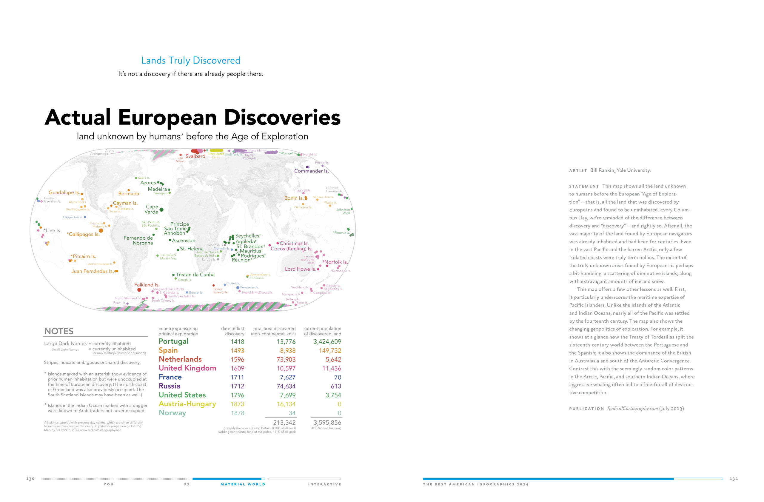
Colonial Europeans talked a pretttttty big game about the Age of Exploration — game that is somewhat less impressive when considered in light of the fact that many of these “newly-discovered” lands had been inhabited by humans for thousands of years. Yale’s Bill Rankin, who makes two appearances on this list thanks to his excellent work on his blog, Radicalcartography, decided to map out what discoveries were actually legitimate — which places were actually, truly unknown to humans before European explorers landed.
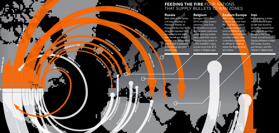
America’s Immense Global Ammo Trade
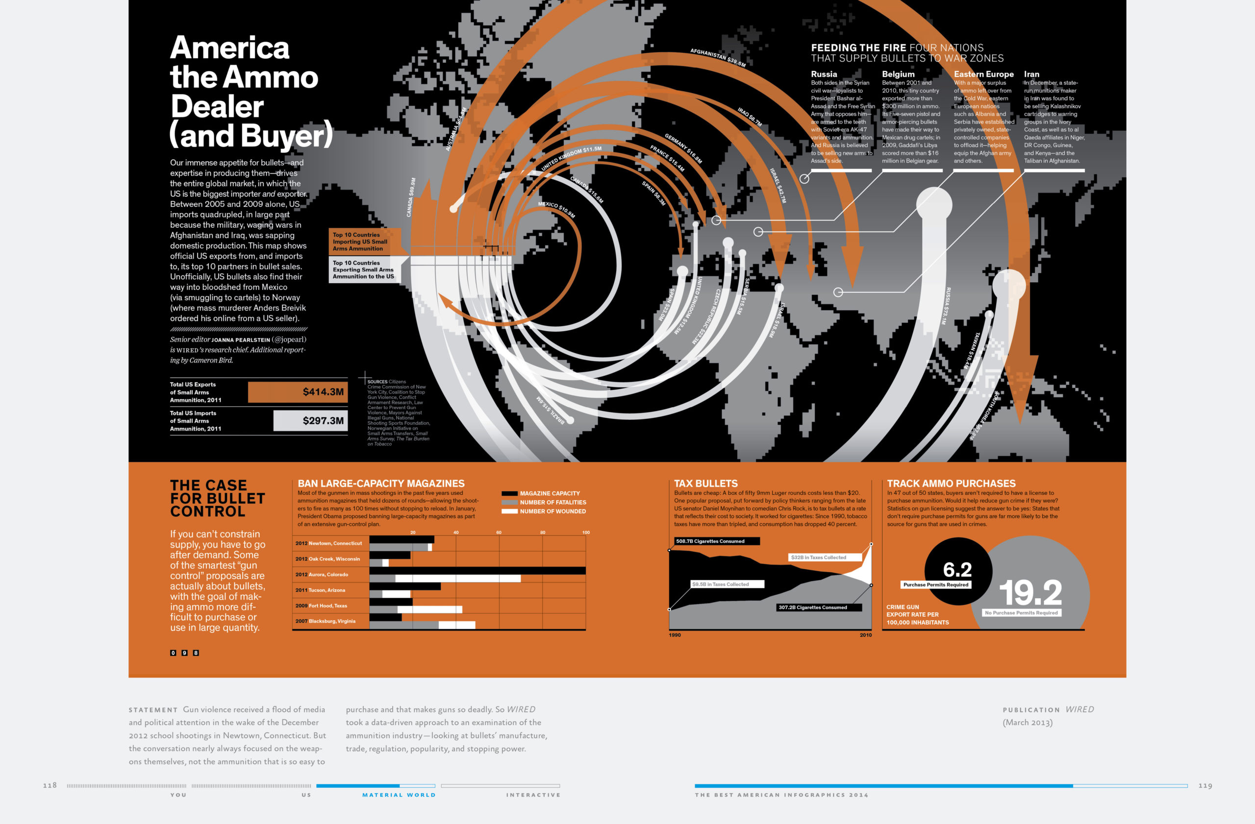
While the debate over gun control wages on, some advocates are instead arguing for legislation that controls the bullets instead of the weapons. Look no further than this Wired graphic, which demonstrates incredible volume of ammo being exported and imported to the US — the world leader in both metrics. By tracing the path of ammo to and from conflict zones, we get a glimpse at a hidden economy that is the very lifeblood of many ongoing wars.
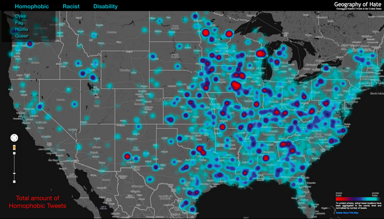
Hate Maps
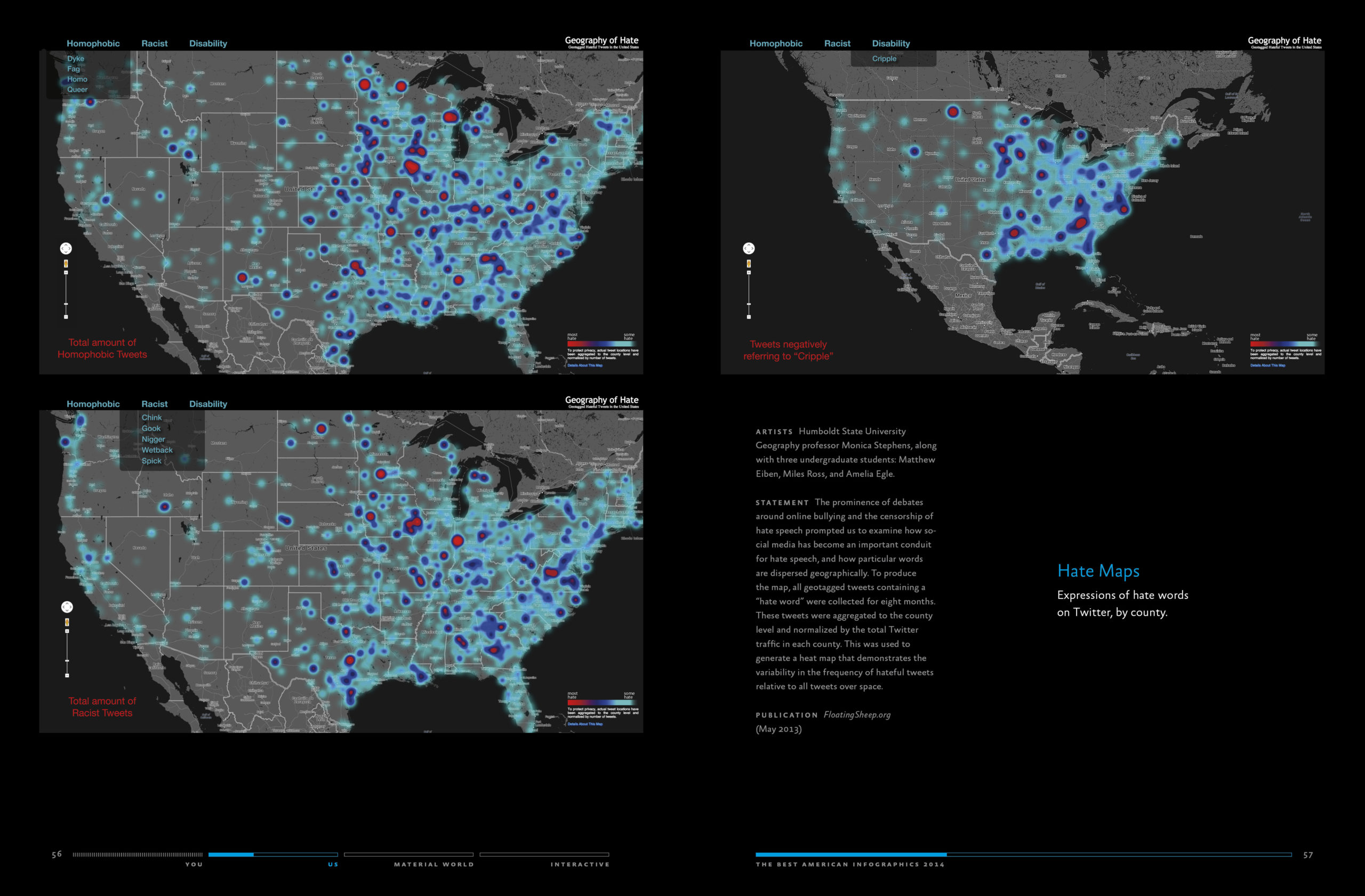
A group of four researchers from Humboldt State University spent eight months collecting tweets that included specific words related to hate — from racial epithets to slang for the disabled to homophobic slurs — to create a geo-located map of hateful language.
Where’s the Real Midwest?
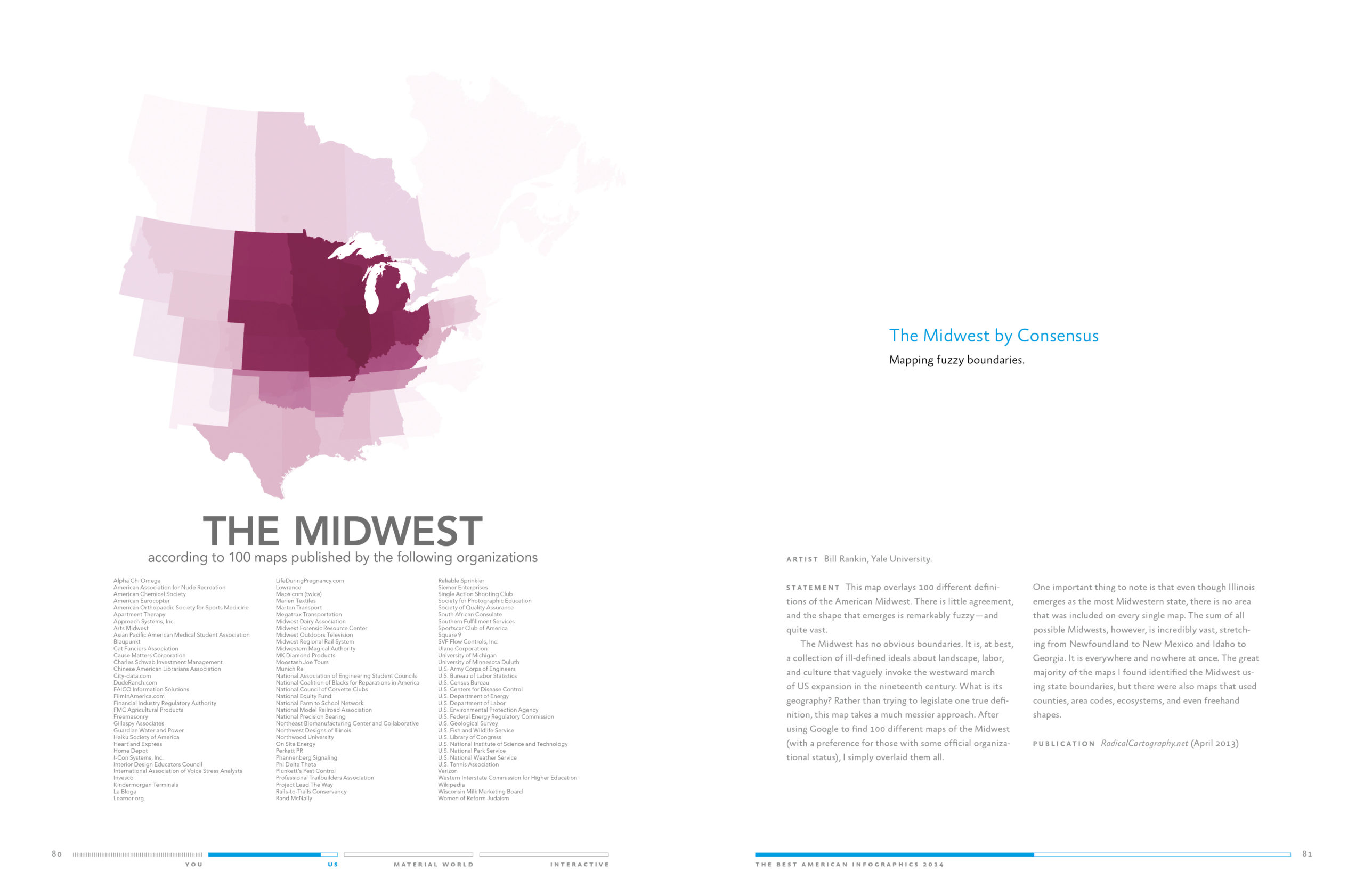
The colloquial language of the Midwest might not be as pressing as some of the other issues on the table here, but it is perennial and pretty damn hard to agree on (as someone from Pittsburgh, an hour away from Ohio, I’ve always felt unmoored from both the East Coast and Midwest).
This clever graphic — another great map by Bill Rankin — analyses 100 maps published by different organisations, each defining the “Midwest,” and creates a heat map showing what states they all agree on — and which are still in that pink “grey” area. “One important thing to note here is that even though Illinois emerges as the most midwestern state, there is no area that was included on every single map,” Rankin writes on his blog. “The sum of all possible Midwests, however, is incredibly vast, stretching from Newfoundland to New Mexico and Idaho to Georgia.”
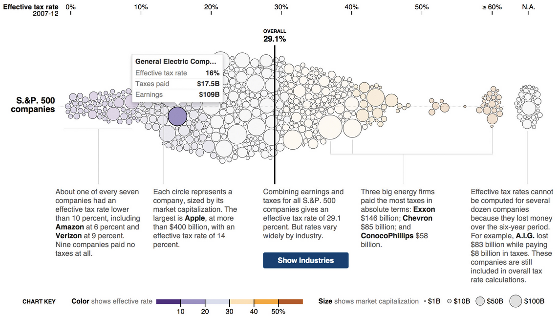
What the Largest Companies Really Pay In Taxes
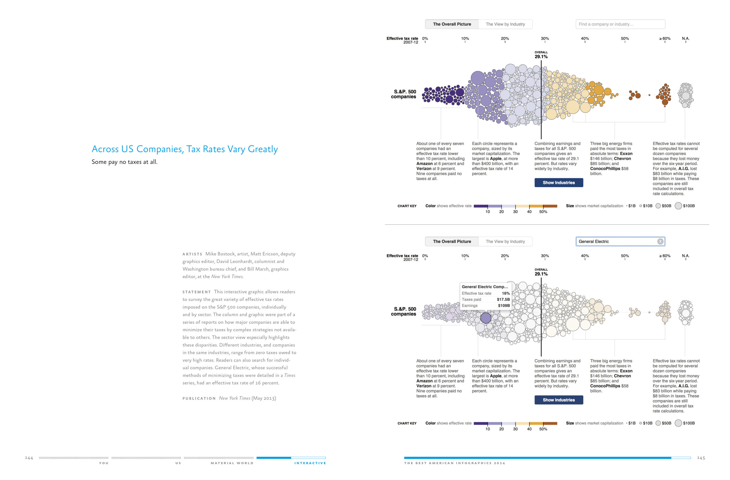
If there was ever an issue in need of concise visual explanation, it’s the way in which major corporations are taxed. In this May 2013 interactive from The New York Times‘ graphics desk, we get a look at the top S&P 500 companies ranked by tax rate. Each company is represented by a bubble, organised by percentage tax rate and sized by market capitalisation. As the NYT explains, the image shows how large companies are able to manipulate the amount of taxes they pay, using “complex strategies not available to others.” Explore the interactive here.