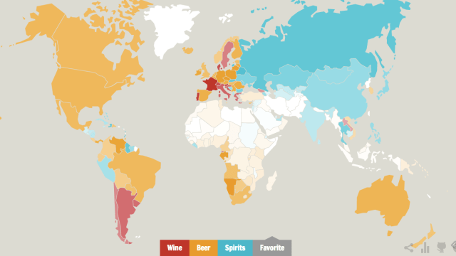
Ever wondered which nation likes beer best? Which prefers to sip at a glass of wine? Or which one slams back the most spirits? Well, this map shows exactly that.
This map was created by Ghost in the Data using alcohol and health data from the World Health Organisation. The consumption of wine, beer and spirits allows the map to show which of the three is favoured in each country — with each one represented by red, yellow and blue respectively. Then, the intensity of each colour shows how much of that drink is consumed: so the dark red of France shows that more wine is drunk than in Argentina, although the drink is still the preferred tipple in each country.
If you head to the full interactive, you’ll find you can click on each country to show the actual average weekly consumption. Some of the results aren’t surprising: France loves wine, Russia loves spirits, and Australians enjoy a beer. Dig a bit more and there are some interesting quirks: Spirits are big in Liberia, for instance, while wine appears to be the preferred drink in Laos. Happy exploring! [Ghost in the Data via Vox]
