Something I was watching closely as the Apple Watch was revealed today: Which typeface would grace this shiny, tiny new device? Well, it’s not Helvetica, the troublesome font that Apple recently adopted for its iOS and OS applications. It’s a brand-new typeface that was designed for excellent readability — by Apple.
There are not too many specific details from the company yet — and there may never be — but Apple did admit the font is its own creation: “We even developed a new typeface to maximise legibility.”
What to make of this big step for Apple’s user interface team? And what to call it? Is it Apple Sans, the typeface that has been rumoured-to-be-in-development for years? Probably not — this is likely a brand-new typeface made just for the Watch’s specific needs. And that is good news.
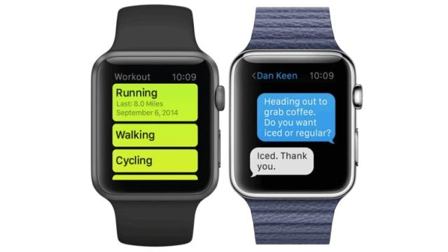
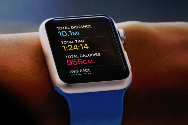
When Apple rolled out its flat-designed Yosemite, designers took the company to task for using Helvetica, which is well-known for being problematic at a small scale. In designing the interface of the Apple Watch, there’s no way that the whisper-thin Helvetica could have performed at that size. Apple designers definitely knew this when embarking upon the project. This new typeface not only features extremely distinctive letters, it looks as if it was designed to be comprehended quickly — whether you’re looking at your running time while on the move or glancing down to check an incoming message.
It reminds me of when the iPod was released, and Apple needed a hardworking typeface that would reproduce well on the low-res black-and-white screen. That time, the company looked back through its own type archives for a winning, readable solution. Susan Kare’s Chicago was resurrected from its appearance on the very first Mac, and proved to be a smart decision. This seems to be a move that’s in the same vein: Going in-house to create something customised, just for Apple. It’s something that used to be done more often in-house, before a decade of choosing off-the-shelf type.
Whatever we’ll call this typeface, it prizes performance over looks. And this is a sign that Apple is finally devoting more attention to user interface design. Helvetica would have been pretty — and would have matched the iPhone 6! — but we would all have been squinting at our wrists. This font works much better for any screen size. In fact, I’m hoping this new Watch-face will soon be rolling out across more of Apple’s products.